After a quiet, Thanksgiving holiday-shortened week, the S&P 500 is almost exactly where investors who might have taken the entire last week off left it.
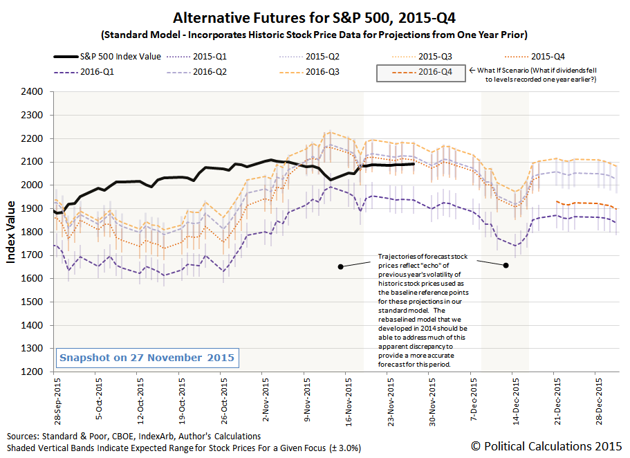
Which is to say that after having shifted their forward looking focus from 2016-Q1 back to 2015-Q4, investors remained focused on the end of the current quarter, as the U.S. Federal Reserve has once again set the expectation that it will finally announce that it will actually begin hiking short term interest rates in the U.S. at its final Open Market Committee meeting of 2015.
Being focused on the end of the current quarter comes with a catch however, as the clock for 2015-Q4 is counting down. Investors will be forced to shift their forward-looking attention to a more distant point of time in the future no later than 18 December 2015, the third Friday in December, which corresponds to the timing of when the the dividend futures contracts for 2015-Q4 will expire.
And technically, they don't need to wait that long. If what they're waiting for is the FOMC meeting, that will have concluded on Wednesday, 16 December 2015.
The real question for investors looking to take advantage of the ticking clock is which future quarter will investors next focus their attention? If investors were to focus upon 2016-Q2 or 2016-Q3, then stock prices wouldn't change very dramatically from where they are at today.
But if investors were to shift their forward-looking focus to 2016-Q1, as they did in August 2015 and just recently in November 2015, then stock prices would be set to fall rather noticeably.
Yet to be determined is the future associated with 2016-Q4, where we won't have data regarding the expectations for dividends per share for that distant future until the fourth week of December 2015.
So the question today for investors is, knowing what you now know, how would you play the S&P 500's countdown clock?
 Today is Black Friday, 2015 - the proverbial day that, if you believe U.S. retailers, enough Americans turn out to the nation's brick and mortar stores to finally lift them into profitability for the year. Which retailers try to ensure by slashing their prices, thereby reducing their marked up profits, in order to lure as many Americans who also have the Friday after Thanksgiving as a holiday into their stores, where they hope to somehow eke out a profit for the year by selling mass quantities of things instead of simply way overpriced things.
But Black Friday has a dark downside. The name really originates in Chicago, where on previous days after Thanksgiving, so many consumers swarmed the city's streets and stores to shop that large numbers of traffic accidents and outbreaks of violence became inevitable, including fatalities, prompting the city's police department to begin calling the day "Black Friday" so they could discourage those activities.
Black Friday brings an inherent conflict of interest for American consumers, who both want to find the ideal Christmas gifts for the people in their lives, and who also don't want to die because of all the other people out shopping at the same time they are.
We have a solution - we've built a tool that you can use to put a limit on how much shopping you need to do to find the perfect gift, which in turn will limit the amount of time that you're exposed to the mayhem that U.S. retailers wrought, increasing your probability of survival. And all you meed to know is how much shopping you're willing to commit to do while shopping for the "perfect gift" before you've seen enough and can simply buy the next best thing you see.
Emily Oster recently addressed this problem in taking on a question from a young couple seeking a new place to live, but not as yet having much luck in finding suitable accommodations. She writes:
You have, perhaps inadvertently, happened upon an extremely famous area of statistics: optimal stopping theory. The classic example is the secretary problem: you want to hire a secretary, and you have many applicants you interview in order. How do you know when to stop interviewing and hire someone? In your case, how do you know when to stop viewing apartments and just rent one?
Part of what attracts statisticians to this problem is it turns out to have an extremely elegant solution. First, figure out how many apartments you expect to see. Let’s say you think you’ll see 50. The solution says that you should reject the first 50/2.71 apartments (or, about the first 20 of them) and then rent the first one you see after that which is better than any you’ve seen before. (For those of you following the math, the precise number you reject is 50/e, the base of the natural log.)
This is pretty easy to follow and statisticians have proved it will get you the best apartment about 40% of the time, which definitely isn’t 100% but is better than any other strategy!
Well, with that kind of statistical endorsement, how could we possibly pass up the opportunity to build a tool to do the math for you? Just enter the total number of possibilities that you're willing to consider in your search to find what's just good enough for you, and we'll determine the minimum number of possibilities you need to consider to make a decent decision! If you're reading this article on a site that republishes our RSS news feed, click here to access a working version of this tool!
For our default example, in a search for where you would be willing to consider up to 20 possible options in your pursuit of the best choice for you, by the time you've considered at least 7 of them, you will have seen enough and can jump at the first opportunity you have that is better than all that you have previously seen.
And, for what it's worth, there's even a 40% chance that you'll be right. Happy shopping!
Labels: geek logik, tool

How did the turkey become the centerpiece for the United States' national dinner? Andrew F. Smith took on that question as Chapter 5 in his book The Turkey: An American Story. Here's a Thanksgiving Day excerpt, in which Smith describes the origins of turkey farming in colonial America:
Domesticated turkeys were reportedly raised in Jamestown by 1614, but they were evidently still rare in 1623 because a law was passed imposing the death penalty for the theft of turkeys if valued at more than 12 pence. Within a decade, however, tables were filled with turkeys at Jamestown. Likewise, domesticated turkeys were sent to Massachusetts Bay by 1628 if not earlier.
During the early years wild turkeys were numerous and easy to acquire. Domesticated turkeys were smaller than wild ones and known to destroy crops and cause other damage if not controlled; some farmers considered domesticated turkeys so mischievous that they were judged uneconomical to raise in large numbers. To further complicate turkey-keeping, cocks had to be separated from hens, especially when the hens laid eggs in the spring.
Because raising turkeys was a marginal activity for most farmers, little attention was directed toward breeding them. Free-range domesticated turkeys mated with wild turkeys, however, and produced new breeds, one of which was the Blue Virginia. Larger than the European turkey, it was therefore more valuable as a food source. Turkey flocks increased to such an extent that by 1744 they were being exported from southern colonies to the West Indies. This export business expanded, and by the following century American turkey growers were sending thousands of turkeys abroad. Two in Massachusetts, for instance, sent a total of 1,300 live birds to London during one month in 1833.
But the thing that really took turkeys from the wild to the farm was their role in supporting the early colonists' first major cash crop:
By far the most important reason for the growth of the domesticated turkey population in America, particularly in Virginia and Maryland, was tobacco. Colonists were lured to the southern colonies, where conditions for that crop were ideal. Tobacco was America's first agribusiness and the preeminent colonial export.
A major challenge in growing the crop was to control tobacco hornworms (Sphinx carolina), which infested fields in the South from June to August. In a time before pesticides and other deterrents, planters were helpless to fight hornworm infestation other than by sending numbers of slaves through fields to hand-pick the worms from tobacco leaves. Even then, half of a crop could be lost to the voracious creatures. To the rescue came the turkey, an omnivore that loves to feast on insects and bugs and finds the large and meaty tobacco worm irresistible. By the mid-eighteenth century planters were sending turkeys into their tobacco fields to eat the worms. In 1784 John F.D. Smyth, a British traveler, reported that turkeys were particularly dexterous at finding hornworms. A tobacco grower would keep a "flock of turkeys, which he has driven into the tobacco grounds every day by a little negroe than can do nothing else," reported Smyth. "These keep his tobacco more clear from horn worms, than all the hands he has got could do, were they employed solely for that end."
We find then that if not for the appetites of domesticated turkeys, it is likely that slavery would have been an even larger institution in early America than it became.
Labels: thanksgiving
Here at Political Calculations, we sometimes live up to the "political" part of our name by taking on, shall we say, delicate topics, where by delicate we occationally mean "really personal".
And what can be more personal than addressing the proverbial turkey on the table every Thanksgiving, the lurking dangers of all the interpersonal interactations that can explode into open conflict as you join your family for your annual holiday feast.
That can be especially challenging in 2015, because thanks to the explosion of the mobile web, many of your family members are unable to go more than a few minutes without some sort of tech-channeled stimulation.
Today everyone is constantly plugged in. We have laptops, smartphones, iPads, ipods, work computers, television, TiVo for on-demand television watching, and Redbox video rental kiosks on every corner. This constant need to be preoccupied with electronic toys is leading to the breakdown of our community ties, and it is likely a strong piece of the puzzle in the ADHD epidemic that seems to be overtaking our society. It seems that excessive use of technology can be harmful to our extended social support systems, and our cognitive development.
Even though many people will argue that technology helps them keep in touch with loved ones easier, there still seems to be a breakdown in social connection. Yes, you can email your family often and text your daughter to see if she is home from school all while you are sitting in a meeting at work. But this is your immediate social support system. Your community is composed of individuals who live in your town. Your relations within your community are extended social support. However, it seems like there has been a gradual breakdown of interest in developing relationships with neighbors, or those you see on the streets everyday.
So in the interest of improving your family's cohesion through real-time, tech-free social interaction, today, we're going to feature Adam Conover's three-minute exercise designed specifically for the tech-addicted so they can begin developing the skills needed to be able to go without that wi-fi or mobile connection for the sake of direct, face-to-face interactions with other human beings in real life, even if just for a few minutes. Good luck....
If you're a tech addict, we appreciate just how hard that was for you. That one ten second long period of silence really did feel like an hour had passed, didn't it?
But you've made it through, so that means that you have a chance - a real chance - of surviving your family's Thanksgiving dinner in 2015. And if you're up for the challenge, if you want to improve your odds even more, go ahead and watch it again. Otherwise, your Thanksgiving dinner experience could turn out like the one portrayed in the following video.
If you fear that sort of calamity taking place at your family's Thanksgiving dinner this year, we'll point you to Doc Palmer's suggestions for putting yourself in the right frame of mind to avoid that kind of outcome altogether.
Labels: thanksgiving
Last Thanksgiving, we presented a chart featuring a spurious correlation between the average live weight of U.S. farm raised turkeys and the MSCI World Stock Market Index, in which we showed how U.S. turkeys predict global stock market crashes. Here's what we wrote at the time....
As you can see in our carefully calibrated chart above, whenever the value of the MSCI World index has exceeded the equivalent live weight of an average farm-raised turkey in the U.S., the index went on to either stagnate or crash. And in 2014, the value of the the MSCI World Stock Market Index has once again exceeded that key threshold, which can only mean one thing.... The climate for investors has changed, and it's time to sell!
And if they try to tell you that doesn't make any real sense, you should hold firm and tell them that the correlation is really strong (the R² is 0.9616), which means that the science is settled and that they really shouldn't want to be some kind of climate change science denier.
Speaking of which, the rising live weight of U.S. farm-raised turkeys also is strongly correlated with global warming. Believe it or not, the correlation between atmospheric carbon dioxide and global temperatures is not very strong at all (other factors do a much more coherent job in explaining actual temperature observations).
Say what you will about the science, but you cannot deny that by using tips like this, you can make the conversation around your Thanksgiving dinner table a lot more lively this year!
The correlation between the live weight of U.S. farm-raised turkeys and global stock prices is still spurious, and yet amazingly, our prediction based upon it has largely come true in the past year, as the worlds' stock markets did indeed go on to either stagnate or crash.
And with those stock prices still above the live weight of U.S. turkeys, we can't as yet say that global markets are finished stagnating or crashing as yet.
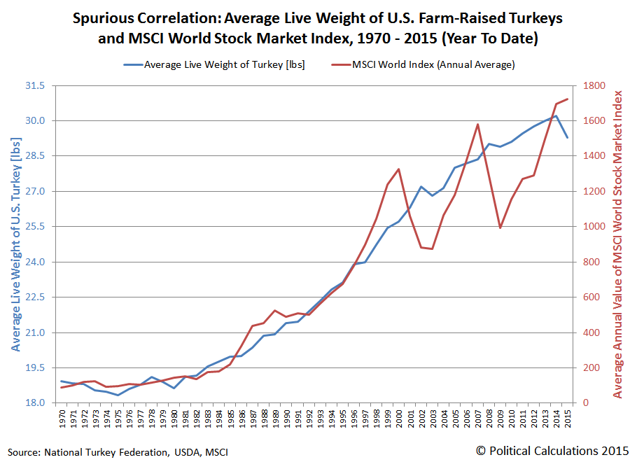
If it seems irrational to link the weight of U.S. turkeys and global stock prices, just remember the old saying: the market can remain irrational longer than you can remain solvent. Do you really feel lucky enough to bet against the birds?

Data Sources
MSCI. MSCI - World Stock Market Index. (End of Day Index Data Search). [Online Database. ]. Accessed 23 November 2015.
National Turkey Federation. Sourcebook. [PDF Document]. October 2013.
U.S. Department of Agriculture. Turkeys Raised. [PDF Document]. 30 September 2015.
Labels: satire, stock market, thanksgiving
Today, we're going to consider the counterargument to the data we presented yesterday, in which we showed that the population of farm-raised turkeys peaked at 302.7 million in 1996 and has fallen steadily since. Or rather, through 2014, as 2015 saw the population fall as a direct result of an outbreak of avian influenza among U.S. farm flocks of turkeys.
While the population of farm-raised turkeys in the U.S. would appear to indicate that's the case, in reality, the truth is somewhat different because today's turkeys are much larger than those of yesteryear. In the chart below, we've graphed the live weight of turkeys raised on U.S. farms for each year from 1970 through 2015 to show just how much the size and weight of U.S. turkeys has changed over time.

In this chart, we see that since the 1970's, the average live weight of a turkey raised on a U.S. farm has increased by 61% through 2014, from 18.7 pounds to 30.2 pounds.
In 2015 however, we see that the average live weight of a turkey has dropped by 3% to 29.3 pounds, which is directly attributable to the outbreak of avian influenza at a number of turkey farms early in 2015. Here's how the U.S. Department of Agriculture described how the outbreak affected the average live weight of turkeys it recorded (emphasis ours):
U.S. turkey meat production in third-quarter 2015 was 1.35 billion pounds, down 9 percent from a year earlier. This continued the downward path for turkey production in 2015, with a strong increase in the first quarter, a small decrease in the second quarter, and most recently, a strong decrease in the third quarter. The third-quarter decline was due to both a lower number of turkeys slaughtered and a drop in their average live weight at slaughter. The slaughter number fell to 57.5 million, 6 percent lower than a year earlier, while the average live weight at slaughter declined to 29.3 pounds, a drop of 3 percent from the previous year. Since April the average live weight at slaughter has been lower than the previous year, for a period of 6 consecutive months—reflecting the impact of the HPAI outbreak, which caused processors to slaughter birds somewhat earlier than they normally would in order to maintain supply levels.
We find then that 2015 represents an outlier in the data for the average weight of U.S. farm-raised turkeys.
That's an important fact to consider in considering our next chart, in which we're showing the aggregate weight of all turkeys raised on U.S. farms for each year from 1970 through 2015, which would represent the product of the average weight of farm-raised turkeys and the number of turkeys raised on U.S. farms in each year.

In this chart, we see that the total weight of all turkeys produced in the U.S. has fallen within a fairly narrow range in each year since 1996, ranging between 6.9 and 7.9 billion pounds in any given year from 1996 through 2014 and varying with the health of the U.S. economy, even though the number of farm-raised turkeys peaked in 1996. Meanwhile, our outlier year, 2015, fell back below the 6.9 million pound mark, but clearly would not have done so if U.S. turkey farms hadn't been forced to cull their flocks to prevent the further spread of the outbreak of avian influenza in early 2015.
With that being the case, what's important to consider in the consumption of turkeys in determining whether the U.S. has passed "peak turkey" is not their number, but their aggregate weight, as turkey meat is consumed by the pound.
A similar phenomenon can be seen elsewhere in the economy when considering the state of oil production in the U.S., where 2015 has seen a declining number of working rigs at U.S. oil fields as oil prices have fallen, but also a much smaller than might otherwise be expected reduction in actual crude oil extraction, as the remaining rigs have been made more productive.
U.S. turkey farms have likewise become much more productive over the years since the total population of farm-raised turkeys peaked in 1996, and really, since the stagnant 1970s.
Which is to say that not only has Peak Turkey not arrived, there is also no great turkey stagnation.
Data Sources
U.S. Department of Agriculture. USDA Livestock, Dairy and Poultry Outlook - November 2015. [PDF Document]. 17 November 2015.
U.S. Department of Agriculture. Poultry - Production and Value, 2014 Summary. [PDF Document]. April 2015.
Labels: thanksgiving
In 2015, the estimated population of turkeys raised on U.S. farms fell to its lowest level in 29 years, dropping nationally by 4% to 228 million. That figure is down by nearly 75 million since the population of U.S. turkeys raised on U.S. farms peaked at 302.7 million in 1996.
Our chart below shows the evolution of annual turkey production at U.S. farms for each year from 1970 through 2015's preliminary estimate by the USDA.
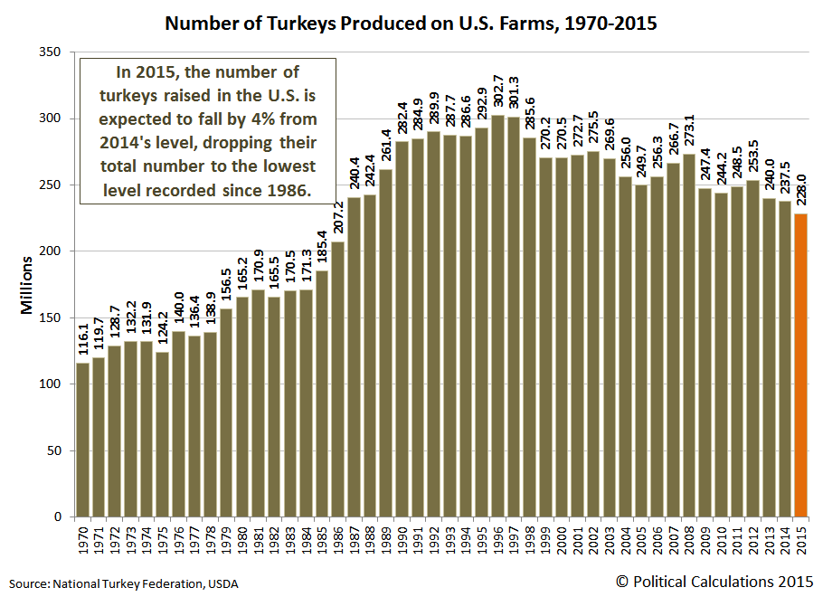
The USDA describes the drop in the number of U.S. farm-raised in 2015:
A combination of six states account for nearly two-thirds of the turkeys produced in the United States during 2015. The largest turkey producing state is Minnesota, at 40.0 million turkeys, down 12 percent from the previous year. North Carolina is up 2 percent from last year, producing 29.0 million turkeys. Arkansas produced 27.0 million turkeys, which is down 10 percent from the previous year. Indiana is up 1 percent from a year ago to 19.1 million turkeys. Missouri is up 6 percent from last year, producing 18.0 million turkeys. Virginia is up compared to the previous year by 4 percent at 17.4 million turkeys.
The big reason for the concentrated declines in Minnesota and Arkansas is that the poultry flocks raised on farms in these states were very negatively impacted by the incidence of avian influenza, which prompted a number of turkey producers to euthanize a large portion of their flocks to prevent the spread of the infectious and deadly disease after detecting its presence on their farms.
But that factor only accounts for the decline in the number of turkeys raised each year on U.S. farms in 2015. It doesn't explain the decline of 65.3 million turkeys that took place in the time from 1996 through 2014, after the population peaked in 1996.
So here's a deeper question to talk about around this year's Thanksgiving dinner: has the U.S. passed "peak turkey"? The hypothetical point in time when maximum turkey production has been reached, but has entered a slow but terminal decline, much like the concept of "peak oil" that has been hypothesized for the production of petroleum.
Otherwise, if you're not prepared with distracting conversation material like that, your Thanksgiving dinner experience could very well turn out like that depicted in the following video.
You can't say you weren't warned - you don't want to go through that kind of pain. Where Thanksgiving dinners are concerned, preparation is everything!...
Data Sources
National Turkey Federation. Sourcebook. [PDF Document]. October 2013.
National Turkey Federation. Statistics. [Online Article]. Accessed 22 November 2015.
U.S. Department of Agriculture. Turkeys Raised. [PDF Document]. 30 September 2015.
Labels: thanksgiving
Prompted by the release of the minutes of the FOMC's October 2015 meeting, investors shifted their forward looking focus back to 2015-Q4, as it now appears the Fed will finally follow through on its previously empty threats to begin hiking short term interest rates in the U.S.

For stock prices, the shift in forward-looking focus from 2016-Q1 back to the nearer term future of 2015-Q4, where the Fed will likely announce its now expected action at its next meeting on 16 December 2015, meant that stock prices would rise. And so they have, just as our hypothesis would expect:

Here's how Reuters reported the story:
Wall St. rallies after Fed minutes solidify December rate hike bets
U.S. stocks closed higher on Wednesday and investors appeared positively inclined toward higher rates after minutes from the Federal Reserve October meeting showed a solid core of officials rallied behind a possible December rate hike.
Central bankers at the October policy meeting also debated evidence the U.S. economy's long-term potential may have permanently shifted lower.
The three major indexes added to earlier gains after the 2:00 PM ET Fed release and buying accelerated ahead of the close.
Now, here's the thing. We're now in a period of time in which investors are myopically focused on the very near term future. That will only last one more month, at most, through the third Friday of December (18 December 2015), which corresponds to when the stock market futures contracts for 2015-Q4 expire, with pretty good odds that investors will shift their forward-looking focus to a more distant point of time in the future after the FOMC meets on 16 December 2015.
Which point in the future they focus upon next will determine the trajectory that stock prices will actually take, as the expectations associated with each point will drive stock prices.
At the same time, we've kept seeing the pattern when when unexpectedly bad news is reported, investors shift their attention to 2016-Q1. What that suggests is that there is a high risk of yet another roughly 10% correction in the market's near term future.
We think that the extent to which that might be avoided will hinge on how the Federal Reserve manages investor expectations after its December 2015 meeting. With the data we have available today, we think that if they set expectations such that investors believe that the next action they take will be after 2016-Q1, the U.S. stock market can avoid a correction event.
But if they indicate that their next action might take place in that first quarter of 2016, or if they otherwise lose the plot in the face of other market driving news, then the kind of focus-shifting correction we've described will become a done deal.
Meanwhile at Political Calculations
We're juggling our posting schedule around as we head into the end of the year's holiday season, which is why we're commenting on the stock market on a Friday when we'd otherwise be turning our attention to more fun-related material.
Speaking of which, we'll be turning our attention next week toward Thanksgiving, where it will be all turkey all week long, as per our annual holiday tradition!
What's the preliminary estimate of the amount of debt that the U.S. government owed to all its creditors as of the end of its 2015 fiscal year on 30 September 2015?
That's not such an easy question to answer, because at the time, the amount of the total public debt outstanding for the U.S. government was locked in at $18.15 trillion - almost exactly the same level it had been when the U.S. Treasury ran into the nation's statutory debt ceiling back on 24 February 2015.
But that doesn't mean that the U.S. Treasury stopped borrowing money. To get around that legal limit, U.S. Treasury Secretary Jack Lew played something of a shell game with accounts controlled by his department - primarily the retirement and disability trust funds for the federal government's civilian employees.
As a result, even though the total U.S. national debt appeared to be frozen at $18.15 trillion, the U.S. federal government was out racking up even more debt.
How much debt it racked up became clear after former U.S. House of Representatives Speaker John Boehner struck a deal with President Obama that allowed the U.S. Treasury Department to ignore the nation's laws regarding how much debt the U.S. government can take on until March 2017. When President Obama signed the deal into law on 2 November 2015, the U.S. government's total public debt outstanding immediately swelled by $339 billion, rising to $18.49 trillion by the end of the day, as the Treasury Secretary's shell game came to an end, along with any consideration that the previous figure of $18.15 trillion was ever anything more than an accounting fiction.
But what would it have been on 30 September 2015 if not for that shell game?
To estimate that figure, we assumed that in the time from 24 February 2015 and 2 November 2015, the amount of money that the U.S. government owes to all its creditors increased steadily. And that assumption put the estimated real amount of the U.S. total public debt outstanding as of the end of the U.S. government's fiscal year somewhere in the ballpark of $18.44 trillion.
And that's the figure we're displaying in the chart below, in which we've also identified how much of that debt is held by the U.S. government's major creditors as of that date.

The rest of the figures shown in the chart above reflect the officially recorded amount of debt held by each entity as of 30 September 2015. Including the percentage share shown for the U.S. government's civilian retirement fund, which was artifically depressed as a result of the Treasury Department's funny money shell game. To keep the accounting simple, whatever that amount might have been is included with the share indicated for U.S. individuals and institutions (which is technically correct).
As of 19 November 2015, the total public debt outstanding stood at $18.66 trillion.
Data Sources
Federal Reserve Statistical Release. H.4.1. Factors Affecting Reserve Balances. Release Date: 1 October 2015. [Online Document]. Accessed 17 November 2015.
U.S. Treasury. Major Foreign Holders of Treasury Securities. Accessed 17 November 2015.
U.S. Treasury. Monthly Treasury Statement of Receipts and Outlays of the United States Government for Fiscal Year 2015 Through September 30, 2015. [PDF Document].
Labels: national debt
Just over a decade ago, we discovered the U.S. Bureau of Economic Analysis' resources for digging deeper into GDP, including applications that could break the nation's GDP down by both industry and state.
Back then, the state-level Gross Domestic Product data went by the name of "Gross State Product", or GSP, which had a major deficiency, as updates for the state level data for a given quarter were released many quarters after which they actually occurred.
That began to change in 2012, as the BEA began developing more timely updates for state-level GDP data by industry, where they seek to release data within 30 days of the release of the third estimate of national-level GDP after the end of a given quarter.
The BEA is still working toward that goal, with the new state-level GDP data, now identified as "Quarterly Gross Domestic Product By State", coming out within 2-to-3 quarters of the end of the quarter to which it applies. The most recently available data at this writing spans the period from the first quarter of 2005 through the fourth quarter of 2014, with the next data release covering the period through the second quarter of 2015 expected to be released in December 2015.
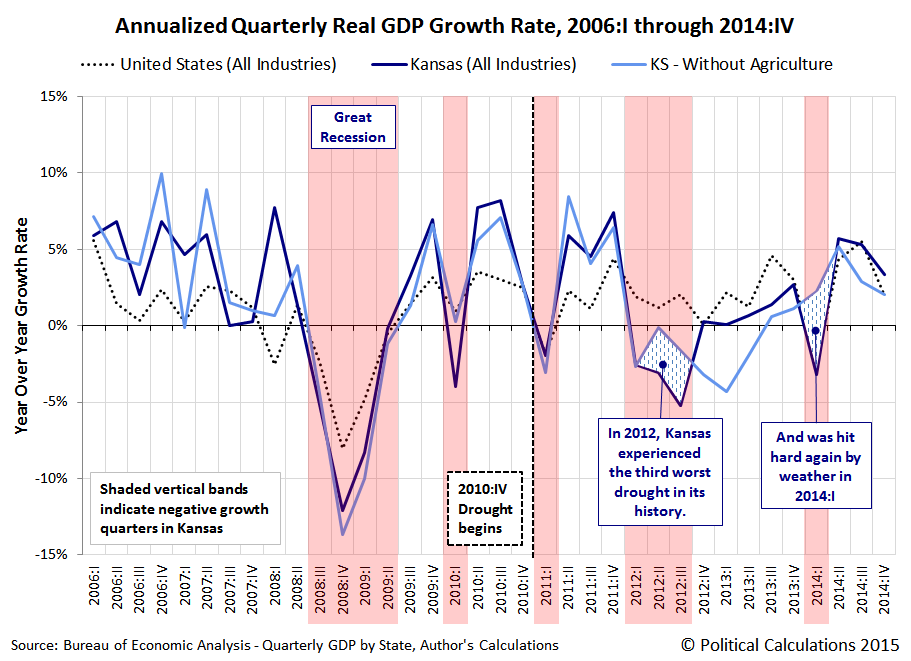
To show what kind of analysis is possible with GDP data detailed to the state level, we're going to compare the performance of the entire U.S. economy, covering all industries, with that of the state of Kansas for the period from the first quarter of 2006 through the fourth quarter of 2014.
Given the difference in the sizes of the respective economies of the entire U.S. and the state of Kansas, the way we'll do that is to compare the real, inflation-adjusted growth rates of GDP at both levels. Our first chart shows each quarter's annualized growth rate over our chosen period of interest, which allows us to fully cover a period of time spanning two full years before the onset of the so-called "Great Recession" with the available data.

In the chart above, we've indicated the quarters in which Kansas' economy experienced negative real GDP growth with the red-shaded vertical bands. The U.S.' real economic growth is shown as the dotted line, while Kansas' is shown as the solid blue line.
Overall, we see that Kansas' economy generally outperformed the economy of the U.S. in the period preceding the Great recession. Beginning with the Great Recession however, we see that Kansas' economy has generally followed the overall trend of the entire U.S. economy, with some notable exceptions.
The most significant deviation between the two occurred in 2012, where Kansas' real economic growth significantly lagged behind that of the U.S. economy as a whole.
Using the state's GDP data broken down by major industry, we quickly determined that the state's agricultural output was very negatively impacted during this period. A simple search of contemporary news sources quickly confirmed why: a multiyear drought that began in earnest in the fourth quarter of 2010 sharply intensified in 2012.
The chart below shows how Kansas' real economic growth was impacted by the drought, where we calculated the state's real GDP growth rate without the contribution of its agricultural sector, shown as the light blue line.
The BEA's state-level GDP data confirms that Kansas' economy was negatively impacted by drought in 2012. Believe it or not, the National Weather Service also recognized the drought's negative economic impact contemporaneously:
The drought has had a detrimental impact on agriculture and crops across the region. Due to a very dry fall, the winter wheat crop is already suffering. According to the Kansas Agricultural Statistics Service from late November and early December, 25% of the winter wheat across the state was in poor to very poor condition, 46% in fair condition, and only 28% in good condition; only 1% was rated excellent.
Of course, livestock suffered terribly. Livestock producers were forced to move their animals off of pasture early because the grass was gone and the water supply was depleted. As of September 10th, farmers and ranchers with cow/calf operations had been feeding hay for a couple of months. They were also forced to either deplete part of their herds or purchase high-priced feed. No doubt, the economic ramifications were significant. Cash flows on almost all livestock operations were severely impacted and in many cases operators with cattle were forced to sell livestock early which, in turn, resulted in less income. Those who held on to their cattle had to buy expensive feed which also resulted in lost revenue. Furthermore, the drought has not only had a negative impact on agriculture and crops, but also has greatly reduced water levels on reservoirs and rivers, with many areas reporting very low and in some cases record low stream flows. This has adversely affected recreational boating.
The effects of extreme drought that year would also negatively impact the state's non-durable goods manufacturing sector, as mills in the state would have less grain to process into flour, particularly in the quarters following the main harvest, which is also evident in the detailed state-level GDP data.
But we also noticed that durable goods manufacturing also experienced a downturn in that period. As it happens, Kansas' economy was also negatively affected in 2012 and 2013 by a downturn in its aerospace and defense industrial sector, which resulted in significant layoffs within the state. In our chart below, we've shown what Kansas' real GDP growth rate was for all its other industries, less its agricultural and manufacturing industries:

What we find is that after accounting for the negative economic contributions of just these two industrial sectors, the gap between Kansas' real economic growth rate and that of the U.S. as a whole narrows to fall within a range that might be expected from simple statistical noise.
As for what prompted the contraction in Kansas' manufacturing industry, we can directly identify the influence of a significant reduction in aircraft orders and deliveries to the industry's worldwide customers that disproportionately affected Kansas' aviation industry and also a reduction in defense spending on the part of the U.S. federal government, which came as part of the budget sequester that President Obama proposed for the Budget Control Act of 2011, making the downturn for aerospace and defense industries actually national in scope.
The remainder of the downturn in Kansas' economic growth in 2012 can otherwise be attributed to two very short term factors that took place in the first quarter of 2012. First, the first quarter of 2012 in Kansas was unusually warm, which reduced the contribution of utilities to the state's GDP that quarter, which was confirmed by one of the state's leading power companies in their financial statements.
The other very short term factor was a downturn in the state's real estate sector, which turned down after having peaked in real terms in the fourth quarter of 2011, thanks to the recovery of housing prices in Kansas, which had boosted the contribution of real estate to the state's economy in 2011, but less so afterward, in part because of the negative shocks experienced in the state's agricultural and manufacturing sectors.
In our final chart, we'll consider the counterfactual of how Kansas' state economy would have grown with respect to the overall U.S. economy, in which we'll show how the state's economy would have grown if its overall real economic growth had not been negatively affected by extreme drought and the results of the recession in its aerospace and defense manufacturing industries. In this chart, we've indexed the growth of both the U.S. and Kansas' economies to the fourth quarter of 2010 (2010:IV = 1.00, or 100% if you prefer), which corresponds to the beginning of Kansas' multiyear period of drought. We've also animated the chart to emphasize the difference that the fortunes of the state's agricultural and manufacturing industries make to its economic performance.

Basically, we've nearly completely accounted for the differences in overall performance between the U.S.' economy and Kansas' economy, substantiating that both severe drought on the state's agriculture and non-durable goods manufacturers and also a national recession for the state's aviation and defense manufacturers negatively impacted the state's actual GDP.
Which we point out because at least one professor at a large public university who claims to be competent in the field of economics was unable to do so. But then, that may be because they are completely unfamiliar with the detailed data on actual state-level GDP that the BEA makes freely available. Then again, based on what we've observed of their analytical ability, we believe that they would be hard pressed to discover their own ass, even if equipped with both hands and a flashlight.
Speaking of which, the only reason we're even discussing this topic today is because of a really bizarre pattern we've observed in our site traffic in recent months, extending back to at least July of this year, with the most recent episode taking place earlier this week, late at night (the timestamps shown below reflect Pacific Standard Time).

While we appreciate the repetitive site traffic, we can't help but think that the ongoing visits represent a level of knowing guilt on the part of our frequent site visitor, where the fear of our potential exposure of what could be described as blithering incompetence at best, or perhaps even purposeful deceit at worst, is keeping them from sleeping soundly at night, driving their frequent visits to our site where they hope to still find that we haven't yet addressed the matter.
We will address the matter in greater detail in a future post. When we do, will be at our leisurely convenience....
Update 6 September 2016: Talk about leisurely convenience! We didn't get back to addressing the matter in greater detail until 8 July 2016, so if you've come to this post by way of Econbrowser, hopefully following this link will help describe why the particular author who pointed you to this post is so put out. If you'd rather not click through, the short story is that we caught them engaged in a practice that some would describe as "academic fraud" and called them out on it - it's so bad that they don't even dispute their bad actions, but instead appear to be engaged in a campaign of misdirection, where they've systematically engaged in some spectacularly unprofessional and unscholarly behavior.
But even in their campaign of pseudoscience, they did raise an interesting point regarding the counterfactual analysis we presented in this post. Let's quote them from their most recent attempt at a smear attack:
Unfortunately, in his calculation of Kansas GDP excluding agriculture and manufacturing, he made an error by simply subtracting (chain weighted) real agricultural output and real manufacturing from real GDP (as discussed in the addendum to this post).
We love the title of the post he linked - at least he's being up front about what he's doing! More seriously, let's compare the results of what you get when you actually add up the subcomponents of the real GDP data that we used to produce our counterfactual in this post and compare it with the BEA's total real GDP estimate for the state.
, Comparison of Total GDP and Aggregate Sum of Component Industries, 2005Q1 - 2014Q4")
As you can see, adding up the subcomponents of the state's real GDP would slightly overstate real GDP in the period from 2005Q1 through 2008Q3, and again briefly in 2012-Q3. At the same time, we also see that we get nearly matching results in the period from 2008-Q4 through 2012-Q3, and then we see that the results of adding together all the subcomponents of real GDP slightly understates total real GDP from 2013-Q1 through 2014-Q4. All results are within 0.6% of the total GDP reported for each quarter, with half of the results falling within half that maximum margin of error (recorded in 2007-Q4). As you would expect for data baselined in 2009, the further away you get in time with respect to the baseline period, the typically greater the error.
Looking over the entire span of data, if we calculate the compound GDP growth rate over the full 10 years from 2005-Q1 through 2014-Q4 from the results of adding up its subcomponents, the resulting 1.47% annualized rate of growth indicates a slightly slower rate of growth than what we get when we perform that math with the state's total GDP, where we get a result of 1.57%.
In other words, our counterfactual falls well within any reasonable margin of error that would be expected arising the inherent statistical errors in the underlying data that the BEA used in its reported estimates throughout this entire period of time.
That also means that our counterfactual that was based on adding up the subcomponents of the industries that contribute to the state's GDP and excluding the contributions from the agricultural and manufacturing sectors of the state's economy slightly understates the amount of GDP growth that would have occurred in the absence of drought and the state's aerospace industry microrecession that ran from 2012 through 2013, which offset the minor recovery from extreme drought in 2013..
We therefore see no need to revise the analysis to reflect the slightly higher rate of growth, because as a counterfactual, we only need it to be reasonably close to a more precise calculation, where we're on very firm ground in erring on the side of understating the amount of growth that would have occurred if the state's agriculture and manufacturing sectors had grown at rates similar to that recorded by all the other sectors of the state's economy throughout this period of time.
That also means that our spiteful critic's repeated attempts at a smear attack on this point also qualifies as junk science. Here's the applicable category from our junk science checklist:
| How to Distinguish "Good" Science from "Junk" or "Pseudo" Science | |||
|---|---|---|---|
| Aspect | Science | Pseudoscience | Comments |
| Precision | If numbers are presented in support of a scientific explanation, they must be stated with the precision and accuracy required by their level of significance as determined by known measurement error in the data from which are derived, neither more nor less. | Pseudoscience practitioners will often present numbers with a level of precision and accuracy that exceeds that supported by the known accuracy of real world data in order to give the appearance of greater validity for their claims. | A recent example of pseudoscientific deception by precision include certain economists suggesting that "a Keynesian multiplier of 1.57" specifically applies for government stimulus spending, when a wide range of studies suggest the actual multiplier may be "anywhere from 0 to 1.5" (note the difference in the number of decimal places and potential range of values!) |
We're pretty sure that it's only a coincidence that 1.57 figure keeps showing up with respect to junk science in economics!
Data Sources
U.S. Bureau of Economic Analysis. Quarterly Gross Domestic Product by State, 2005-2014 (Prototype Statistics).
Table: Real GDP by Stgate, 2005-2014. Excel Spreadsheet]. 2 September 2015. Accessed 19 November 2015.
References
General Aviation Manufacturers Association. 2013 General Aviation Statistical Databook & 2014 Industry Outlook. [PDF Document]. 18 February 2014.
Kansas Department of Labor. 2013 Kansas Economic Report. [PDF Document]. 28 August 2013.
Kiser, Becky. "'3rd Worst Drought for Kansas' According to Local Research". Hays Post. [Online Article]. 21 May 2014.
National Weather Service. Wichita, Kansas Record Breaking Heat and Drought in 2012. [Online Article]. Accessed 19 November 2015.
Said, Hashem. Map: US Struggles Through Five years of Drought. Al Jazeera America. [Online Article]. 9 July 2015.
Southwest Farm Press. Kansas October Moisture a Third of Normal. [Online Article]. 11 November 2010.
Strassner, Erich H. and Wasshouser, David B. BEA Briefing: Prototype Quarterly Statistics on U.S. Gross Domestic Product by Industry, 2007-2011. [PDF Document]. June 2012.
Westar Energy. "Westar Energy announces 1st quarter 2012 results; 1st quarter was warmest in more than 50 years." PDF Document]. 9 May 2012.
Labels: economics
What effect has the Federal Reserve's previous Quantitative Easing (QE) programs had on the acceleration of private debt in the U.S. economy?
That's an important question to answer because of the remarkable correlation between the nation's real economic growth rate and the change in the rate of growth of private debt in the U.S., where periods of a rising real GDP growth rate are associated with a rising acceleration of private debt, and periods of falling real GDP growth are correlated with decelerating private debt.
In the chart below, we've visualized the periods in which the Fed's three major QE programs of recent years provide the backdrop against the trajectory of the acceleration of private debt and its trailing twelve month average. For reference, we've also indicated the period of the so-called "Great Recession", as determined by the National Bureau of Economic Research.
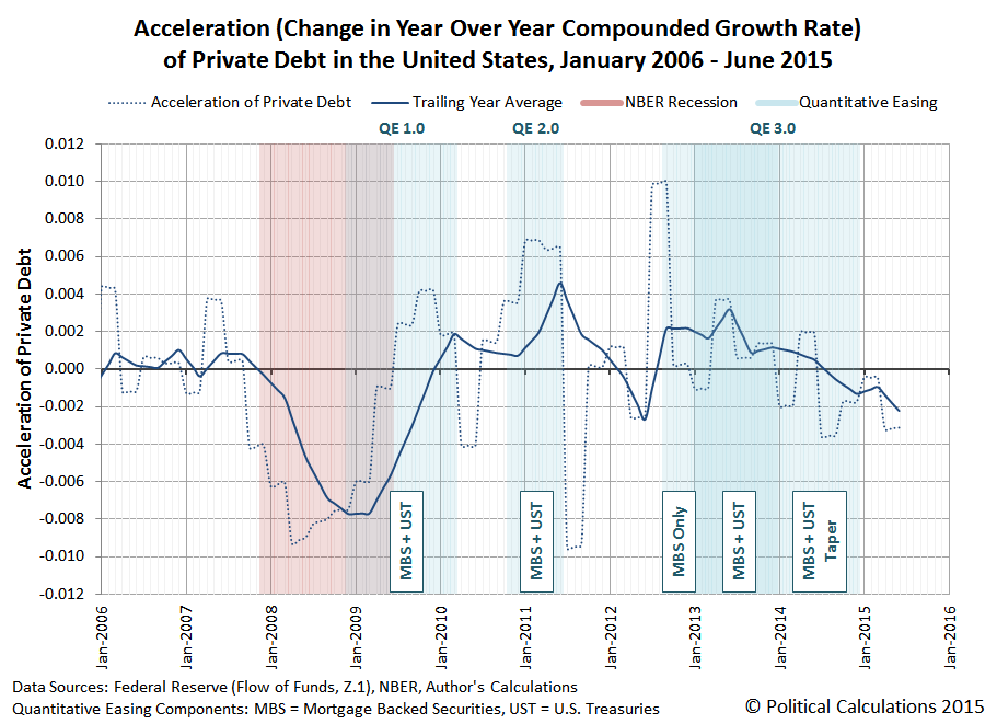
In the chart above, we've also identified the kinds of assets that the Federal Reserve's focused on purchasing during each of the major phases of its QE programs, Mortgage Backed Securites (MBS) and U.S. Treasuries (UST).
What we observe in the trailing year data is that the Fed's various QE programs have had a fairly clear "on-off" effect on changes in the rate of growth of private debt in the U.S. economy, which is especially evident for QE 1.0 and QE 2.0., with the acceleration of private debt being jerked upward coincidentally or soon after when the Fed's QE programs were turned "on", and jerked downward almost instantly when the applied impulse of QE was turned "off".
The results for QE 3.0 are different in that the Fed's asset buying programs were structured differently from its previous programs. Here, the acceleration of private debt received an immediate upward jerk as the Fed initially began only purchasing MBS assets, but when the Fed expanded its third QE program in January 2013 to include U.S. Treasuries, the upward jerk would appear to be somewhat delayed.
We suspect that apparent delay is due to the then-looming impact of the U.S. government's fiscal cliff crisis, which was prompted by the re-election of President Obama and the expectation that the very large tax hikes that he favored would into effect on 1 January 2013 as a consequence, which weighed down the acceleration of private debt going into the end of 2012.
The Fed, seeing the economic drag from those expectations, announced in December 2012 that it would expand its third QE program in Janaury 2013 to include U.S. Treasuries, which would compensate for the negative effects of those tax hikes on the weakened U.S. economy of late 2012. (The 2012 fiscal cliff crisis was resolved on 3 January 2013 with a compromise that raised tax rates, but to a lesser extent than would have otherwise, but not before the damage to the acceleration of private debt was done.)
After 2013, the Fed began steadily tapering its purchases of UST and MBS assets, which coincides with a generally decreasing acceleration for private debt in the U.S. economy, which has continued to fall fairly steadily since. Since August 2014, the level of acceleration of private debt in the U.S. has also been negative. Through June 2015, the trailing year average of private debt acceleration in the U.S. has not yet reached the levels where the Fed has launched its previous rounds of quantitative easing in its attempts to stimulate the debt-funded growth of the U.S. economy.
On a final side note, in previous posts, we've described the Fed's addition of U.S. Treasuries to its its third QE asset purchase program as QE 4.0, although in retrospect, it's really better understood as an expansion of QE 3.0. If you happen to come across older posts of ours (before 18 November 2015) where we reference QE 4.0, that's what we're referring to! Any reference of ours to QE 4.0 after 18 November 2015 would be with respect to a new QE program, which we would see as becoming more and more likely with the continued deceleration of the growth of private debt in the U.S. economy....
Data Sources
U.S. Federal Reserve. Data Download Program. Z.1 Statistical Release (Total Liabilities for All Sectors, Rest of the World, State and Local Governments Excluding Employee Retirement Funds, Federal Government). 1951Q4 - 2015Q2. [Online Database]. 18 September 2015. Accessed 28 October 2015.
National Bureau of Economic Research. U.S. Business Cycle Expansions and Contractions. [PDF Document]. Accessed 28 October 2015.
Labels: data visualization, debt, physics
Every three months, we take a snapshot of the expectations for future earnings in the S&P 500 at approximately the midpoint of the current quarter. Today, we'll confirm that the earnings recession that began in the fourth quarter of 2014 has continued to deepen. Again.
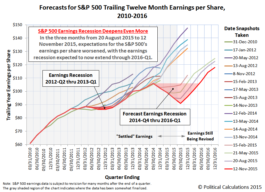
In the chart above, we confirm that the trailing twelve month earnings per share for the S&P 500 throughout 2015 has continued to fall from the levels that Standard and Poor had projected they would be back in August 2015. And for that matter, what they forecast they would be back in May 2015, February 2015 and in November 2014.
The deterioration in the S&P 500's earnings per share has finally drawn the attention of Reuters, which notes that the earnings of U.S. companies in the third quarter, which were just reported, were the first to be outright negative as opposed to being less and less positive.
S&P 500 earnings are on track to close their first reporting season of negative growth since the Great Recession and estimates call for sub-zero growth in the current quarter as well.
The previous recession in the S&P 500's trailing year earnings per share, which ran from 2012-Q2 through 2013-Q1, coincided with economic growth in the U.S. economy stalling out to near-zero levels, a fact that has become more and more apparent with each year's comprehensive revisions to the nation's GDP, where estimates of the real growth rate have been consistently reduced below their originally reported figures.
The current trailing year earnings recession is of a considerably greater magnitude. We would therefore expect to see larger downward revisions in estimated GDP growth for the period from 2014-Q4 through at least 2016-Q1 as the U.S. Bureau of Economic Analysis' annual GDP revisions are released.
Data Source
Silverblatt, Howard. S&P Indices Market Attribute Series. S&P 500 Monthly Performance Data. S&P 500 Earnings and Estimate Report. [Excel Spreadsheet]. Last Updated 12 November 2015. Accessed 13 November 2015.
Labels: earnings, forecasting, recession, SP 500
U.S. markets had already closed on Friday, 13 November 2015 before news of the Islamic terror attacks in Paris, France first crossed the wires, so the first part of our analysis of the U.S. stock market below will consider the state of the market before the targeted massacre of ordinary Parisians.
Here, with the conclusion of 2015-Q4's earnings season, investors had begun to shift their focus to the more distant future of 2016-Q1 in setting stock prices, with the much lower expectations for dividends per share for that quarter pushing driving stock prices lower throughout the week, which is very evident in our updated "accelerations" chart from last week.
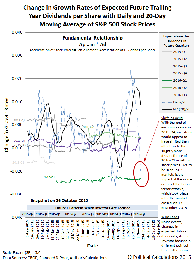
We observe the corresponding change in stock prices occur as the sudden shift from the alternative future defined by the expectations for dividends per share associated with 2015-Q4 to those associated with 2016-Q1. This change was very much a Lévy flight event, which is characteristic of the kind of the seemingly unpredictable quantum random walk that stock prices follow.

We say "seemingly unpredictable" because we managed to correctly describe how stock prices would behave if investors were to shift their forward looking attention to 2016-Q1 back on Monday, 9 November 2015 (emphasis ours).
"Going forward, a shift in the forward-looking focus to 2016-Q2 or 2016-Q3 would tend to put U.S. stock prices on a slightly higher trajectory than the one we've projected for 2015-Q4, but a shift in focus to 2016-Q1 would coincide with a significant decline in stock prices, similar to what we observed in late August 2015."
So clearly we knew far more than at least one hapless Seeking Alpha commenter, who should have taken more care to pay attention to our long history of pulling off seemingly impossible, yet successful predictions before questioning the usefulness of the information we provide in our analyses.
Now, let's turn our attention to the upcoming week, where if Reuters is to be believed, global stock markets are likely to experience a noise event, which might best be described as the situation where stock prices are affected by things other than their primary driver: expectations for changes in the growth rate of future dividends per share.
To that end, we're going to draw on our previous analysis of how the U.S. stock market reacted to Canada's Parliament Hill Islamic terror attack, which occurred while U.S. markets were open.
"We see that it was the reporting of the exchange of gunfire in the Parliament Buildings at 12:10 PM EDT [K] that prompted the reaction in the U.S. stock market, as stock prices began falling as investors immediately adopted a more "safety"-oriented investing strategy - selling off stocks to capture recent gains. From 12:10 PM to the end of trading, the S&P 500 fell from 1946.16 to 1927.11 - a decline of 19.05 points, or just shy of 1% of the S&P 500's index value at the time U.S. investors learned of the seriousness of the event.
"That's far less than the potential +/-3% range of the typical "noise" level that we expect for the daily variation in stock price prices that is built into our forecast model. Which is to say "hardly any impact at all." And because it's just noise, even that will quickly fade. Terrorism is the act of the impotent."
That said, noise events do have the useful property of allowing stock prices to behave more efficiently than they might otherwise, in that they can promote a shift in investor focus from one particular point of time in the future to another more quickly than might otherwise happen, such as when investors progressively "split" their forward looking focus between different points of time in the future as they weight the probability of certain events occurring at each.
To the extent that stock prices might experience more than a 1% change in response to the 13 November 2015 Paris terror attack should then really be taken more an an indication that investors are considering more fundamental factors in their outlook for the future rather than an indication that terrorism itself is weighting their outlook.
Labels: chaos, forecasting, SP 500
We never really understood what the Iraqi who welcomed American troops after Saddam Hussein's Baath party was ousted from power meant when they said they hoped the Americans would bring "Democracy. Whisky. And Sexy!"
Until now, thanks to the Kickstarter-funded introduction of the Norlan Whisky Glass (via Core77), which manages to combine all three!
The Iraqi man was clearly on to something. They simply wanted a good life. It's a simpler shame that the potential to realize it in Iraq lasted less than ten years.
Labels: technology
As promised, today we're doing something more interesting with the Federal Reserve's data for the level of private debt that has accumulated over time in the United States than just calculating its amount, it year over year rate of growth (or velocity) and also the rate of change in its year over year growth rate (or acceleration).
Starting with our results for the acceleration for private debt, we first calculated its trailing twelve month average to smooth out the volatility in our results to better capture its general trends during the period from January 1955 through June 2015.
We next extracted the U.S. Bureau of Economic Analysis' data on the quarterly growth rate of real (inflation-adjusted) Gross Domestic Product (GDP) spanning the same period, using linear interpolation to estimate the real growth rate in the months in between the months ending each calendar quarter, and then calculating the trailing twelve month average of the real GDP growth rate to smooth out the volatility in the results and to better capture the general trends in real GDP growth rates over time.
We then graphed both the acceleration of private debt (dotted blue line) and its trailing twelve month average (solid blue line) in the chart below, in which we've also indicated the periods for when the real growth rate of U.S. GDP was falling (shown as the light red vertical bands). For added measure, we've also indicated the periods in which the National Bureau of Economic Research has determined the U.S. economy was in recession (darker red vertical bands).

What we observe in the chart above is a really remarkable correlation. When the general rate of acceleration of private debt in the U.S. is falling, very much more often than not, such periods either precede or coincide with the periods in which the real rate of growth of the U.S. economy was also falling.
We next calculated some very basic statistics related to that basic correlation. In the 726 months from January 1955 through June 2015, we counted a total of 395 in which the trailing twelve month rate of growth of GDP in the U.S. was falling and a total 366 in which the trailing twelve month average rate of acceleration was falling.
There were 245 months in which both the trailing twelve month averages of both the acceleration of private debt and the growth rate of real GDP in the U.S. were both falling. That works out to be a correlation of nearly 65% for periods in which the trailing twelve month average of private debt acceleration declined, or 62% if we look just at the periods in which the trailing twelve month average of the real GDP growth rate declined.
That works out to be very close to the results that Michael Biggs, Thomas Mayer and Andreas Pick found in their 2010 paper, in which they worked out the correlation between changes in the acceleration of debt and the level of employment in the U.S, which Steve Keen summarized that year (emphasis ours):
They first showed the correlation between what they called “the credit impulse”—the rate of change of the rate of change of debt, divided by GDP—and both GDP and employment (for those who have access to research from Deutsche Securities, they have a simpler explanation of their analysis in Global Macro Issues for December 17 2009: “The myth of the credit-less recovery”).
The chart below shows my confirmation of the relationship with the data on the annual change in unemployment in the USA and the annual rate of acceleration of private debt since 1955. The correlation is –0.67: a staggering correlation of a first and a second order variable over such a period, and across both booms and busts.
We noted above that the change in the rate of acceleration of private debt often either leads or coincides with changes in the real GDP growth rate, which is something that we can directly observe in the acceleration of private debt in the U.S. turning downward before as as the real GDP growth rate in the U.S. falls, and also as it turns upward either before or as the real GDP growth rate in the U.S. rises, which is very clearly evident during the periods in which the U.S. economy was in recession.
It occurred to us that the simple correlation between a declining rate of acceleration for private debt and a falling rate of real GDP growth isn't necessarily capturing the full dynamic between the two. So we went the extra mile and calculated the correlation for when the trailing twelve month average of private debt acceleration was either falling or negative and the periods in which the real growth rate of U.S. GDP was falling.
For the period from January 1955 through June 2015, we found that nearly 88% of periods in which the trailing twelve month average of private debt acceleration declined or was negative occurred when the U.S.' real GDP growth rate was falling, and if we look just at the periods in which the trailing twelve month average of the real GDP growth rate declined, we find that nearly 84% of those periods are ones in which the acceleration of private debt was either falling or negative.
Speaking of which, in looking at the period since June 2013, we see that the acceleration of private debt in the U.S. has been falling and, through June 2015, the most recent month for which we have data, has become negative. We expect that the U.S. Federal Reserve will update its data for the U.S.' private debt through September 2015 sometime in mid-December 2015.
Update 14 December 2015: Added the words "growth rate" in boldface type to the second to last paragraph above for clarification.
References
Political Calculations. The Position, Velocity and Acceleration of Private Debt. [Online Article]. 5 November 2015.
Biggs, Michael and Mayer, Thomas and Pick, Andreas, Credit and Economic Recovery: Demystifying Phoenix Miracles (March 15, 2010). Available at SSRN: http://ssrn.com/abstract=1595980 or http://dx.doi.org/10.2139/ssrn.1595980.
Keen, Steve. Deleveraging, Deceleration and the Double Dip. Steve Keen's Debtwatch. [Online article]. 10 October 2010. Accessed 28 October 2015.
Data Sources
U.S. Federal Reserve. Data Download Program. Z.1 Statistical Release (Total Liabilities for All Sectors, Rest of the World, State and Local Governments Excluding Employee Retirement Funds, Federal Government). 1951Q4 - 2015Q2. [Online Database]. 18 September 2015. Accessed 28 October 2015.
U.S. Bureau of Economic Analysis. National Income and Product Accounts. Table 1.1.1. Percent Change from Preceding Period in Real Gross Domestic Product. 1947Q1 through 2015Q3 (first estimate). [Online Database]. Accessed 28 October 2015.
National Bureau of Economic Research. U.S. Business Cycle Expansions and Contractions. [PDF Document]. Accessed 28 October 2015.
Labels: debt, physics, recession
Welcome to the blogosphere's toolchest! Here, unlike other blogs dedicated to analyzing current events, we create easy-to-use, simple tools to do the math related to them so you can get in on the action too! If you would like to learn more about these tools, or if you would like to contribute ideas to develop for this blog, please e-mail us at:
ironman at politicalcalculations
Thanks in advance!
Closing values for previous trading day.
This site is primarily powered by:
CSS Validation

RSS Site Feed
JavaScript
The tools on this site are built using JavaScript. If you would like to learn more, one of the best free resources on the web is available at W3Schools.com.
Other Cool Resources
Blog Roll


