Via Core77, the Crazy Russian Hacker reveals how to make your Halloween pumpkin carve itself on demand!
If you want to try it out for yourself this weekend, your shopping list is:
- One Pumpkin
- Ziploc Sandwich Bags
- Dry Ice
We presume you have already have access to warm water and an appropriate pumpkin carving tool. And for safe handling of the dry ice, gloves or a towel.
Labels: technology
The United States has a curious relationship with the price of oil and gasoline. For much of the U.S., falling fuel prices represent a positive economic situation, which gives Americans the opportunity to spend their disposable income on things other than fuel, such as dining out, clothes, and cars. And yes, even more fuel (for leisure travel).
These are the kinds of oil price-sensitive industries that can grow and expand when oil prices fall, which because these kinds of businesses are found in every state, means that American consumers benefit in every state from that dynamic.
In some states however, whose economies include significant contributions from oil production, falling oil prices can have a negative consequence as well. As revenues and profits in the oil producing sector of their economies fall, the benefits of falling oil prices for consumers is offset by losses in the productive part of their economies.
That's something that becomes especially clear when we look at statistics like new jobless claims. If we look across the nation, we see that there has been a general trend of improvement in the level of initial unemployment insurance claims filed each week since oil prices began falling from their peaks in early July 2014.

But now, if we focus on the eight states that have significant, but high cost oil production that is really only profitable when oil prices are high, we find that the number of new jobless claims has risen and fallen inversely with the national average price of gasoline.
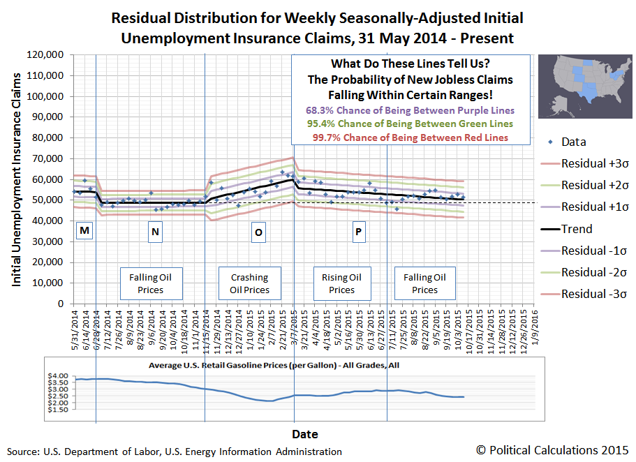
At present, we find that the seasonally-adjusted level of new jobless claims for the states of Colorado, North Dakota, Ohio, Oklahoma, Pennsylvania, Texas, West Virginia and Wyoming is essentially the same as it was before oil prices began falling. In these states, for new jobless claims, the positive economic benefits of falling oil and gasoline prices for consumers has been almost perfectly offset at this point of time by increased new jobless claims taking place in their oil production sectors.
That state of affairs then makes it possible for us to easily estimate just how many oil-related layoffs leading to new jobless claims have been taking place in these states compared to the 42 others. The chart below shows the trend for new jobless claims in all these other states:
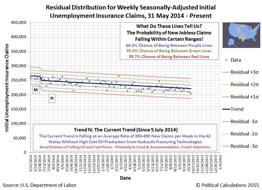
In these 42 states, since 5 July 2014, the number of new jobless claims has been falling at an average rate of 424 claims per week. Meanwhile, as we previously noted, the overall trend in new jobless claims for the 8 high-cost oil-producing states since 5 July 2014 is essentially flat.
If we assume then that the other economic sectors of these eight states would be seeing the same benefits from falling oil and gasoline prices that are being realized in the other 42 states, we would therefore estimate that these states have lost, on average, about 424 jobs per week in each week since 5 July 2014, where the people laid off subsequently acted to apply for unemployment benefits.
That number could be a lot higher, but isn't, because there are other industries in these states that are still hiring, which pay better wages than the alternative of unemployment benefits.
Still, over the 67 weeks since oil prices began falling after 5 July 2014, that 424 per week figure would represent a total of 28,408 Americans who couldn't find a better paying alternative for unemployment benefits in these states.
Labels: jobs
Earlier this year, we broke the news that the Apollo Education Group (NASDAQ: APOL), the parent company of the University of Phoenix, had suffered a major setback with respect to its strategic plan to become a major provider of educational software. Three months later, we recognized that setback would lead to the likely sale of the company's Carnegie Learning division, whose math curricula-oriented products had become "damaged goods" in the eyes of the Apollo Education Group's leadership.
Last week, in the Apollo Education Group's fourth quarter earnings conference call, the company's interim Chief Financial Officer Joseph D'Amico confirmed that the company would be seeking to unload its damaged goods, almost immediately after being introduced by CEO Greg Cappelli (emphasis ours):
Thank you, Greg, and good morning, everyone. To recap our consolidated results, revenue in the fourth quarter decreased 14% year-over-year to $600 million. Net revenue for fiscal year 2015 was $2.57 billion, down from $3 billion in fiscal 2014.
Note that 2015 and prior years reflect Carnegie Learning as a discontinued operation as we are actively marketing it and expect it will be sold during fiscal 2016. Carnegie Learning represented approximately $25 million in net revenue for 2015 and is excluded from the net revenue amounts reported. Included in Carnegie – including Carnegie Learning revenue, we were slightly below the bottom end of our revenue outlook of $2.6 billion.
Our operating loss for the fourth quarter was $5 million. But excluding special items, operating income was a positive $26 million. Net loss from continuing operations attributable to Apollo in the fourth quarter was $10 million, or $0.09 per share. But, again, excluding special items, income from continuing operations was $19 million or $0.17 per share.
Operating income for fiscal 2015 was $115 million, and excluding special items was $203 million. And if you include the Carnegie loss of $8 million, we were within our outlook of $190 million to $200 million. Income from continuing operations for the full year was $53 million or $0.49 per share, and excluding special items was $120.5 million.

The Apollo Education Group had originally purchased Carnegie Learning for $75 million in August 2011. The Apollo Education Group's 10-K statement filed with the SEC indicates that for the company's financial year ending on 31 August 2015, Carnegie Learning has total assets of $40.9 million, which is down by $30.3 million, or 42.5%, from a figure of $71.2 million a year earlier.
At the same time, Carnegie Learning's net revenue has fallen from $67.5 million in 2013, to $50.2 million in 2014, then down to $25.1 million in 2015.
Any potential buyer for Carnegie Learning can expect that the University of Phoenix will not be a customer for the division's products. The Apollo Group recorded a $13 million write off for "certain Carnegie Learning technology intangibles that were no longer being used. The associated technology had been incorporated into University of Phoenix’s academic platform and as a result of the University ceasing use of the technology, no future cash flows associated with the technology were expected over its remaining useful life."
That's a major vote of no confidence in Carnegie Learning's products. Espeically from an education instution that has so thoroughly degraded its academic standards for evaluating student performance in math so much, especially as compared to other institutions.
From a business perspective, the failure of Carnegie Learning's math curricula products at the University of Phoenix would suggest that if a sale is made, it will be at an extreme discount with respect to the $75 million price that the Apollo Education Group paid in acquiring the operation.
We suspect however that the more likely disposition for Carnegie Learning will be for its remaining assets to be unloaded to multiple buyers as part of the division's outright liquidation, as they will prove to be worth more than its future prospects as an ongoing business.
Previously on Political Calculations
Labels: bankruptcy, business, education
Today, we're going to tell a big story with just two charts. Here's the first, which updates the chart we last featured on 15 October 2015.

In case you are wondering what we mean by "QE Promise" in the chart above, we're hearing that the European Central Bank is looking to extend its current Quantitative Easing program, where it is currently buying 60 billion Euros worth of bonds each month, by another six months. Oh, and is also considering expanding it by another 10-20 billion Euros per month.
But that's not the big question that needs to be answered, because in our second chart, in which we get under the hood of the S&P 500 with some old school analysis, spanning 2015 to date, we show why what we showed in the first chart is such a concern....

Here's the problem. The ECB launched their current 60 billion Euro per month QE program back in March 2015, having virtually no effect on U.S. stock prices, which behaved exactly as our theory says they should, with the change in the rate of growth (acceleration) of stock prices being directly proportionate to the change in the rate of growth (acceleration) of expected future trailing year dividends per share at the point of time in the future where investors have focused their forward-looking attention.
But now, in the days since the market reacted to the ECB's announcement that it is considering extending and potentially expanding its QE program, U.S. stock prices have risen well above the levels we would expect to see them at if they were purely being driven by the market's underlying fundamentals.
That suggests that speculation, more than any other factor, is what has driven stock prices to their currently elevated levels, where investors in the U.S. market are betting in favor of one or more of the following possibilities:
- The amount of dividends per share that the market will pay in the future will be much higher than currently expected levels, for which we have data looking forward through 2016-Q3 that says that we should only look for single digit growth, at best.
- The U.S. Federal Reserve will not only not hike short term interest rates, it will add Oprah Winfrey to its board, who is going to launch her own new round of quantitative easing, and it will be glorious ("And you get a billion, and you get a billion, and you get a billion!...").
- The multiplier in the fundamental relationship between stock prices and their underlying dividends per share, instead of being nearly constant as it has been over the past several years, has suddenly, unexpectedly and inexplicably changed, from +5 to something on the order of -50.
In short, we think it's a noise event. The good news it that is would appear to be one that is actually providing a positive benefit in that it has shifted the likely future trajectory of stock prices to be higher than what we were projecting a month ago.
The bad news is that it's a noise event. All noise events end - it's only ever a question of when.
So far in this fourth quarter of 2015, the pace of dividend cuts being announced by U.S. firms is consistent would appear to be consistent with what we observed in the first and third quarters of 2015. Which unfortunately is to say that the recessionary conditions in the U.S. economy that have been contributing to reduced economic growth throughout the year to date are persisting.
Our chart showing the cumulative number of announced dividend cuts by U.S. firms by day of quarter confirms that through the first 23 days of 2015-Q4, the private sector of the U.S. economy would not appear to be behaving any different than it did in 2015-Q1 or 2015-Q3.

It is however performing better than 2015-Q2 through the same point of time in that quarter, which was initially drug down by the adverse conditions that were recorded in 2015-Q1 before it registered improvement.
Looking at the sampling of firms that we are able to obtain from our two real time reporting data sources, we once again are seeing the pattern where the most distress being felt in the U.S. economy is being felt in the oil, mining and finance industries, which have all been affected by the changes in the price of crude oil that have been taking place.
Here, after crude oil prices began falling near the beginning of 2014-Q3 when Saudi Arabia initiated a price war in an attempt to derail both the Saudi's geopolitical competition and U.S. shale oil producers, the pace of dividend cuts in the U.S. has largely followed the trajectory of crude oil prices - rising when prices have fallen and falling whenever prices have rebounded. Through 23 October 2015, those prices have once again resumed falling.
For the U.S. economy, the negative impact upon the U.S. oil industry has largely been concentrated within eight states, whose economies all feature significant oil production from high cost extraction operations, which low oil prices make less economically feasible. We'll take a closer look at the developing recessionary conditions within those states in an upcoming post.
For the U.S. economy as a whole however, those conditions are consistent with our definition of a microrecession, where negative economic forces are too limited in either scale, scope or severity to qualify as a full recession as might be officially determined by the National Bureau of Economic Research.
Data Sources
Seeking Alpha Market Currents. Filtered for Dividends. [Online Database]. Accessed 24 October 2015.
Wall Street Journal. Dividend Declarations. [Online Database]. Accessed 24 October 2015.
In 2009, the University of Phoenix degraded its academic standards for assessing student performance in its math classes. The University of Phoenix achieved this result by recommending to its instructors that they decrease the emphasis that they had previously mandated for students to demonstrate their proficiency in solving assigned problems in favor of increasing the weighting of the subjective evaluation of student participation in class discussions in determining student grades.
Our chart below, which we based on information contained within different versions of the course syllabus for a University of Phoenix Algebra class that captured these changes, graphically reveals how those changes would effectively inflate student grades.
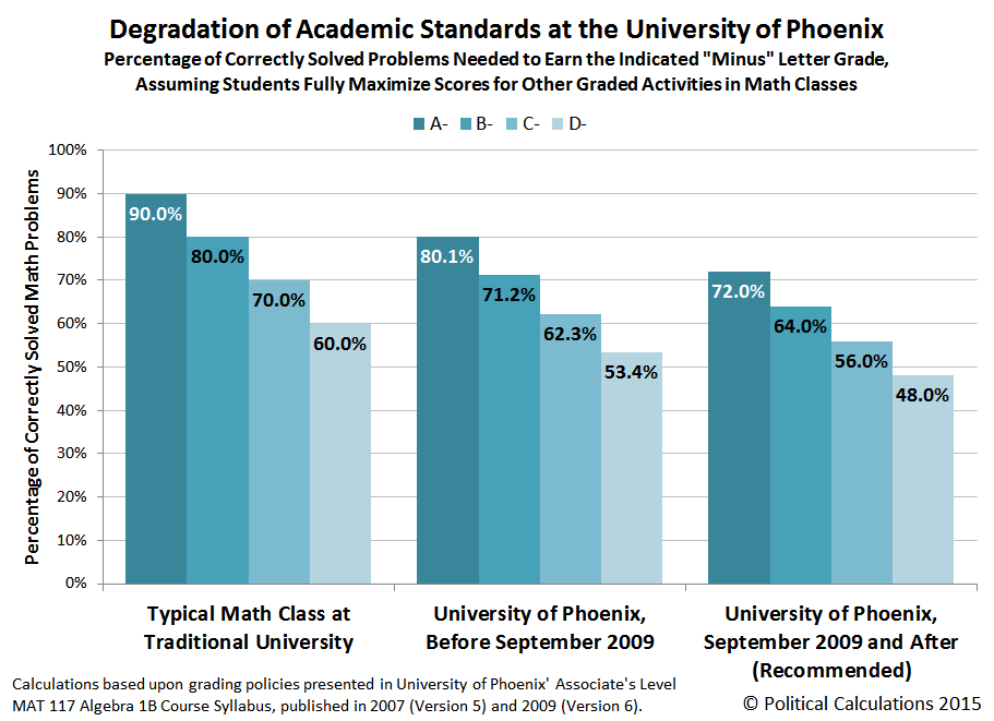
We wondered to what extent similar practices that would result in grade inflation in math classes might have been implemented at other accredited colleges and universities. In the table below, we've presented the relative weighting that subjective, non-math related criteria has upon determining the grade that a student might earn at the indicated institution, based on the course syllabii they have published for their own math classes, which we've linked in the table. We then ranked them in order from best to worst....
| Grade Inflation in College Algebra, Ranked from Best to Worst at Selected Colleges and Universities Relative Weighting of Criteria Other Than Demonstrated Proficiency in Correctly Solving Assigned Problems for Determining Course Grade | ||||
|---|---|---|---|---|
| College or University (Click link for syllabus) | Discussion & Participation, or Attendance [Non-math] | Homework Assignments [Math] | Quizzes & Tests [Math] | Final Exam [Math] |
| University of Houston | 0% | 10% | 75% | 15% |
| Odessa College | 0% | 20% | 50% | 30% |
| Indiana State University | 0% | 25% | 45% | 30% |
| Penn State University | 0% | 15% | 55% | 30% |
| University of Massachusetts | 0% | 70% | 0% | 30% |
| DeVry University | 5% | 15% | 40% | 40% |
| Louisiana State University | 5% | 15% | 55% | 25% |
| Florida Atlantic University | 10% | 10% | 60% | 20% |
| University of Phoenix (Before September 2009) | 12% | 40% | 24% | 24% |
| University of Phoenix (September 2009 to Present) | 22% | 30% | 24% | 24% |
Some interesting takeaways from what we found in our analysis:
- We had expected that for-profit universities like the University of Phoenix would occupy the bottom of the list. Instead, we were surprised to find that the other for-profit institution for which we obtained a math course syllabus, DeVry University, would actually rank near the top, if not at the very top. The surprising reason for that outcome? Even though 5% of a DeVry's student's grade is based on the non-math related criteria of attendance, the for-profit university requires that students demonstrate that they are proficient enough to earn 80% of the points possible in their math classes before being allowed to progress to more advanced classes. For all the universities listed, that is by far the most demanding requirement that a student must satisfy to obtain a passing grade.
- At least one public, state-funded university, Florida Atlantic University, has academic standards similar to what the University of Phoenix had before September 2009.
- Louisiana State University, has a course syllabus that clearly reveals the very low standard needed to earn points attending class....
You will receive a participation grade for each class meeting. You must attend for 50 minutes, take notes, pay attention, and stay awake to earn a grade of 100%. If you fail to meet this requirement throughout the 50-minute class meeting, you will receive a grade of 0% for that class meeting.
And even with that competing standard for low academic performance, when it comes to math, the post-2009 Univerity of Phoenix is still at the bottom of the academic barrel by a pretty wide margin.
Labels: education, math, quality
In our previous installment, we made the following claim:
On average, the amount by which the typical American's health insurance premiums went up in 2014 over the previous year was $639, with the largest percentage increases being paid by the households led by the youngest Americans - the ones who could afford it the least.
We were wrong. After we dug deeper into the demographics of age and income, we found that the youngest Americans are only the second-most harmed group that has been negatively impacted by the implementation of President Obama's Affordable Care Act. In reality, the Americans most materially harmed by Obamacare are the oldest.
Our table below works through the math that backs up that finding. If you're accessing this article through a site that republishes our RSS news feed, but which doesn't maintain our CSS formatting, you may want to click through to our site to view the table in the format in which we published it):
| 2014 Health Insurance Expenditures and Total Money Income by Age Group | ||||||
|---|---|---|---|---|---|---|
| Age Group | Average Health Insurance Expenditure in 2014 | Average Health Insurance Expenditure in 2013 | Year Over Year Increase in Expenditure for Health Insurance | Year Over Year Percentage Increase in Expenditure for Health Insurance | Average Total Money Income in 2014 | Increase in Health Insurance Expenditure as Percentage of Average Total Money Income |
| Age 24 and Under | $766 | $526 | $240 | 45.6% | $15,734 | 1.53% |
| Age 25-34 | $1,910 | $1,334 | $576 | 43.2% | $39,532 | 1.46% |
| Age 35-44 | $2,683 | $1,944 | $739 | 38.0% | $52,967 | 1.40% |
| Age 45-54 | $2,936 | $2,242 | $694 | 31.0% | $55,692 | 1.25% |
| Age 55-64 | $3,218 | $2,537 | $681 | 26.8% | $50,066 | 1.36% |
| Age 65-74 | $3,985 | $3,409 | $576 | 16.9% | $40,675 | 1.42% |
| Age 75 and Over | $3,906 | $3,265 | $641 | 19.6% | $29,726 | 2.16% |
| All Ages (Average) | $2,868 | $2,229 | $639 | 28.7% | $42,789 | 1.49% |
Americans Age 75 and older were most negatively affected by the implementation of the Affordable Care Act in 2014, as the increase in their average annual expenditures for health insurance increased by an amount equal to 2.16% of their average annual total money income.
And so we find that Americans Age 75 and older, a demographic group that predominantly consists of elderly widows whose primary source of income is provided by Social Security's survivor's insurance benefits, are the Americans most harmed by the increases in health insurance costs driven by the implementation of Obamacare.
Image Credit: Theodora.
Data Sources
U.S. Bureau of Labor Statistics. Consumer Expenditure Survey. Multiyear Tables. [PDF Documents: 2013-2014]. Reference URL: http://www.bls.gov/cex/csxmulti.htm. Accessed 18 October 2015.
U.S. Census Bureau. Current Population Survey. Annual Social and Economic (ASEC) Supplement. Table PINC-01. Selected Characteristics of People 15 Years and Over, by Total Money Income in 2014, Work Experience in 2014, Race, Hispanic Origin, and Sex. [Excel Spreadsheet]. 16 September 2015. Accessed 16 September 2015.
Labels: demographics, health, insurance, whoops
The promise that Barack Obama for implementing his vision of health care reform in the United States was very appealing:
"I will sign a universal health care bill into law by the end of my first term as president that will cover every American and cut the cost of a typical family's premium by up to $2,500 a year."
It was so appealing, that he kept repeating it, over and over again, to anybody who would listen.
President Obama signed his vision of a universal health care bill into law on 23 March 2010. It went into effect in 2014. Our chart below shows the amount that all American families paid in health insurance premiums on average in each year from 2004 through 2014, with respect to the reference age of the family member who responded to the U.S. Census Bureau and U.S. Bureau of Labor Statistics' annual Consumer Expenditure Survey for each of those years.

On average, the amount by which the typical American's health insurance premiums went up in 2014 over the previous year was $639, with the largest percentage increases being paid by the households led by the youngest Americans - the ones who could afford it the least.
Data Sources
U.S. Bureau of Labor Statistics. Consumer Expenditure Survey. Multiyear Tables. [PDF Documents: 2000-2005, 2006-2012, 2013-2014]. Reference URL: http://www.bls.gov/cex/csxmulti.htm. Accessed 18 October 2015.Labels: data visualization, demographics, health, health care, insurance, politics
Previously, in visualizing the data for how Americans have spent their money in each year since 1984, we noted that spending for health care, or really, health insurance and other medical expenses, saw a significant uptick in 2014, thanks to the Affordable Care Act, whose government-run health care "marketplaces" went into effect that year.
We thought we'd take a closer look at that remarkable increase today. First, let's directly compare the trends for the average amount of money that Americans spent on health care and on entertainment-related expenses in each year from 1984 through 2014.
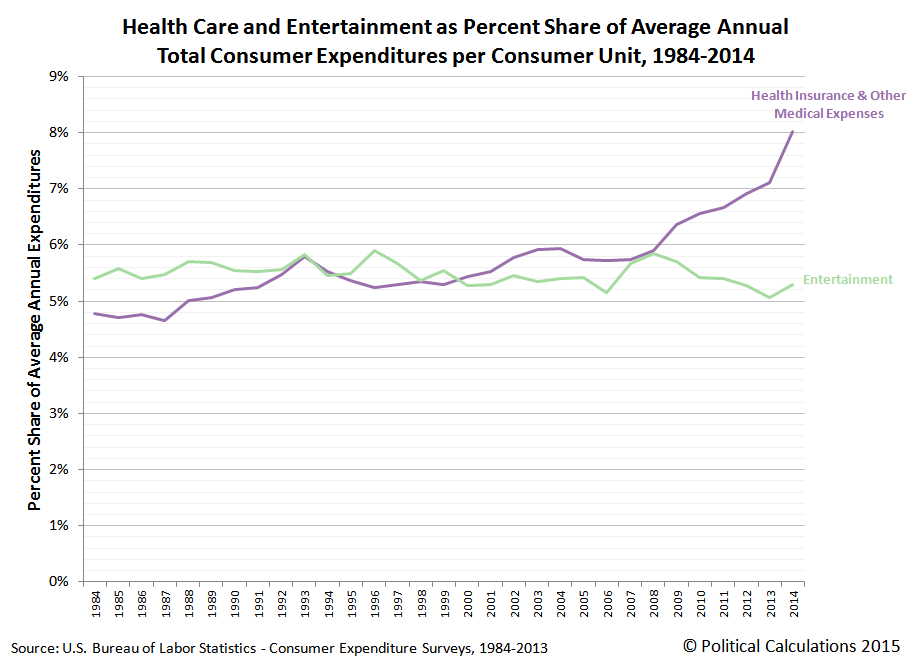
The reason we're comparing these two expenditure categories is because in the years from 1984 through 2008, health care and entertainment represented approximately equal shares of the average annual total expenditures of American households, as both follow roughly the same general trajectory.
But after 2008, things begin to change, which we see when we break down the major categories of health care and entertainment into their subcategories. The chart below shows the dollar value change in each of the subcategories that make up these major expenditure categories with respect to the base year of 2008.

What we first find is that the amount of spending for each subcategory of the health care and entertainment expenditure categories holds fairly steady through 2010, where all the dollar amount spent each year are within $200 of their 2008 level.
What we next observe is that after 2010, the amount of money that Americans spend on the health insurance subcategory of health care expenditures begins to grow exponentially, where all the other kinds of spending, including for actual medical care, medical equipment, and medicine, not to mention all the various entertainment-related spending subcategories, are otherwise little changed - all are within $200 of their 2008 levels.
But American households through 2014 are spending over $1,200 more on health insurance than they were before 2008, as its cost curve has been bent upward.
The reason why is not difficult to determine. The passage of the Affordable Care Act, which is perhaps more popularly better known as "Obamacare", mandated that all Americans either buy costly health insurance or else pay higher income taxes, for which the latter option for most Americans, would represent a more affordable option.
But for those Americans who chose to buy health insurance after it was mandated, who are spending $1,215 more on average in health insurance in 2014 than they were in 2008, we get a sense of just how much more costly that option is.
And when you consider that the average total expenditures of American households in 2014 is $53,495, which is $3,009 higher than it was in the recession year of 2008, we find that the federal government mandated increase in personal health insurance spending accounts has claimed over 40% of the gain in spending money that Americans have otherwise realized as the U.S. economy has slowly recovered.
Which is to say that thanks to Obamacare, through 2014, average Americans are only benefitting from 60% of whatever economic recovery has occurred. The rest of the benefit has gone to the Obama administration's crony coalition of health care firms who were the primary beneficiaries of the Affordable Care Act.
If you don't believe us, just ask their investors, who wouldn't have done anywhere near as well if Americans had not been required by law to buy health insurance instead of whatever else they might otherwise have chosen to buy.
Data Sources
U.S. Bureau of Labor Statistics. Consumer Expenditure Survey. Multiyear Tables. [PDF Documents: 1984-1991, 1992-1999, 2000-2005, 2006-2012, 2013-2014]. Reference URL: http://www.bls.gov/cex/csxmulti.htm. Accessed 18 October 2015.Labels: data visualization, health care, insurance
The Consumer Expenditure Survey for 2014 was released last month, which means that it's time to update our charts showing how much money Americans spend and on what!
Our first chart shows the average annual expenditures for all major expense categories for data collected by the U.S. Census Bureau and reported by the U.S. Bureau of Labor Statistics from 1984 through 2014 per "consumer unit" - the affectionate term that the data jocks at the U.S. Census and BLS use to describe the targets of their statistical data samples, which roughly corresponds to households:

In the table above, we're renamed the general "Health Care" expense category to instead be "Health Insurance & Other Medical Expenses" since that description more accurately captures where American consumer health care expenditures really go. Our next chart shows the percentage share of each of the major expenditure categores for each year from 1984 through 2014:
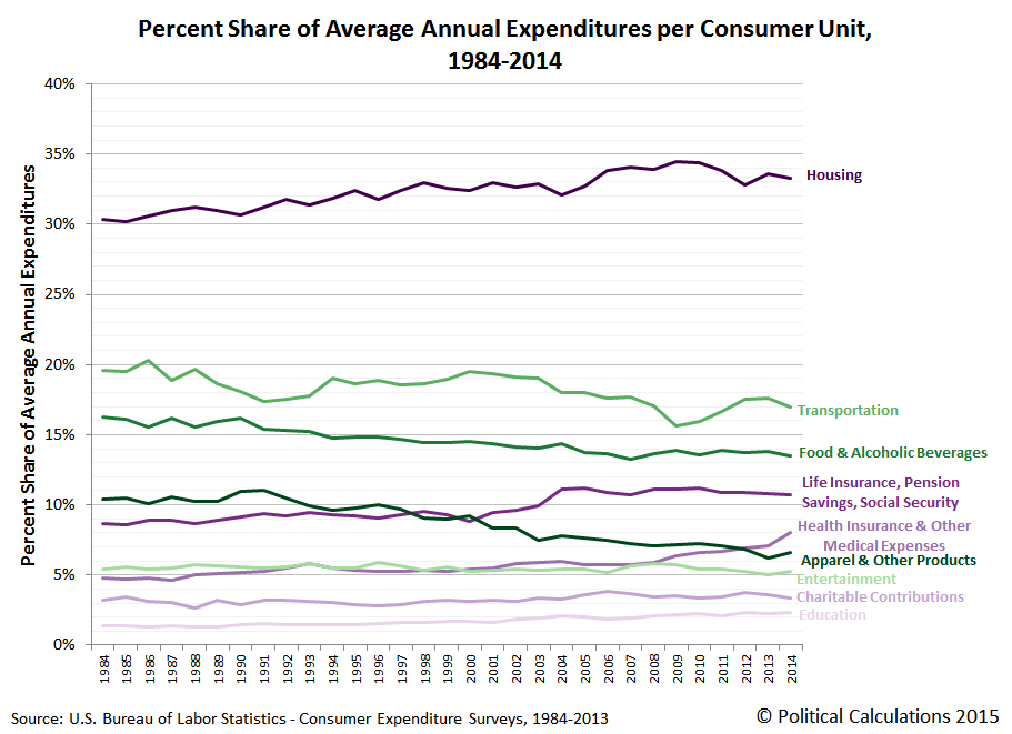
Perhaps the most remarkable observation here is the sharp increase in the share of average annual consumer spending that is now being taken up the "Health Insurance & Other Medical Expenses" category in 2014, the first full year of operation for the Patient Protection and Affordable Care Act's health insurance government-operated"marketplaces", in which Americans were mandated to either acquire costly and bloated health insurance coverage or else pay the more affordable option of higher income taxes.
Our final chart shows how these percentage shares stack up with respect to the total average annual expenditures of American consumers from 1984 through 2014, which gives a sense of the overall trends of where Americans have spent their consumer dollars over time.

We'll be exploring the rather dramatic upward bend in the average cost of health care driven by the implementation of the Affordable Care Act in upcoming posts.
Data Sources
U.S. Bureau of Labor Statistics. Consumer Expenditure Survey. Multiyear Tables. [PDF Documents: 1984-1991, 1992-1999, 2000-2005, 2006-2012, 2013-2014]. Reference URL: http://www.bls.gov/cex/csxmulti.htm. Accessed 18 October 2015.Labels: data visualization, demographics
The gift wrappers in Japan's department stores have gift wrapping down to a science. So much so that not only can they wrap a gift like the one shown in the video below in less than 20 seconds, they can get away with using only one strip of tape to hold it all together.
Fortunately, the wrapper in the video below is moving at a slow enough speed so that ordinary humans can follow each stage of the wrapping process.
Speed will come with lots and lots of practice. Hope this helps streamline your holiday gift-giving plans this year!
HT: Core77.
Labels: none really
We don't comment on the analysis posted at ZeroHedge very often, as many of the contributions to the site have a very high noise to signal ratio, but we have to tip our hats to the Tyler Durdens because they've helped answer a question we've had about the internal market mechanics that are needed to drive a Lévy Flight Rally.
A Lévy flight is perhaps best described as a random walk where the otherwise random path an object takes as it moves is periodically punctuated by sudden, large movements. That's very different from a typical random walk, also called Brownian Motion, where the variation in the magnitude of movements might be described by a normal distribution.
Going by that frame of reference, the large movements of a Lévy flight would therefore be highly unlikely, and therefore, unpredictable. Or as a mathematician might describe the bell curve associated with the distribution of a Lévy flight, they have much fatter tails than do typical normal distributions.
But then, the stock market is well known for its sheer number of improbably fat-tailed events. A good example is the recent rally that took place between 29 September 2015 and 5 October 2015. Here, we had observed in our model of how stock prices work as the transition from investors being focused on 2016-Q1 to instead be focused on 2016-Q2 (or Q3).

We could easily understand how stock prices could crash in a Lévy Flight event, as might happen when investors suddenly shift their focus from a future quarter with more positive prospects for their investments to a different future quarter with more negative prospects. All that takes is an increased demand to sell in a market environment with reluctant buyers considering a negative sentiments for the future prospects of their newly acquired holdings. But why would that sentiment suddenly reverse to power stock prices up at a much faster pace than markets rise during boom times? Especially in the absence of positive news for the market.
And that's where ZeroHedge's analysis by actual market traders becomes invaluable. They dug into the "savage reversal" and found a rather amazing amount of short covering, where investors who had speculated too far to the negative side of the market during the Lévy Flight crash that preceded the rally were force to cover their short investments by buying up shares - especially of the stocks they were most seeking to sell short.
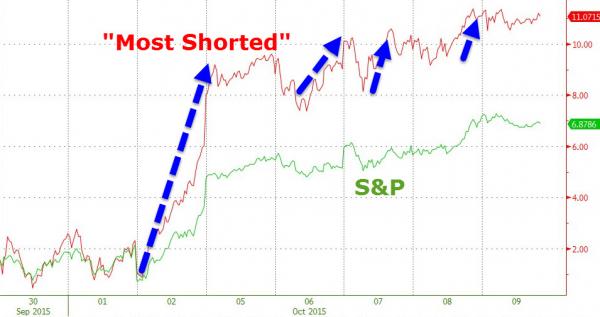
We see then that a very large short squeeze played a very large role in driving stock prices back up so quickly. Better still, in the days following the rally, the Tyler Durdens also documented which stocks were the most "hated", as measured by the percentage of their floating shares being shorted, going into the rally.
And though our model of how stock prices work allows us to determine in advance where stock prices will go during a Lévy flight crash or rally, we're still learning what it takes for stock prices to actually make those quantum shifts during such "fat-tailed" events.
Welcome back to the cutting edge!
One final note - in our chart showing the alternative future trajectories of stock prices above, since our model incorporates historic stock prices, its projections of future stock prices can be affected by the volatility associated with them, which we refer to as the echo effect. To account for that factor in upcoming days, we've simply drawn a straight line (the purple shaded region) across the period where we observe that our model's projections are most affected by larger than typical volatility in those historic stock prices.
Since April 2015, while the estimated trailing year average median household income of Americans has increased by roughly $500, the median sale prices of new homes in the United States has essentially moved sideways - holding level at a trailing year average of roughly $290,000.
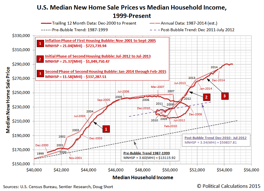
While that combination indicates that new homes are becoming relatively more affordable for the typical American household, we can't also help but notice how similar the current trend is to the nine month-long period from July 2006 through March 2007, which saw the final topping of the first U.S. housing bubble before it fully entered into its deflation phase.
Unlike that period however, the number of sales of new homes in the U.S. is currently rising - not falling. The chart below shows our calculation of the effective market capitalization of the total U.S. new home market, as adjusted for inflation to be in terms of constant August 2015 U.S. dollars.
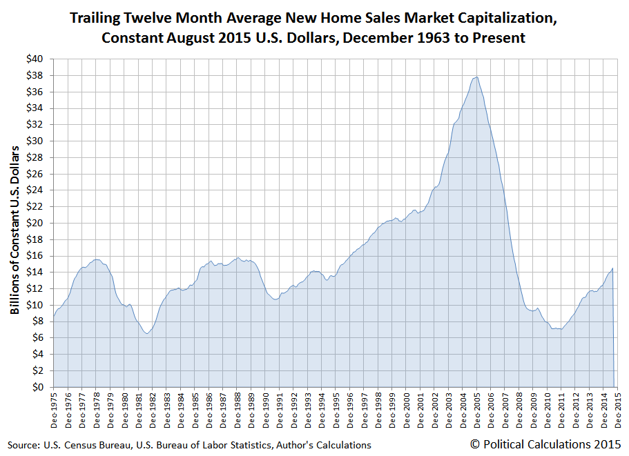
So from that perspective, it's completely different! And considering how elevated median new home sale prices are with respect to the long term relationship between median household income, that those prices are moving sideways actually represents a positive development for the very slowly recovering U.S. real estate market.
Labels: real estate
We're seeing more signs of a reversal in China's recent economic fortunes. First, taking advantage of what may be the most unique alternative economic indicator we've developed to date, we observe that the trailing twelve month average of the year-over-year change in Earth's atmospheric carbon dioxide levels have rebounded off their June 2015 trough.
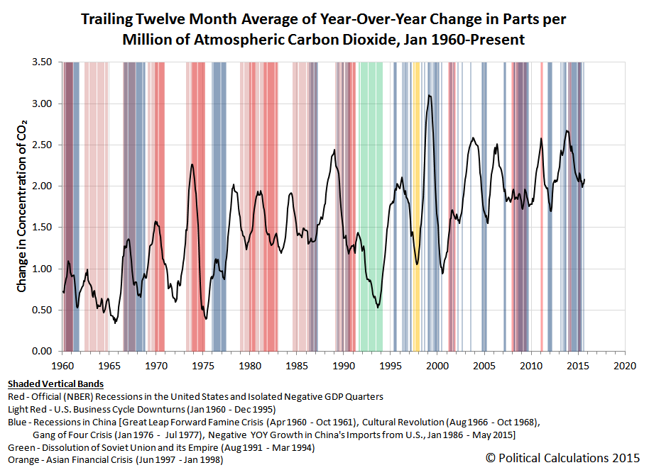
That change is significant because the nation of China is, by a considerable margin, the world largest producer of atmospheric carbon dioxide. The recent cyclical decline in the rate at which global CO2 levels are increasing had coincided with a change in the communist nation's economic strategy, where the nation's leaders had sought to put the nation onto a much slower growth trajectory.
China's leaders were too successful however, as the nation's economic growth stalled out far more rapidly than they had desired, prompting them to initiate new stimulus efforts in an attempt to reignite growth during the second quarter of 2015.
The global CO2 data suggests that those efforts to stimulate the Chinese economy have had some positive effect, as its economy is burning more fuel - an indication of increased activity. [We suppose that some might claim the increase might be purely due to recent explosions and other incidents that have taken place in China recently, however the increase in atmospheric CO2 levels precedes those events, indicating that other factors are responsible for the reversal in direction.]
Meanwhile, our alternative economic indicator of the exchange rate-adjusted, year-over-year growth rate of the value of goods and services traded between the U.S. and China also suggests that China's economy has rebounded off the lows that were recorded in the first quarter of 2015.

Here we observe that China's exports to the U.S. surged in August 2015, while at the same time, the year-over-year growth rate of China's imports from the U.S. was elevated above its 2015-Q1 lows, which suggests an improving economic situation in China.
The August 2015 data is the first following China's surprise devaluation of its currency on 11 August 2015. Given its timing, the data for August is affected by the change, but the goods and services recorded during the month would already have been in transit between the two nations.
What that means is that while our calculation of the exchange rate adjusted year over year growth rates for August would have been affected, the volume of goods and services would really not have been much impacted. Consequently, the impact of China's currency devaluation won't be fully realized in the U.S. Census Bureau's trade data until the upcoming reports for September and October 2015.
Perhaps the more interesting thing however is that the apparent improvement in the trade numbers between the U.S. and China rather directly contradict the numbers that would have to exist between China and all other nations, if the direction indicated by the official trade data that China has reported for September 2015 is any indication. One possible interpretation of that outcome is that China is loading up on U.S. agricultural products, but is otherwise forgoing importing resources from other nations.
By no means is China's economy out of the woods as yet.
Data Sources
Board of Governors of the Federal Reserve System. China / U.S. Foreign Exchange Rate. G.5 Foreign Exchange Rates. Accessed 9 September 2015.
U.S. Census Bureau. Trade in Goods with China. Accessed 9 September 2015.
National Oceanographic and Atmospheric Administration. Earth System Research Laboratory. Mauna Loa Observatory CO2 Data. [File Transfer Protocol Text File]. Accessed 8 September 2015.
Labels: trade
According the S&P's Monthly Dividend Report (Excel spreadsheet), the U.S. economy is once again experiencing contractionary economic forces.

At 43, September 2015's total reported by Standard and Poor is over double what was recorded by our two primary sources for real time dividend cut announcements, Seeking Alpha's Market Currents (filtered for dividends) and the WSJ's Dividend Declarations, which we use to generate our near-real time cumulative dividend cuts by day of quarter chart, which confirms that the U.S. economy took a turn for the worse in September 2015, but for the third quarter of 2015 overall, only indicates that the U.S. economy experienced recessionary, rather than contractionary, conditions.

Although our near real time sources for announced dividend cuts would appear to have missed half of the firms cutting dividends in September 2015, it does provide a large enough sample to give an indication of the kinds of firms that came under the most distress during September.
- Oil industry-related firms
- Interest rate sensitive firms (such as mortgage REITs)
- Education industry-related firms
The first two stock market sectors are pretty self-explanatory. First, with oil prices falling significantly during the quarter, a number of U.S. oil producers are seeing declining revenues, which are negatively impacting their bottom lines.
Second, interest rate sensitive firms had come under similar negative pressure in the first two and half months of 2015-Q3, as investors expected that the U.S. Federal Reserve would make good on their threat to finally begin increasing short term interest rates in the U.S., which had the effect of contributing to modestly boost longer term interest rates over much of the quarter. Although that boost ended when the Fed failed to follow though on the expectations it had set after its September 2015 meeting, the increase that did occur was enough to cut into the profit margins of a number of REITs, who were compelled to reduce cash dividend payments to their owners.
What's new however is the appearance of education-industry related firms among those announcing dividend cuts. While there was only one such firm that took that action, Universal Technical Institute (NYSE: UTI), which slashed its dividend by 80% from $0.10 per share to $0.02 per share, the cut comes as the entire education industry sector is coming under increased strain.
Speaking of which, since we've been following the story of the academic and financial degradation in the business situation of the Apollo Education Group (NASDAQ: APOL), we would be remiss if we didn't note two very recent developments.
First, on 3 October 2015, reports came out that indicated that enrollment in the Apollo Group's University of Phoenix division is now projected to continue falling for another year, to where it will fall some 70% below its 2010 peak of 476,500. That would put its enrollment at the end of its 2016 fiscal year at roughly 142,500, below the 150,000 level that CEO Greg Cappelli indicated that he expected it would bottom nearly three months earlier.
Second, on 9 October 2015, the U.S. Department of Defense barred the University of Phoenix from recruiting students at U.S. military installations in response to the company's unauthorized recruitment practices. Recruiting military service members had become a priority for the University of Phoenix and also a significant source of revenue for the Apollo Education Group as the University of Phoenix' overall enrollment has fallen.
It will be interesting to see to what extent other firms in the education sector of the U.S. economy will come under similar levels of distress as the U.S. higher education bubble continues to burst.
Data Sources
Silverblatt, Howard. Standard and Poor's Monthly Dividend Action Report. [Excel Spreadsheet]. Accessed 11 October 2015.
Seeking Alpha Market Currents. Filtered for Dividends. [Online Database]. Accessed 11 October 2015.
Wall Street Journal. Dividend Declarations. [Online Database]. Accessed 11 October 2015.
People have had a very hard time waking up in the morning for a very long time, which is why alarm clocks were among the first devices ever invented. In fact, there's a pretty good argument to be made that one of the first alarm clocks ever was invented by the Greek philosopher Plato, who rigged up the most advanced, non-sun-based time keeping device of the ancient world, the water clock, with a whistle that would awaken a sleeper after a set period of time, even in darkness.
But soon after that innovation, and for centuries afterward, really sound sleepers developed a natural resistance to the sound of their alarm clocks going off: they grew used to the sound of the alarm, and instead of being alarmed into wakefulness, they continued their slumber.
And that's the problem that U.S. Patent Number 256,265, issued on 11 April 1882, was devised to solve! Invented by Samuel S. Applegate of Camden, New Jersey, the "Device for Waking Persons from Sleep" forever solved the problem of people sleeping in for too long by rigging a frame containing a number of weighted objects above a sleeper, which would be triggered to drop on their head when their alarm clock went off.
Really! Here are the illustrations from the patent that show Applegate's Alarm Clock of Damocles:

And here is the description of the invention from the patent, in the inventor's own words (emphasis ours):
The object of my invention is to construct a simple and effective device for waking persons from sleep at any time which may have previously been determined upon, the device being also adapted for use in connection with an electric or other burglar-alarm apparatus, in place of the usual gong-alarms....
Ordinary bell or rattle alarms are not at all times effective for their intended purpose, as a person in time becomes so accustomed to the noise that sleep is not disturbed when the alarm is sounded.
The main aim of my invention is to provide a device which will not be liable to this objection.
In carrying out my invention I suspend a light frame in such a position that it will hang directly over the head of the sleeper, the suspending-cord being combined with automatic releasing devices, whereby the frame is at the proper time permitted to fall into the sleeper's face.
In the drawings, A represents the frame, which consists of a central bar, a, having on each side a number of projecting arms, b, the whole being made as light as is consistent with proper strenth. From each of the arms b hand a number of cords, d, and to the lower end of each of these cords is secured a small block, e, of light wood, preferably cork. These cork blocks, however, are not essential, as tassels, or balls of zephyr may be attached to the cords, or the latter alone may be used, or a rectangular frame having having a network of cords may take the place of the frame wiht its pendent cords, the only necessity to be observed in constructing the frame being that when it falls it will strike a light blow, sufficient to awaken the sleeper, but not heavy enough to cause pain....
I prefer to limit the extent of fall of the frame A so that the bars a and b of the same will not come into contact with the sleeper's face....
We're sure that heavy sleepers everywhere thank goodness for Applegate's preferences. On the other hand though, how heavy of a sleep can one have when the objects that will drop hard enough to wake them up, even without pain, are visibly suspended above their faces?
Other Stuff We Can't Believe Really Exists
- Inventions in Everything: The Alarm Clock of Damocles
- Inventions in Everything: The Toilet Snorkel
- Inventions in Everything: Antiterrorism Barriers
- Inventions in Everything: Geothermal Beer Coolers
- Inventions in Everything: The Salmon Cannon
- Powdered Wine: Just Add Water!
- Fail: The Newest Innovation in Ice Cream
- Unlimited Virtual Legos
- Inventions in Everything: The Ultimate Turkey Blind
- Inventions in Everything: Turning Cans Into Sippy Cups
- Inventions in Everything: Anatomical Lego Figures
- It's Not What You Think....
- Inventions in Everything: Soup Bowl Attraction
- Inventions in Everything: Making Life More Difficult
- Inventions in Everything: The Oreo Separator Machine
- Air Shark!
- Markets in Everything: Stormtrooper Motorcycle Suit
- The Bike That Rides You
- One Inventor's Stick-to-itiveness
- High Five!
- Inventions for Everything
- The Best Mousetrap Ever
- An Invention for the True Wine Connoisseur
- Three of Ten Things You Don't Need on St. Patrick's Day
- The Future Just Got a Lot Cooler Than It Used to Be
- The Worst Piece of Design Ever Done
- The Magic Marker of the Future
- Coming Soon, to a Gym Near You!
Labels: technology
Welcome to the blogosphere's toolchest! Here, unlike other blogs dedicated to analyzing current events, we create easy-to-use, simple tools to do the math related to them so you can get in on the action too! If you would like to learn more about these tools, or if you would like to contribute ideas to develop for this blog, please e-mail us at:
ironman at politicalcalculations
Thanks in advance!
Closing values for previous trading day.
This site is primarily powered by:
CSS Validation

RSS Site Feed
JavaScript
The tools on this site are built using JavaScript. If you would like to learn more, one of the best free resources on the web is available at W3Schools.com.
Other Cool Resources
Blog Roll


