Back in 1823, Clement C. Moore published the classic Christmas poem 'Twas the Night Before Christmas, which convinced the world, once and for all time, that Saint Nicholas (perhaps now better known as "Santa Claus") traveled the world in a miniature sleigh pulled by eight tiny reindeer.
Did you ever wonder what that sleigh looked like?
To find out what a sleigh in Clement Moore's time might have looked like, we turned to the U.S. Patent Office. Since many inventions, like sleighs, really represent the results of the cumulative incremental improvements of things that already exist, by going to the earliest sleigh-related patents, we should be able to get a good sense of what they looked like in that early era.
The oldest patent for a sleigh in the United States that we could find is represented in U.S. Patent 1,334, which was issued to Daniel Carpenter of Nelson, New York on 20 September 1839.

As you can see, it's really more of a sled, but it really gives a good idea of what the suspension for a sleigh was like in the early-1800s: super-rigid. Santa would definitely have been in for a rough experience on his ride!
The next oldest patent we found also gives some insight into the sleigh-riding experience. Here's U.S. Patent 4,667, which looks a lot more like the sleigh we would expect Santa to drive!
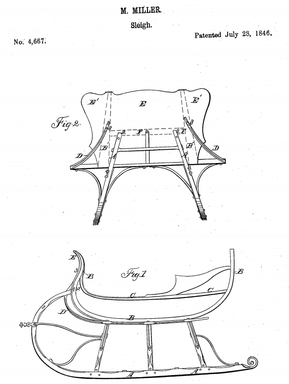
The invention incorporated into this sleigh design by Moses Miller of Fort Ann, New York, is the screen for keeping snow out of the sleigh's coach. What that tells us is some twenty years earlier, the typical sleigh riding experience frequently involved having snow kicked up into the cab, which means that in addition to a very bumpy ride, Santa was likely also cold, damp and miserable.
Which perhaps explains his girth. Moore describes St. Nicholas as "chubby and plump", which of course would provide him with the necessary insulation to cope with the cold.
Our next sleigh patent takes us 11 years further into the future, as David S. Barber, Almon Thompson and De Algeroy Thompson were awarded U.S. Patent 12,850 for their improvement in sleighs on 15 May 1855. Their innovation? Retractable wheels!
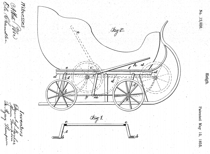
Now, think about this. The rails of a sleigh are meant for traveling over snow, but what good are they when they run out of snow and ice to run upon? Santa's rough ride would get a lot rougher, unless he could quickly convert his sleigh into a wagon!
The next sleigh invention we'll feature starts going off in a very different direction. Charles H. Hudson's U.S. Patent 116,191 is the earliest self-propelled sleigh we came across in our search of the U.S. Patent Office's records, which would eliminate those eight tiny reindeer that worked as Santa's propulsion system.

But that's not the main innovation! Here, for the first time, we see that a large spring has been incorporated under the seat of the sleigh, which would make this one of the first sleighs we can see to have some kind of shock absorption capability!
Not that it was used for that - it was really part of the self-propulsion system for this sleigh design, where the driver would throw their weight onto the seat, which would then compress before springing back, the momentum of which was converted into forward motion. Although left unstated in the patent, that method of locomotion would also address the issue of Santa's chubbiness, because going anywhere on this sleigh would be a real workout!
The next sleigh patent we'll consider was invented by John Zbornik of Old Mission, Iowa, who thought to incorporate leaf springs between the runners and the coach of the sleigh to work as true shock absorbers in U.S. Patent 245,597.

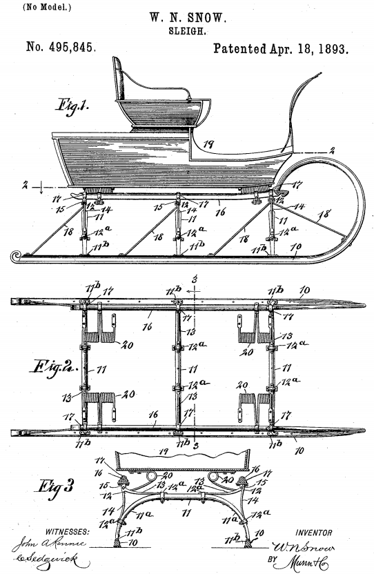
It would be another 12 years before sleigh designs really advanced, thanks to Willie N. Snow of Snowville, New Hampshire, who would invent a more robust and simpler suspension system for sleighs in U.S. Patent 495,845 on 18 April 1893.
As you can imagine, it wouldn't be long after this point in time that the new U.S. automotive industry would begin to influence sleigh inventions.
But not before steam power was first tried. That innovation was the focus of U.S. Patent 756,078, which was issued to Joseph Raymond Tibbets of Delmar, New York on 29 March 1904.

Looks a bit like a World War I tank. But then, that's pretty close to what it was, considering the era in which it was invented!
Still, with reindeer, human and steam power being what they are, American inventors finally turned to the internal combustion engine from automobiles to propel their sleigh inventions. But, since we're now into the brand new age of airplanes, why not throw in some propellers too, as Samuel Weinberg did in U.S. Patent 1,213,715.

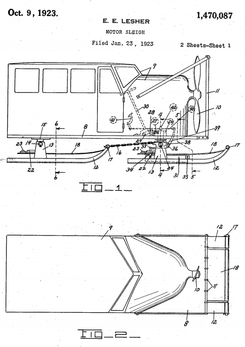
Now, we're even getting close to a flying sleigh! But you'll notice that sleigh riders are still exposed to the cold. Eugene E. Lesher addressed that shortcoming in U.S. Patent 1,470,087 for his motor-sleigh invention, which was issued on 9 October 1923.
Do you feel it? We're almost ready to fly!
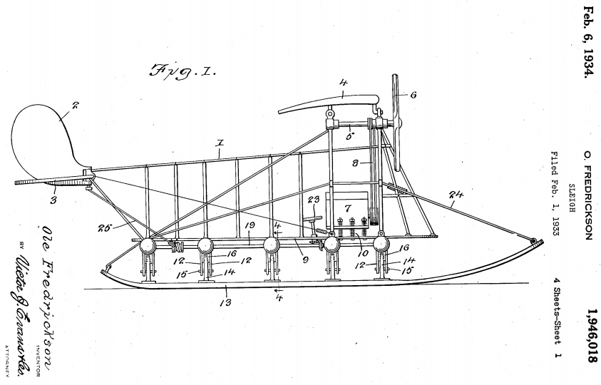
U.S. Patent 1,946,018, issued to Ole Frederickson of Great Falls, Montana on 6 February 1934, covers the aerial sleigh, which was designed to fly at very low altitudes above snow and ice. And no magical corn-fed reindeer were required!
And that really covers the history of the sleigh in U.S. Patents. From a functional standpoint, the snowmobile has replaced the sleigh (very early versions of what we would recognize modern snowmobiles are shown in U.S. Patent 1,254,456 and U.S. Patent 1,318,166), and as a result, sleighs as a means of transportation have fallen by the wayside of history.
But then, why would a little something like that ever stop St. Nick? This is a man, after all, who was flying sleighs over 110 years before the aerial sleigh was even invented!
Merry Christmas - we'll be back in 2014!
Labels: technology
We're down to crunch time before the Christmas holiday, and if you're still looking for last-minute gift ideas, particularly for that special someone you know who is dismayed by seeing either their or the nation's debt skyrocket in recent years, we think we've found the perfect gift - Kikkerland's "Drowning in Debt Salt and Pepper Shakers"!

Here's the description of the product from its creators:
Like so many of us, these two humble workers have found themselves buried under an inescapable debt. Whether debt or unemployment, these two little salt and pepper shakers humbly attempt to represent the struggle that is the sign of our times.
Yes, it's a real product - you can even buy a set through Amazon while supplies last!
But more to the point, that this product even exists says quite a lot about the world in which we live. Right there on your dinner table....
Labels: national debt, none really
We're afraid that we're going to have to rewrite the lyrics to The Mamas and The Papas classic song, "California Dreamin'":
The governor is Brown and the sky is gray.
I've been out of work on a winter's day.
I'd be safe and warm if I could get pay;
California schemin' on such a winter's day.
The reason for the rewrite of the song this season is the ongoing problems that the state of California is having in processing new applications for insurance benefits. Californians who have recently been forced into the marketplace for those benefits are being prevented from receiving them thanks to a large number of technical glitches that are plaguing the state Economic Development Department's brand new computer and telephone application system that was specifically built to handle them.
Oh, before we go on, we should clarify that we're not talking about California's Obamacare enrollment system, which is experiencing similar issues. Instead, we're talking about the state's unemployment insurance system, which is preventing Californians who have recently lost their jobs from being able to obtain the unemployment insurance benefits for which they and their former employers have already paid the premiums.
It would seem that finally, after weeks of silence in which they hoped that all the technical problems would be fixed so newly jobless Californians could enjoy their benefits and begin really boosting the state's economy, the state's elected lawmakers are finally becoming outraged at the state's bureaucrats' ongoing incompetence in fixing its broken system:
California lawmakers blasted state officials for their oversight of a computer problem that delayed jobless benefits for nearly 150,000 Californians, while front-line employees testified Wednesday that problems persist.
"This whole situation put a big black eye on how our constituents see the state of California," Assemblywoman Lorena Gonzalez, D-San Diego, told Employment Development Department officials at an Assembly Insurance Committee oversight hearing, the first on the troubled project.
A miscalculation converting old unemployment claims into a new processing system over the Labor Day weekend resulted in a massive backlog of unemployment claims. The problem became so severe it skewed reporting of initial jobless claims by the U.S. Department of Labor, and it provided another example of the state's information-technology shortcomings.
That, of course, is how we first learned of the situation, months before California's lawmakers were willing to pay attention to it. In the chart below, we see that aside from Hurricane Sandy, which was an actual natural disaster that severely disrupted the economies of states in the northeastern United States, virtually all of the extreme volatility in the data is originating in California.

Meanwhile, California's lawmakers would appear to believe that their state's problems in processing new jobless benefit claims is creating something an image problem for the competence of the state's government, if the comments of California Assemblyman Ken Cooley, D-Rancho Cordova, are any indication:
"I think the fundamental issue for the state is we are the home of Silicon Valley, we are seen as the most technologically adept state in the nation. To have this sort of thing happening is a colossal problem."
No, really? Well, at least someone with a "D" behind their name thinks so!
After the problems first developed, the state's Economic Development Department (EDD) launched something of a technical surge to deal with backlog of claims created by the department's incompetence. Here's how things stand after nearly three months of that sustained effort:
While EDD administrators said backlog claims have largely been resolved, Irene Livingston, an employment program representative for EDD in San Jose, testified that it remains "nearly impossible" for unemployed California to reach front-line employees. She said the system is overwhelmed with telephone calls and an email system that remains backlogged.
"There's literally hundreds of thousands of messages that have yet to receive a response," she said.
Sound familiar? Now, how about this as we compare the rollout of California's new unemployment insurance application system with the train wreck rollout of Obamacare:
EDD administrators lamented staffing shortages at the department, but EDD Chief Deputy Director Sharon Hilliard told the committee that staffing levels were not responsible for the computer problem. The department greatly underestimated how many claimants would be affected by a glitch in data conversion done over the Labor Day weekend, as well as how long it would take employees to address the problem.
"For this, we are very sorry," Hilliard said.
Oh, but wait - there's more!
Hilliard and a representative of Deloitte Consulting, the contractor on the project, both said the department should have done a more thorough test on the amount of time required to address "stop pay" flags associated with a portion of claims being converted.
Ba-bam! California Governor Jerry Brown's EDD isn't just following the same playbook as U.S. President Obama's HHS in implementing Obamacare. They're writing it!
Ready for another bizarre parallel with the Obamacare fiasco? Let's check in with the people with the greatest incentive to sign up for benefits. Here are the comments of Nicholas Lee, a 33-year old husband and father who lost his job back in September, who hasn't received any unemployment benefits or assistance from EDD officials, much less an unemployment benefits check, who has become very distressed that he hasn't been able to obtain any help despite his frequent calls and visits to the state's unemployment offices:
"I have two autistic kids, I have a wife, I have a house, and I am barely making it right now. And this system is not working.... I don't understand what they're doing, what's wrong, but maybe they should go back to the old system, because the old system was working."
Clearly, Mr. Lee is unaware that the old system was substandard, which is why that computer system needed to be replaced with a $35 million upgrade, because the state decided it really needed to enhance access to its unemployment insurance services.
And California is sparing no expense to deliver that $35 million upgrade for enhanced access to its unemployment insurance services, the bill for which now tops $188 million.
We should point out at this juncture that California Governor Jerry Brown's first response to this problem when it first hit critical mass back in September 2013 was to order the state's Economic Development Department to pay out unemployment insurance benefits to all applicants, without checking to confirm if they are even eligible to receive them. Which is something that is useful for fraudsters, if not actual people with legitimate claims like Nicholas Lee who are being left out in the cold.
Why, the parallels with Obamacare just keep stacking up like cordwood!...
But what we find fascinating are the parallels between the claims of improved performance after having the system break down, which are almost carbon copies of things that the Secretary of Health and Human Services, Kathleen Sebelius has been saying as the still-under-heavy-construction Healthcare.gov site continues to crash and burn. Here is EDD Chief Deputy Director Sharon Hilliard speaking before a state legislature committee:
"The system is working, and a majority of our customers are receiving benefits without interruption."
Except perhaps for those few, those unlucky few, that unfortunate band of brothers for whom California has failed to process even a single jobless benefit claim for week upon week. And since it only takes 50% plus 1 to make a majority, how few indeed are they? And why should any state government employee be concerned enough to set things right if that's where their administrators set the bar for their work?
Speaking of which, were any state government employees ever concerned that the implementation of the new unemployment benefits processing system was going to be such a total train wreck?
According to the Sacramento Bee, state government employee unions have begun circling their wagons and are suggesting that the department's managers dismissed the concerns of state employees about the project. Because why should unionized state government employees have to worry about serving the needs of distressed Californians who are laid off from their private sector jobs? Plus, it's not like they have any special connections to higher level state officials who might be able to address their concerns if they were really voiced before they became real problems now, is it?
We wonder with all this California schemin' if any two-bit lying politician has promised that if Californians like their unemployment insurance, they can keep their unemployment insurance?
Because if they did, that's another promise with an expiration date. And on such a winter's day!
Labels: satire

What if we told you there are ways you can buy real health insurance, and more importantly, more affordable health insurance, than you can get from either the federal government's or your state government's health insurance "marketplaces"?
By now, you are likely very well informed about how President Obama's lies and multiple broken promises have produced an even more broken system for buying individual health insurance coverage. Coverage that has become both more costly and of lower quality than what you may have had before because of all the useless bloat that has been added to it by President Obama and his bureaucrats who have put their politics ahead of people.
Sean Parnell, who helped us with the development of our "Obamacare: Should You Pay the Premium or the Tax?" tool, has been working on how to get effective and affordable health insurance coverage without dealing with Obamacare. At all. And best of all, in describing how to opt out of Obamacare, he explains you can get the kind of unbloated coverage that might make the most sense for you (emphasis ours):
- Join a health care sharing ministry. These are voluntary, charitable membership organizations that agree to share medical bills among the membership. They function similar to insurance, and are probably the best alternative to conventional health insurance. There are four of them, at least that I know of. Three are open only to practicing Christians (Samaritan Ministries, Christian Healthcare Ministries, and Christian Care Ministry***) while a fourth, Liberty HealthShare, is open to anyone who agrees with their ethical commitment to religious liberty. They operate entirely outside of Obamacare’s regulations, and typically offer benefits for about half the cost of similar health insurance. Members are also exempt from having to pay the tax for being uninsured.
- Buy a short-term health insurance policy. These policies usually last between 1 and 11 months (6 months seem to be standard) and are not regulated under Obamacare, and therefore don’t offer the same high level of benefits that can drive up costs. Deductibles are available that are higher than what is allowed with Obamacare-compliant health insurance, leading to further savings. They can typically be renewed at the end of the policy, although it is a new policy that won’t cover any conditions that occurred under the previous short-term policy. Another limitation is that they often can’t be renewed over and over again, it looks like 3 years of coverage is about the maximum. But they are much less expensive than conventional health insurance, and can be a good option for covering major medical expenses.
- Buy alternative insurance products like fixed-benefit, critical illness, or accident insurance. These policies pay cash in the event you are diagnosed with cancer, spend a night in the hospital, or need some other medical treatment. They cost a fraction of what health insurance costs under Obamacare, and by giving you cash directly you aren’t locked in to any particular provider network. Another thing to do is to max out your medical and uninsured/underinsured driver coverage amounts under your auto insurance policy, which can pay medical bills if you are hurt in a car accident.
***UPDATE #2: I listed four health care sharing ministries above, including Christian Care Ministry. What I forgot to mention is that they operate under the name Medi-Share, which many of you may be more familiar with.
He also goes on to describe how to get lower cost health care (not just lower cost health care insurance), so you can get more bang for the bucks you do spend on health care, at least as compared to what someone who signs up for an Obamacare policy will get.
For those who might be interested in investigating the Christian-oriented health cost sharing ministries, back when we were editing On the Moneyed Midways, a weekly summary of the best content we found among money-related blog carnivals, we came across a discussion of how the three Christian-oriented Medi-share ministries work by Bob at Christian PF, who has since updated it based upon his personal experience with them.

The short-term policies are more like traditional health insurance coverage, which makes them ideal for only paying for the kind of unbloated coverage you need. A good portion of your premiums for an Obamacare policy is actually going to pay for out-of-pocket health care expenses that President Obama's political supporters would like to not have to pay for themselves, which is one reason why their premiums are so much higher than what typical premiums were before the law's implementation.
One downside to the short-term policies is that they don't automatically cover pre-existing conditions, so if you develop a condition that requires extended treatment during the term of one of these policies, you may not be able to renew that coverage. A good way to get around that limitation though is to time the coverage period of your short-term policies during the year so that they go through December, where you could have the option to then get Affordable Care Act coverage during its next enrollment period if you do develop a condition that requires extended treatment. You could then drop the expensive Obamacare policy after you no longer need it in favor of the less costly short term policies again, as would be your right as an honest tax-paying American citizen.
If that describes your situation, when you do "opt-in" to Obamacare, it will be to your advantage to select a "Gold" or "Platinum" level plan, where instead of a high deductible that can require you to pay thousands of dollars out of your own pocket before you even get any meaningful benefit for having health insurance coverage, as is the case for both "Bronze" and "Silver"-level plans under the terms of the Affordable Care Act. We have previously found that people with expensive chronic or short-term, but costly health conditions will almost always pay less for their health care by selecting an Obamacare plan with minimal deductibles.
In fact, we could tell if Obamacare has developed an adverse selection problem simply by looking at the percentage of each kind of "metal" plan that its enrollees have selected, which is perhaps a very big reason why the Obama administration has refused to provide that information to date.
The fixed-benefit and accident insurance coverage would be beneficial as gap filling coverage, which is a means of covering the cost gap if you choose a policy that has a high deductible.
Of course, these kinds of policies would also make sense for people who can only afford Bronze or Silver-level health insurance coverage under the Affordable Care Act, but the difference is that those people will also be paying higher premiums, and are therefore less likely to have the money to pay for the kind of insurance that might actually reduce their out-of-pocket costs for health care.
Previously on Political Calculations
- Obamacare: Should You Pay the Premium or the Tax?
- We ask the question and provide a tool where you can do the math to answer the question for yourself!
- The Sebelius Solution
- You might be surprised to find out that Kathleen Sebelius, the Secretary of the U.S. Department of Health and Human Services, effectively endorsed the idea of ditching buying health insurance in favor of paying Obamacare's small income tax!
- Obamacare: Will Making a Little More Income Cost You Thousands?
- We show how crossing certain critical income thresholds can cost you the subsidies that make your Obamacare health insurance coverage affordable - welcome to the welfare trap, middle-class Americans!
- Obamacare and Trader Joe's: An Economic Detective Story
- We find out what's really happening to the grocer's part-time employees.
- Obamacare and Trader Joe's: The Rest of the Story
- We conclude our investigation of the popular grocery store chain's Obamacare-driven change of philosophy with respect to the value of their employees.
- The Odds of Going to the Hospital
- We begin the analysis of finding out just how likely it is that a random individual plucked from society might need serious medical treatment.
- Do You Even Need Health Insurance?
- We help you answer the question that supporters of Obamacare hope you won't ask!
- The Obamacare Cost Gap
- Depending upon what plan you find affordable, there may be very little difference for you in how much you'll actually pay for health care expenses between having health insurance and not having health insurance. We built a tool to help you find out how big the gap in your health care costs can get before you get any real benefit from having health insurance.
- Obamacare: Does Buying Health Insurance Make Sense for You?
- We consider the situation where buying health insurance through the Obamacare exchanges might make sense for you.
Labels: health, health care, insurance, personal finance
Well, we now know what it takes to wreck our echo filtering technique: a new noise event!
That event began last Tuesday, 10 December 2013, as stock prices began to fall on the increasing expectation that the Federal Reserve will once again prematurely act to cut back on its current program of buying $255 billion worth of U.S. Treasuries and Mortgage-Backed Securities each quarter, which has been keeping the U.S. economy out of recession.
The new noise threw a monkey wrench into the echo-filtered analysis that we were doing, so since this would have been the last week in which we could have used the methods we developed to account for the effect of 2012's Great Dividend Raid in determining how stock prices are behaving today anyway, we're simply going to dispense with it until we might need it again sometime in the future. In our final update of our chart showing the change in the year-over-year growth rates of dividends per share and stock prices this year, just note that the relative position of stock prices is not really as negative as it would appear....

We can also now see all the way through to the end of 2014 with respect to the expected future for dividends (the S&P 500's dividends in 2014-Q4 are currently expected to be near $10 per share, with a total of about $38.64 for all of 2014). The good news is the change in the expected growth rate of dividends in 2014-Q4 is positive, so when investors might turn their forward-looking focus to that quarter, it should be generally beneficial for stock prices in the relative absence of noise.
Looking forward throughout 2014, except for 2014-Q1, the nearer term alternative futures for stock prices are negative. Things that might cause a shift in investor focus to the nearer term, such as the timing and relative magnitude of the tapering of the Fed's quantitative easing programs, will have a negative impact upon the stock market.

Speaking of which, if the Fed does indeed act to begin tapering its QE programs, the recent budget deal gives it a little bit of room to do so, provided it is implemented in the first quarter of 2014. Although the deal would increase federal government spending by an average of $5.3 billion per month, with the official unemployment rate having fallen well below 7.5%, the nation's GDP can be expected to increased by half that amount each month. Since it appears that the GDP multiplier for the Fed's QE programs is about equal to 1.0, if the Fed were to reduce it's purchases of U.S. Treasures and Mortgage-Backed Securities by no more than $2.7 billion per month, the taper would have a neutral effect on the nation's economy. See update below....
If the Fed reduces their QE program by more than that amount per month however, it will have a negative effect on the U.S. economy, which will mean slower growth in 2014. This effect, of course, is why stock prices fall each and every time the topic of the Fed's potential tapering of its QE programs comes up.
There's another, bigger problem on the horizon however, which probably won't be appreciated until we get close to the end of 2014: the new Obamacare income taxes.
Here, those individuals who are being forced out of their existing health insurance coverage by the Affordable Care Act law, and who either cannot afford to enroll in the more expensive, lower quality (higher deductible) health insurance policies available on the Obamacare exchanges or cannot enroll because of the incompetence of the Obama administration in establishing and running the Obamacare exchanges, will instead be forced to pay higher income taxes.
Although these taxes will likely only fall upon the several million Americans who have been forced out of their existing coverage by the arbitrary mandates of the Affordable Care Act law, the higher taxes they will be required to pay will have a disproportionate and negative effect on the economy unless they are waived. We expect a delayed reaction because many of these taxpayers will not recognize that they will face a really nasty tax hit unless they adjust their income tax withholding to account for their higher Obamacare-driven income taxes in 2014, and will not do so until late in the year, if at all.
That's a topic we'll revisit in 2014. In the very near future, we'll share a solution for how people in this situation can get real and affordable health insurance that can avoid those higher income taxes without having to screw with Obamacare at all....
Update 19 December 2013: We did some back-of-the-envelope analysis on the Fed's taper decision via e-mail yesterday afternoon shortly after the Fed's announcement. Here it is:
Some quick back of the envelope numbers for the Fed's taper decision.
There are two positive economic factors enabling the change in Federal Reserve policy at this time:
1. Falling oil prices - they have fallen about 10% since summer and unlike last year, are likely to hold for a longer period of time thanks to the recent decay in France's economic situation. Here, a 10% decline in the price of oil would boost GDP by a factor of 1.4%.
For U.S. nominal GDP in 2013-Q3 of $16,891 billion, that would be a gain of $236.5 billion over a one-year period, which works out to be $59.1 billion for just one quarter or $19.71 billion per month. The reduction in oil prices in 2013-Q3 is a contributing factor to the re-emergence of organic economic growth in the U.S., although its contribution in that quarter was small compared to the impact of record bumper crops in U.S. agriculture. It will have a bigger impact going forward, particularly for transportation-related industries and automobile manufacturing.
2. The recently concluded budget deal in the Congress will increase federal spending throughout 2014 by roughly $64 billion, which if spread out equally per month would be about $5.3 billion. Per Owyang, Ramey, etc., when the official U.S. unemployment rate is below 7.5%, the GDP multiplier for government spending is 0.5.
That puts the economic boost to GDP for the budget deal at $2.7 billion per month.
Combining the numbers, that's a $22.4 billion per month boost to GDP for these driving factors. The Fed's announced taper is conservative at approximately half that value (at $10 billion per month.) Given the Fed's past practice, that reduction in its asset purchases will take place in the month following the announcement of the change in policy.
Stock prices will rise thanks to the end of uncertainty related to the Fed's near-term intentions for its QE program, and should return to the approximate level they were before 10 December 2013, which is when the latest outbreak of Fed-taper related noise broke out in the stock market.
Combined with the GDP-boosting factors noted above, the Fed's taper is net positive.
And that is why the S&P 500 rose by nearly 30 points to 1810 yesterday. Two points above the level it closed at on 9 December 2013. Merry Christmas from the Fed, who could have played the Grinch instead by announcing a much larger QE taper than they did!
Labels: chaos, disaster planning, dividends, gdp forecast, SP 500, taxes
If you take time to think about it, the Sun is perhaps best understood as being an uncontrolled nuclear fusion-powered ball of fiery plasma in the sky. As you can imagine, it's relationship with the Earth is complex, especially as scientists have only just determined that our planet is only just within the Sun's "habitable" zone, which is a fancy way of saying that we are only just far enough away from it to avoid it both boiling away the oceans and being burned into carbon-based cinders.
Which is completely cool, if you take some more time to think about it. The problems begin however if you don't think about it, as the architects of London's "Walkie-Talkie" Skyscraper apparently did not do as they designed and built what has turned out to be a multi-story solar energy concentrator with the capability of distorting and damaging the parts of cars parked on the streets below it. Via Core77:
Of course, there are people who try to harness the power of the sun in a positive way, but who are also hopelessly inept at it. Unsurprisingly, most of those people are being heavily subsidized by the government.
And then, there are those who do get it, who aren't subsidized by the government at all, who can do genuinely incredible things with the power of the sun, on purpose. Here's Grant Thompson, who has properly harnessed the intense power of the sun using the screen from an old big-screen projection television set (via Core77, who described the device that Thompson created as "an absurdly powerful, eco-friendly death ray capable of heating things to 2000 degrees Farenheit"):
Small wonder then that "ever since the beginning of time, man has yearned to destroy the sun." Those French candle makers were certainly on the right track years ago with their petition to the government against its destructive power.
Flashing forward to today, the real-life satire is that today's hopelessly inept candle makers now get government subsidies.
Labels: satire, technology
We're going to start solving the mystery of why economic growth in the U.S. was so unexpectedly strong in the third quarter of 2013 in a place you wouldn't necessarily expect: the ports of China.
According to the U.S. Census Bureau, the United States' exports to China surged in October 2013, which we can see in the dramatic spike upward in the year-over-year rate of growth of U.S. exports to that nation for the month:

But that's putting it mildly. Left unstated is that the U.S. set at all-time record for the value of its exports to China:

Even Reuters took notice, but didn't really appreciate the magnitude of the month's trade, as the news agency reported from the Chinese perspective:
(Reuters) - China's imports surged in October as exports grew at their slowest rate in months, suggesting efforts to tilt the economy toward domestic demand may be offsetting the external weakness that has dragged on economic growth this year.
Customs figures showed import growth of 28.7 percent year on year in October, well ahead of the 23.0 percent forecast and far in excess of September's 20.9 percent growth rate.
Headline growth in exports meanwhile was its most sluggish in eight months, but strip out the traditionally volatile month of February and October's growth of 15.9 percent was the slowest since November 2009 when they shrank.
"We were expecting quite a deceleration as external demand continues to decline in Western economies," said Donna Kwok, an economist at HSBC in Hong Kong. "But the key thing to look at here is the strength of the domestic demand factors as imports grew nearly 29 percent."
Reuters goes on to look at where all the increase in the goods that China imported from other nations originated:
Imports from all three of China's key trading partners surged.
The rate of import growth from the United States accelerated the fastest at 20.5 percent over a year earlier, jumping by 7.6 percentage points from September's pace.
Imports from resource-rich Australia grew at 36.7 percent versus September's 33.4 percent, while European Union imports rose 28.2 percent versus 25.7 percent previously.
So most of the increase in what China imported from other nations came from the United States. But what was it that China imported in such great quantity?
We drilled down into the Census' data on what the U.S. exported to China. And what we found is that the U.S. exported a record amount of soybeans to China in October 2013, the value of which accounted for 22.6%, or nearly $1 out of every $4 of the value of all $13.060 billion worth of the U.S.' exports to that nation, accounting for nearly all of the year-over-year increase.
So where did all these soybeans come from? Because they definitely weren't there last year....
It turns out that weather conditions in 2013 across all of North America were nearly ideal for growing just about every crop grown in the U.S., with the result that U.S. farmers were harvesting bumper crops of just about everything they grow in August and September 2013.
Those bumper crops, in turn, solves a different mystery: why did the U.S.' GDP unexpectedly grow so much on increased business inventories in the third quarter of 2013?

Reuters reports on that story:
(Reuters) - The U.S. economy grew faster than initially estimated in the third quarter but weak demand and a pile-up in business inventories buoyed the case for the Federal Reserve to keep up its bond-buying stimulus for now.
Gross domestic product grew at a 3.6 percent annual rate instead of the 2.8 percent pace reported a month ago, the Commerce Department said on Thursday.
It was the biggest gain since the first quarter of 2012, but inventories accounted for almost half of the increase in growth.

Thanks to the international trade data, we now know what U.S. businesses were putting into their inventories in such great quantities! It would appear that the bumper crops produced by U.S. farmers were parked in silos and storage containers (or rather, inventories) in the third quarter of 2013. Those inventories subsequently enabled a very large surge in exports to China in October 2013, which is in the fourth quarter.
Now, what that means is that the U.S. economy isn't necessarily as strong as it would seem from its GDP data, since the vast majority of the organic growth in the economy, above and beyond the level the Fed has been able to generate through its quantitative easing programs, would appear to have occurred just in the agricultural industry. Which we note would also appear to be the result of unique factors that applied in 2013 that are well outside the control of that industry.
That in turn would explain why the stock markets are reacting so negatively to the increasing expectation that the Fed will begin to taper its QE programs in the first quarter of 2014 - they know there isn't enough sustainable organic growth in the U.S. economy to offset the loss of the Fed's stimulative QE programs.
And we've already demonstrated that increasing likelihood of a Fed QE taper is behind the recent resurgence of recessionary conditions in the U.S. economy, with the greatest impact being felt by the U.S. housing industry.
We should also note that the spending increases in the new budget deal in Congress would not meaningfully add to GDP in 2014, since it doesn't address the source of over 90% of the fiscal drag holding down the U.S. economy: President Obama's 2013 tax hikes.
Nor does it address the imposition of higher income taxes on low and middle-income earners, which will take effect in 2014 thanks to the multiple failures and mandates of the Affordable Care Act (popularly known as "Obamacare"), and which have put obtaining affordable health insurance coverage beyond their means unless President Obama agrees to address them.
On the whole, unless something dramatically changes in the very near future, 2014 won't be anywhere near as promising as what a lot of economists are currently suggesting. But then, all of the rest of them haven't figured out the soybean thing yet....
Labels: trade
The number of publicly-traded U.S. companies announcing that they would be acting to cut their dividend payments rose back into recessionary territory again in November 2013.

We believe we've identified where the distress in the U.S. economy is originating. A number of Real Estate Investment Trusts (REITs), which allow stock market investors to be able to invest in the nation's real estate markets, have been acting to cut their dividends.
This follows the apparent stagnation of the U.S. new home real estate market, which has seen price increases stall out in recent months as mortgage rates spiked upward, largely upon the speculation that the Federal Reserve will act to trim the amount of U.S. Treasuries and Mortgage-Backed Securities from its current buying pace of $85 billion per month, which has driven that increase in U.S. interest and mortgage rates.
For U.S.-based REITs, the impact of those increases has meant two waves of dividend cuts so far - the first in September 2013, when at least 10 REITS acted to cut their future dividend payments, with the economic pressures to cut dividends continuing as Fed officials have tip-toed ever closer to acting on their intentions.
Such is life for the extremely interest-rate dependent.
References
Standard and Poor. Dividend Action Report. [Excel spreadsheet]. Accessed 10 December 2013.
Labels: dividends, real estate, recession
With the U.S. Census Bureau's long-delayed release of new home sale prices last week, we now have a better picture of the situation developing for the U.S. new home market. It would appear that the rapid rise in new home sale prices that we have observed since July 2012 is now stalling out.
That development is particularly evident when we focus just in the period since July 2012. The chart below shows the twelve-month moving average of U.S. median new home sale prices, which minimizes the effect of seasonality in the data:

In this chart, we see that the upward trend in median new home sale prices largely held up through July 2013, after which it appears to have stalled out. We should note however that the data for the most recent months is subject to revision, but what we observe is sufficient to determine that things for the new home market in the U.S. significantly changed after July 2013.
Of course, the thing that happened to drive that change was a sudden increase in mortgage interest rates, which spiked upward as it began to appear that economic conditions would lead the Fed to begin tapering its quantitative easing programs sooner rather than later, which would mean that the Fed would decrease its purchases of U.S. Treasuries and Mortgage-Backed Securities. The effect of that change would be to increase both interest and mortgage rates in the United States, given the relationship that exists between the two and although that spike began after April 2013, its effect shows up in the new home sale price data several months later since these prices are recorded when their mortgages are closed, after the typical three-month period required for their construction.
Our next chart shows the trailing twelve month average of median U.S. new home sale prices against the trailing twelve month average of median household income, which confirms that the inflation of the second U.S. housing bubble has all but stalled out:

Our final chart shows how median new home sale prices are stacking up against the median sale prices for all homes in the U.S.

At present, we observe that while new home prices would seem to have peaked, the median sale prices of all homes sold in the U.S. is continuing to increase. What that combination indicates is that the sale prices of existing homes in the U.S. are continuing to increase, even those the sale prices of new homes are stalling out.
Labels: real estate
The S&P 500 continued to behave predictably through the week ending 6 December 2013, at least if our "echo-filtered" analytical technique is any indication.

Going into the week, we had anticipated that the value of the S&P 500 would fall in the near-term, which held through Thursday, 5 November 2013. By that time however, the relative position of our echo-adjusted change in the growth rate of the S&P 500 daily stock prices had fallen well below the level where the dividends expected to be paid in 2014-Q1 would set them, which was a significant factor in the rally of stock prices on Friday, 6 December 2013. That rally brought stock prices up to right about where 2014-Q1's expected dividends would place them.
In the absence of new noise events, we expect that stock prices will continue to bounce around at or near this level, with somewhat of a mild upward trend given that we're looking a positive expectation for future dividends associated with the ongoing focus of investors upon 2014-Q1.
Analyst Notes
We now have enough data to illustrate why we went to so much trouble to develop our echo-filtering technique. In the chart below, we show what our dividend-futures based model for forecasting stock prices would have predicted if we had not accounted for the disruptive event of the Great Dividend Raid rally, which ran from 15 November 2012 to 21 December 2012:

Here, we observe that a deviation develops between what our dividend futures-based model predicts and actual S&P 500 stock prices, which looks very much like a negative noise event - just as we expected would happen.
Our next chart shows how our model's forecast of S&P 500 stock prices behaves when we account for the presence of the echo effect:

What that means is that we can successfully adapt our model to account for the presence of the echo effect so that it will continue to work in anticipating the level of actual stock prices, where we expect stock prices to fall within the range forecast by our model.
As a practical matter, we think that it would only be necessary to use this filtering technique to account for those echoes of significant past events that could otherwise lead to large deviations between actual observations and forecast values, as the typical level of noise we observe in stock prices already incorporates a contribution from the echoes produced by previous noise.
What is the lasting economic impact of the men who died while serving their country in war?
In our last installment, we showed that the single greatest factor behind the exponential increase in the number of single person households after the 1930s was the loss of over 416,000 men who died while in military service during the Second World War. The vast majority of these men had been drafted into military service, all between the ages of 18 and 37, where they were inducted after being selected through a lottery process operated by their local draft boards.
That lottery process ensured that approximately equal numbers of healthy American men by year of birth would enter into military service, which explains why the average age of the men who served in the U.S. military during World War 2 was 26. And since over 87% of U.S. military casualties in the war occurred in 1944 and 1945, enough time had elapsed from when President Franklin D. Roosevelt imposed the draft by executive order for the population of American casualties to reflect the age distribution of those who had been drafted.

If these more than 416,000 men had lived, they would have turned Age 65 in the years from 1970 through 1992. Instead, if we assume that the number of American casualties are approximately equally distributed by age, reflecting the age distribution of those who served, beginning in 1970 at least 15,735 fewer men reached Age 65 in each year for the next 22 years than would have been the case otherwise. (87% of the over 416,000 deaths of U.S. servicemen during the war is 361,920, which divided by the 23 years between 1970 and 1992, works out to be 15,735 men per year.)
The Hole They Left Behind in American Society
How can you measure the economic impact of men who died?
The only way that can really be done is to measure the size of the hole they left behind in society. Here, that hole can be measured by the population of women who lost their husbands and boyfriends, who because the number of women outnumbered the number of men after the end of the war, meant that many would have to go on to either live with their families or alone as they aged. Many of the men who had been their contemporaries in age were no longer there.
Since most American women in this era were homemakers, a large majority of these women would be dependent upon their families or upon survivors benefits for widows for their income. Others would find work and earn wages or salaries, but with little education or previous work experience, most would go on earn very low incomes throughout their lives.
But not just low incomes. Their incomes were the lowest of all income earners in the United States:
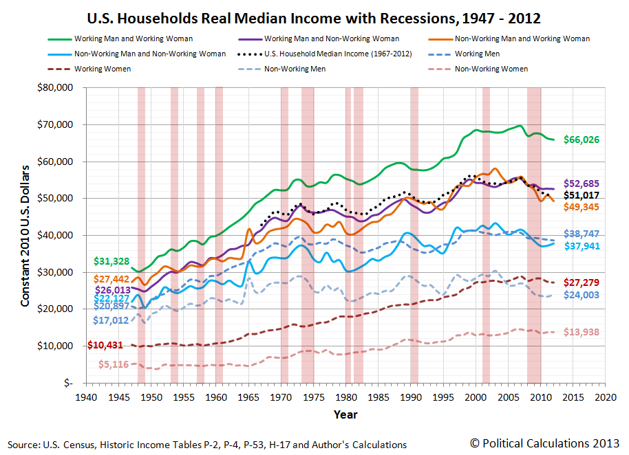
In this chart, we can see the median incomes earned by women who worked (and earned wage or salary income) and those who did not (whose income came from other sources, such as survivors' benefits provided by the U.S. government.) We can also see how they compared to American men and to typical American households consisting of at least one man and woman for the years from 1947 through 2012, all adjusted for the effect of inflation to be in terms of constant 2012 U.S. dollars.
By the time many of these women reached Age 65, they would find themselves living alone in increasing disproportionate numbers, as their parents passed away for those who continued to live with their families or because that's how they had lived for years. The number of households in the United States consisting of just one Age 65 woman living alone would rise dramatically from 1960 through 1992 as a direct consequence of the deaths of so many men during World War 2:

But it is the absence of men surviving to be at least Age 65 from 1970 through 1992 that would have the greatest economic impact on the nation, because the men who were drafted into service represented the majority of casualties for the war. Because they didn't survive and because they didn't live and work to support their families after they came home, that resulted in a very large increase in the number of Age 65+ women living alone beginning in 1970. And since we've already established that such women represent the lowest income earners in the United States, the large increase in this segment of the population caused the amount of income inequality measured among U.S. families and households to begin increasing in these years:

In the chart above, we see that a steady increase in the Gini coefficient, the most common measure of income inequality in the U.S., begins to take place for both households and families in 1970 after bottoming in the late 1960s. Meanwhile, we see that the amount of income inequality among individual American income earners remains essentially flat during that time.
The only way that can happen is if the composition of U.S. households changed so that they consisted of greater numbers of lower income earning households and families. In this case, the change was driven by an increasing number of single person households, and specifically by an increasing number of single person households consisting of women over the Age of 65.
The Women Who Survived the War
How do we know that it was an increase in the number women over Age 65 living alone who drove the rising trend in the amount of income inequality observed among U.S. families and households? After all, that change would also be occurring at the time in which the very large Baby Boom generation, who had been born beginning in 1946, would also be moving out from their parents' homes and setting up their own households in increasing numbers after leaving high school or college.
The difference between these different groups is their income. Almost all baby boomers leaving home or school and establishing their own households would be working and earning wages or salaries, which would put them much higher in the income spectrum for all American income earners, as we showed in our earlier chart showing the median incomes earned by typical one or two-person households.
But the vast majority of women Age 65 or older living alone wouldn't be working - not at that point in their lives. They would instead be drawing upon Social Security benefits for their income. And as it happens, we can demonstrate that the annual amount of income collected by the typical recipients of Social Security benefits is fully consistent with the median income earned by women without wage or salary incomes:
![Real Annual Incomes of U.S. Women Without Wage or Salary Incomes, 1956-2012 [Constant 2012 U.S. Dollars]](https://blogger.googleusercontent.com/img/b/R29vZ2xl/AVvXsEiRjSeMJvP-CbNEmH_MUzic007Su9HJCGWrmxV2wYnugrjTECO_leDeYCJj_lFZEco8bH9bcaJKAMv-7qInS4Kb_mBRgFY88K9Qa3E5oh11TDNePT2XtZseMXLZUXk9s2596DKr1A/s1600/2-real-annual-incomes-us-women-without-wage-or-salary-income-and-average-female-social-security-income-1956-2012.png)
And since Social Security benefits are typically paid to individuals over Age 65, that means that we're looking specifically at the population of women who were the direct contemporaries by age for the men who died in the Second World War.
From there, it is the combination of a large increase in the share of U.S. households consisting of elderly women living alone and their very low incomes that allows us to single out this group as being the primary driver of the rising trend in income inequality among all U.S. households and families. Here, without changing the distribution of income earned by individual Americans, we can account for much of the observed increase in the years after the 1960s. Simply recognizing that the number of Americans at the very lowest end of the income spectrum increased is enough to account for much of that change, given how the math behind the Gini coefficient works.

The men who weren't there also explains why the increase in the income inequality among U.S. families and households shifted to grow at a much slower pace after 1992 (or really, 1993, if you want to include the smaller impact of the 17-year olds who were allowed to enlist to serve in World War 2 in 1945). Men who were 17 or younger in that year were much more likely to survive to reach Age 65, which explains why the percentage share of women Age 65 or older living alone begins to fall and the percentage of men Age 65 living alone increases after 1992, as shown in our third graph above.
Conclusion
Obviously, there's more to the story of why the amount of observed income inequality among U.S. families and households has increased in the years since 1970, as the men who didn't survive World War 2 only accounts for one of the factors behind the changing composition of U.S. households that have driven that change since that time. Higher divorce rates, the increase of out-of-wedlock births and the expansion of the welfare state enabled much of the increase in single income-earner households that combine to explain virtually all of the increase we observe in income inequality among America's families and households since 1970.
But it was the lasting impact of the men who died in World War 2, and the women who survived them to go on to populate the very lowest end of the American income spectrum that explains why it started and also a good portion of why the distribution of income in the United States has evolved as it has.
To us, it's more remarkable that so many economists and politicians insist on focusing on the opposite end of the income spectrum in attempting to blame the highest income-earning Americans for that increase. It's much like the con artist's or magician's trick of misdirection, where they're trying to conceal what really happened in using deceptive means to distract attention away from it, so the uneducated and misinformed buy into such a flawed perception of reality.
That their latest "solution" for that poorly conceived problem has already been shown to be utterly useless as a result is likely lost upon them.
And that observation concludes our ninth anniversary post.
Celebrating Political Calculations' Anniversary
Our anniversary posts typically represent the biggest ideas and celebration of the original work we develop here each year. Here are our landmark posts from previous years:
- A Year's Worth of Tools (2005) - we celebrated our first anniversary by listing all the tools we created in our first year. There were just 48 back then. Today, there are nearly 300....
- The S&P 500 At Your Fingertips (2006) - the most popular tool we've ever created, allowing users to calculate the rate of return for investments in the S&P 500, both with and without the effects of inflation, and with and without the reinvestment of dividends, between any two months since January 1871.
- The Sun, In the Center (2007) - we identify the primary driver of stock prices and describe a whole new way to visualize where they're going (especially in periods of order!)
- Acceleration, Amplification and Shifting Time (2008) - we apply elements of chaos theory to describe and predict how stock prices will change, even in periods of disorder.
- The Trigger Point for Taxes (2009) - we work out both when, and by how much, U.S. politicians are likely to change the top U.S. income tax rate. Sadly, events in recent years have proven us right.
- The Zero Deficit Line (2010) - a whole new way to find out how much federal government spending Americans can really afford and how much Americans cannot really afford!
- Can Increasing the Minimum Wage Boost GDP? (2011) - using data for teens and young adults spanning 1994 and 2010, not only do we demonstrate that increasing the minimum wage fails to increase GDP, we demonstrate that it reduces employment and increases income inequality as well!
- The Discovery of the Unseen (2012) - we go where so-called experts on income inequality fear to tread and reveal that U.S. household income inequality has increased over time mostly because more Americans live alone!
We celebrated our 2013 anniversary in three parts, since we were telling a story too big to be told in a single blog post! Here they are:
- The Major Trends in U.S. Income Inequality Since 1947 (2013, Part 1) - we revisit the U.S. Census Bureau's income inequality data for American individuals, families and households to see what it really tells us.
- The Widows Peak (2013, Part 2) - we identify when the dramatic increase in the number of Americans living alone really occurred and identify which Americans found themselves in that situation.
- The Men Who Weren't There (2013, Part 3) - our final anniversary post installment explores the lasting impact of the men who died in the service of their country in World War 2 and the hole in society that they left behind, which was felt decades later as the dramatic increase in income inequality for U.S. families and households.
Image Credits: Michael Wu.
Labels: data visualization, demographics, income distribution, income inequality
Welcome to the blogosphere's toolchest! Here, unlike other blogs dedicated to analyzing current events, we create easy-to-use, simple tools to do the math related to them so you can get in on the action too! If you would like to learn more about these tools, or if you would like to contribute ideas to develop for this blog, please e-mail us at:
ironman at politicalcalculations
Thanks in advance!
Closing values for previous trading day.
This site is primarily powered by:
CSS Validation

RSS Site Feed
JavaScript
The tools on this site are built using JavaScript. If you would like to learn more, one of the best free resources on the web is available at W3Schools.com.
Other Cool Resources
Blog Roll


