After we had first announced that a new housing bubble had taken root in the U.S. economy beginning in July 2012, we soon followed up with additional analysis that suggested that it had perhaps begun to decelerate to a more sustainable level after December 2012. Recently revised data from the U.S. Census Bureau for the median sale prices of new homes in the United States through March 2013 now confirms that there has been no slowdown in the rapid inflation of new home sale prices observed since July 2012.

Since 1967, there is only one period of rapid price escalation that even comes close to matching the current trend for median new home prices in the United States: the initial inflation phase of the first U.S. housing bubble, which ran from November 2001 through September 2005 - approximately the time at which the Federal Funds Rate began to converge with the level that would apply if the Federal Reserve had been following the Taylor Rule.
What is more remarkable however is that the trailing twelve-month average of median new home sale prices through February 2013 has now exceeded the peak value set at the height of the inflation phase of the first U.S. housing bubble. The previous record for this figure was set in March 2007 at $245,842. In February 2013, the trailing year average of median new home sale prices is now $246,167 and the preliminary data for March 2013 has it increasing further to $246,767.
These new figures may be subject to revision during the next several months.
Since the inflation phase of the second U.S. housing bubble began in July 2012, the trailing twelve-month average of median new home sale prices has increased by an average of $2,532 per month through February 2013. By contrast, the trailing twelve-month average for median household income in the U.S. has increased by an average of $121.56 per month, as median home prices have been rising by an average of roughly $21 for every $1 increase in median household income.
In more normal circumstances, or at least those we've observed since 1967, a $1 increase in median household income would typically correspond to somewhere between a $3 to $4 increase in median new home sale prices.
Previously on Political Calculations
- The U.S. Housing Bubble Is Back - we apply our groundbreaking analytical methods to determine that a new housing bubble has begun to inflate in the U.S. economy.
- Fuel, Oxidizer and a Spark - Part 1 - we revisit the origins of the first U.S. housing bubble and identify the factors that ignited it.
- Fuel, Oxidizer and a Spark - Part 2 - we explain why housing prices rose so much more in just four states than they did elsewhere.
- Fuel, Oxidizer and a Spark - Part 3 - we examine the factors that kept the first U.S. housing bubble going, even after the Fed acted to stop throwing so much fuel on the fire.
- Confirming the Second U.S. Housing Bubble - using revised data, we confirm that there is no apparent new-year slowdown in the inflation phase of the new U.S. housing bubble.
Labels: real estate
There are 10 companies that make up over 18% of the value of the market capitalization-weighted S&P 500 stock market index:
- Exxon Mobil (NYSE: XOM): 2.78%
- Apple (Nasdaq: AAPL): 2.70%
- Microsoft (NYSE: MSFT): 1.70%
- Johnson & Johnson (NYSE: JNJ): 1.68%
- Chevron (NYSE: CVX): 1.62%
- General Electric (NYSE: GE): 1.61%
- Pfizer (NYSE: PFE): 1.53%
- Google (Nasdaq: GOOG): 1.52%
- Procter & Gamble (NYSE: PG): 1.48%
- AT&T (NYSE: T): 1.44%
In the last two weeks, 5 of these companies, whose combined market capitalization makes up over 10% of the value of the S&P 500 index have boosted their dividends:
- Exxon Mobil: Up 11% to $0.63 per share, payable to shareholders of record on 13 May 2013, to be paid on 10 June 2013.
- Apple: Up 15% to $3.05 per share, payable to shareholders of record on 13 May 2013, to be paid on 16 May 2013.
- Johnson & Johnson: Up 8.2% to $0.66 per share, payable to shareholders of record on 28 May 2013, to be paid on 11 June 2013.
- Chevron: Up 11.5% to $1.00 per share, payable to shareholders of record on 17 May 2013, to be paid on 10 June 2013.
- Procter & Gamble: Up 7.7% to $0.6015 per share, payable to shareholders of record on 26 April 2013, to be paid on 15 May 2013.
We're making note of these announcements and upcoming events today because we're trying to work out when exactly investors might permanently shift their focus away from the second quarter of 2013 to a more distant future quarter in setting today's stock prices.
After all, just two weeks ago, we had observed that the change in the growth rate of stock prices was beginning to diverge from the level that is consistent with investors focusing on the expected income they could derive from dividends being paid in 2013-Q2.
That changed in the middle of the last week however, on that weird day in the markets, as the forward-looking focus of investors appears to have suddenly snapped back to 2013-Q2:

The announced increases in cash dividends to be paid out during the second quarter of 2013 provide an additional incentive for investors to either buy or hold stocks at least through the period in which they would need to be documented as a shareholder of record. For four of the five largest companies of the S&P 500 that have announced dividend increases taking effect in 2013Q2, investors would need to hold their stocks into the third week of May to be able to pocket a large portion of that cash.
After which, if they expect stock prices to fall, it might make more sense to sell while prices are high, then to buy back in later when shares are cheaper. Especially if the expected change in the growth rate of dividends per share in upcoming future quarters is negative.
These incentives could explain some of the dynamics of the "sell in May and go away" phenomenon, which suggests that investors who buy then hold stocks only from November through April have higher returns with less volatility than those who only invest in the May through October period.
CXO Advisory has looked into the phenomenon and compared it to the results of a simple buy-and-hold strategy, with buy-and-hold being a clear winner. However their analysis has investors selling immediately after April each year, although there's nothing in the adage for "selling in May" that spells out exactly when in May investors should sell.
If investors held out for a few weeks longer into May, long enough to be documented as shareholders of record for dividends paid out in the second quarter before acting to sell their shares, then that additional cash would boost their effective returns, which is something that using Robert Shiller's S&P 500 dataset to model the investing strategy wouldn't necessarily capture.
Since dividends for the S&P 500 are also weighted by market capitalization (unlike the index' earnings per share, which are not), it therefore would not take much additional holding of stocks to collect a lot of the extra benefit in cash dividend payments.
That additional gain then might wipe out a lot of perceived advantage of CXO Advisory's buy-and-hold comparison. But it would take some really detailed backtesting to confirm if that is indeed the case, which we'll leave as an exercise for others.
Labels: chaos, dividends, SP 500
Science is a wonderful tool for understanding how our world really works. But if the science supporting a given understanding is flawed, or worse, if it is slanted in favor of a politically-favored outcome, it can become the justification for excessively wasteful activities. When science crosses that line, it is transformed from something that is worthy of respect into junk science.
This is the story of Michelle Obama and her fight against the food deserts of America. The story begins on 24 February 2010, when the First Lady of the United States of America used her White House platform to introduce the little-understood concept of the newly-discovered "food deserts" of America to Americans as part of a media blitz:
As part of Lets Move!, the campaign to end childhood obesity, First Lady Michelle Obama is taking on food deserts. These are nutritional wastelands that exist across America in both urban and rural communities where parents and children simply do not have access to a supermarket. Some 23.5 million Americans – including 6.5 million children – currently live in food deserts. Watch the video below and learn what the First Lady is doing to help families in these areas across the country.
Food deserts sound horrible. Isn't it good that the First Lady is doing something about this awful problem that would appear to be plaguing America's most poor, yet obese citizens, who suffer because they are deprived from having large supermarkets stocked with nutritious foods within walking distance of where they live?

Or is the First Lady relying upon junk science to justify the wasteful expenditure of taxpayer money to benefit her and the President's political cronies? After all, there was already plenty of evidence back in 2010 that indicated that food deserts were more a junk science-fueled political talking point than a real factor that significantly contributed to making poor Americans obese, as the original 2006 study proclaiming the crisis in President Obama's home base of Chicago was funded by LaSalle Bank of Chicago, then the largest business lender in the city, who would directly profit from investments to "remedy" the situation.
Fortunately, respectable science can help provide the answers to these questions. The U.S. Centers for Disease Control very recently published a peer-reviewed scientific study of the impact that a lack of nearby access to nutritious foods, such as might be found in one of the First Lady's food deserts, actually has upon the Body Mass Index (BMI) of the Americans who live within such regions. Here are the results and conclusion for their study of 97,678 adults in the state of California (home to 1 out of every 8 Americans):
Results
Food outlets within walking distance (≤1.0 mile) were not strongly associated with dietary intake, BMI, or probabilities of a BMI of 25.0 or more or a BMI of 30.0 or more. We found significant associations between fast-food outlets and dietary intake and between supermarkets and BMI and probabilities of a BMI of 25.0 or more and a BMI of 30.0 or more for food environments beyond walking distance (>1.0 mile).
Conclusion
We found no strong evidence that food outlets near homes are associated with dietary intake or BMI. We replicated some associations reported previously but only for areas that are larger than what typically is considered a neighborhood. A likely reason for the null finding is that shopping patterns are weakly related, if at all, to neighborhoods in the United States because of access to motorized transportation.
Economist Jacob Geller reviewed the study's statistical results:
If you look at the statistical tables, they’re pretty striking. Even where there is statistical significance — which is the exception to the rule — the size of the effect is so tiny, it’s like practically nothing. For example, on the margin, adding one full-service supermarket within a one-mile radius of your house is associated with an average BMI decrease in your neighborhood of .115. That is a difference of just one pound. (see back-of-the-envelope calculations here)
So there is really no relationship, according to this one recent study of nearly 100,000 Californians, between the distance between your body and a full-service supermarket (or any other kind of food store), and whether or not you are obese. Distance, which is a proxy for access (the idea of a food desert is that the nearest supermarket, which has fresh produce, is distant), is for all practical purposes a non-factor.
We created the following tool so you can see what Michelle Obama's publicity campaign to direct large and/or politically well-connected retailers to spend millions of dollars to open or expand stores in the "disadvantaged" regions identified by the U.S. government as supposed food deserts would have in terms of your own weight. And the cool part is that the math is such that we can figure out just how much that would be for you from just your height!
Our tool indicates how much of your weight would be affected by whether you lived within a food desert. If you live in an area identified by the U.S. government as a food desert, it indicates how much more you would weigh, and if you were to move out of that area, it is how much you would lose. To put your result into proper context, the weight of an adult American normally fluctuates by up to 5 pounds during the course of a single day.
Did we mention large and/or politically well-connected retailers are involved? That's actually how we know that the whole food desert publicity campaign is really about crony capitalism more than it is about dealing with the health problems of obesity. Because in truth, if it were a real problem that could be fixed by opening new store locations, it would be a lot easier, cheaper and faster for small "Mom and Pop"-style grocery businesses to fit themselves into the already existing and available retail spaces within such deprived communities as the supposed food deserts of America.
But since the whole food desert concept would seem to be based on junk science rather than the more respectable kind, it is perhaps too much to ask for the solutions advanced by the politicians taking charge of the crisis to solve a legitimate problem.
References
Carras, Michelle Colder. Normal Body Weight Fluctuation. LiveStrong.com. http://www.livestrong.com/article/29567-normal-body-weight-fluctuation/. 7 May 2011.
Croft, Cammie. Food desert? What’s a food desert? White House Blog. http://www.whitehouse.gov/blog/2010/02/24/taking-food-deserts. 24 February 2010.
Gallagher, Mari. Examining the Impact of Food Deserts on Public Health in Chicago. http://www.marigallagher.com/site_media/dynamic/project_files/Chicago_Food_Desert_Report.pdf. Mari Gallagher Research & Consulting Group, sponsored by LaSalle Bank. 2006.
Geller, Jacob A. The Problem of "Food Deserts" Is Not All About Access. http://jacobageller.com/2013/04/the-problem-of-food-deserts-is-not-all-about-access/. 3 April 2013.
Hattori A, An R, Sturm R. Neighborhood Food Outlets, Diet, and Obesity Among California Adults, 2007 and 2009. Prev Chronic Dis 2013;10:120123. DOI: http://dx.doi.org/10.5888/pcd10.120123. 14 March 2013.
McWhorter, John. The Root: The Myth of the Food Desert. National Public Radio. http://www.npr.org/2010/12/15/132076786/the-root-the-myth-of-the-food-desert. 15 December 2010.
Mooney, Alexander. First Lady Takes on 'Food Deserts'. CNN: The 1600 Report. http://whitehouse.blogs.cnn.com/2011/07/20/first-lady-takes-on-%E2%80%98food-deserts%E2%80%99/. 20 July 2011.
Political Calculations. How To Detect Junk Science. http://politicalcalculations.blogspot.com/2009/08/how-to-detect-junk-science.html. 19 August 2009.
White House. Transcript of President Obama's Remarks at 2013 White House Science Fair. White House Photos and Video. http://www.whitehouse.gov/photos-and-video/video/2013/04/22/president-obama-tours-2013-white-house-science-fair#transcript. 22 April 2013.
Wright, Ann. Interactive Web Tool Maps Food Deserts, Provides Key Data. http://www.letsmove.gov/blog/2011/05/03/interactive-web-tool-maps-food-deserts-provides-key-data. LetsMove.gov. 3 May 2011.
Update 27 March 2022: The original video hosted at the White House's web site is no longer available. We've replaced it with a copy still available on YouTube.
Labels: development, economics, food, politics, quality, tool
On 30 January 2013, we introduced our tool for determining the percentile ranking of Americans according to their net worth (or net wealth), writing:
We didn't know this until yesterday, but apparently, our "What's Your Income Percentile?" tool is the second most highly ranked result on Google if you search for "household wealth percentile". Which we found out only because someone who works for the Federal Reserve Board came to our site after performing that exact search on Monday, 28 January 2012!
Well, that's not good enough, is it? We want to own the #1 result for that particular Google search and we're going to get it by building a tool that you can use to see how your household's net worth ranks among all U.S. households!
We recently noticed an upsurge in our site traffic, with visitors being drawn to our net worth percentile tool. It turns out that in less than three months time, the tool we developed that day has become the third highest result returned by a Google search for "household wealth percentile"!

Technically, we also own the #2 result, but that's our post as it appeared at Before It's News, which republishes our RSS site feed, and which doesn't include the JavaScript code needed to make the tool functional.
And to think, we achieved all that without the aid of any so-called "SEO experts"!
Instead, we have to thank all those who made their way to our site and who hopefully discovered something they thought was interesting or useful, then shared what they found with others. Our Google search ranking for "household wealth percentile" can be almost entirely attributed to that process of discovery.
We very much appreciate your finding us! And if you know any bird enthusiasts, be sure to let them know about our long-tail experiment with bird perches!
Labels: none really
What a weird day for the stock market. And the weirdness started early. Pragamatic Capitalism's Cullen Roche sets the scene:
Here’s a brief rundown of some of the data we saw in the last 12 hours:
- U.S. Flash PMI came in at 52, weaker than expected and down from 54.6 last month.
- German Flash PMI hit a six month low of 48.8.
- China PMI hit a two month low of 50.5, down from 51.6 last month.
- Richmond Fed Manufacturing came in at -6 vs expectations of a +3 reading.
- Redbook sales were up just 1.8%, down from 2% last week.
- New home sales came in at 417K, below estimates of 419K, but up from last month’s 411K.
So, not a great day for data. And yet the equity markets in Europe were up 1-3% and the S&P is up over 1%. No one I’ve talked to can make a whole lot of sense of this.
The big news in Europe overnight was that the ECB and Germany in particular might be easing on their austerity approach. The Euro tumbled in response and European equities soared despite very weak overall PMI data. So I think it's the Abenomics effect. As the Japanese market rallies higher almost every single day on the back of the "whatever it takes" commitment by the BOJ/MOF, there appears to be a belief that the policy is already working and worth trying elsewhere. It might just be that simple – we’re seeing market participants all over the place capitulating to the power of governments.
Now, that's what we would call a noise event, when the stock market completely goes off in a speculative direction that's not directly supported by a real (or implemented) change in their fundamental outlook, which we measure in the form of the signal provided by their announced expected future level of dividend payments.
As an example of what we mean, what is being called Abenomics is an announced policy in Japan, so it should have an affect on the fundamental outlook of the businesses that make up the Japanese stock market. But if the prospect of a similar approach being adopted in other nations affects stock prices in those nations, without there actually being a corresponding change announced for those nations' economic policies that would actually affect the fundamental outlook for the businesses within their borders, then any change in stock prices driven by such speculation is purely the result of noise.
 On top of that then, the market got weirder. There was another noise event during the day, this time a negative one, after a "verified" Twitter account operated by the Associated Press was hacked with an announcement that two explosions had occurred at the White House and that President Obama was injured.
The false news hit the wires at 1:07 PM EDT. The market responded to this negative noise event by immediately losing nearly 1% of its value in first three minutes following the false news hitting the wires, then took an additional two minutes after that to fully recover as traders overrode automatic trading programs that had been set to immediately sell stocks as soon as possible in the event that news of a terror attack was made public, after they realized that the news was phony in the absence of other breaking news reports to confirm it.
Reuters describes the trading that occurred during that short window of time:
More than 620,000 front-month S&P 500 E-mini futures contracts - the most popularly traded futures contract - and more than 180,000 front-month 10-year Treasury futures contracts changed hands between 1:09 p.m. and 1:12 p.m. EDT (1709 to 1712 GMT) after the tweet.
Here's what the event looked like in the context of the S&P 500 during the day's trading on 23 April 2013:

The time to respond to correct the reaction to this unexpected noise event is consistent with what we've frequently observed for the market's response to "ambiguous" news - where analysis by real-life humans is needed to determine a particular course of action in trading. It normally takes anywhere from two to four minutes for the market to respond to news it wasn't expecting, and the response in the automatic selloff reaction certainly fits within that typical window of time.
That stands in contrast to how the noise event began however, as stock prices responded almost instantly to the false news report, which almost gives the impression that traders were expecting the news!
That perhaps is the danger of programming computers to automatically execute trades in certain pre-defined circumstances - where a response is triggered before any sort of confirmation has occurred. At the very least, it appears that some Wall Street quants will be reviewing and perhaps rewriting a good portion of their code for trading pretty soon!
The really bad news however is that this is exactly the sort of thing that draws Congressional attention and government investigations. We're afraid that there's also going to be some very non-value added testimony in the future for a number of trading institutions.
Finally, the day ended with some good news. As many investors have been speculating for some time, Apple is going to boost their dividend by 15%, to $3.05 per share, so the day wasn't completely lost to noise! Since Apple is still the second-largest component of the S&P 500, Apple's action to boost its dividend does lend support for today's otherwise noise-driven increase in the value of stocks.
Labels: SP 500, stock market
Who is the median woman who doesn't earn a wage or a salary?
The question arises because of something we did last year. Specifically, when we extracted data for this demographic category of American income earner from other data published by the U.S. Census Bureau.
What makes this particular demographic category so interesting is that U.S. women who do not earn wages or salaries make up what is perhaps the lowest income earning group within the United States. To see what we mean, our chart below shows the inflation-adjusted median incomes earned by women from 1947 through 2010 in terms of constant 2010 U.S. dollars:

So just who is the median woman who doesn't earn a wage or a salary, who is part of the lowest ranks of income earners in the United States?
The answer came to us when we were looking at the history of average Social Security retirement and survivors benefits paid out over time, for which the Social Security Administration provides data for selected years going back to 1956. Our chart below shows what we found:
![Real Annual Incomes of U.S. Women Without Wage or Salary Incomes,
1956-2010 [Constant 2010 U.S. Dollars]](https://blogger.googleusercontent.com/img/b/R29vZ2xl/AVvXsEgISR27FGAxwWR7PrEZM2yo1FGk9d5qj_DVhyphenhyphenFVXeoavShjLSe7U5PyyrvrbRAB300j2xweny5VlCjtdK9zTT7czjoO_PCXa4BiPPQivoSKMVLTXi-UisDGXmsAZ4zOO-cU9ic-/s1600/real-annual-incomes-us-women-without-jobs-1956-2010.png)
What we find is that the income earned by the median U.S. woman without a job paying a wage or salary for the years from 1956 through 2010 is largely consistent with benefits paid by Social Security, which means the median U.S. woman who doesn't earn a wage or salary is of retirement age - typically Age 62 (for those taking a reduced benefit) or older (for those taking non-reduced benefits).
We note that for much of the data, the median income is less than the average income. This is a characteristic of the lognormal distribution of income. However, we do observe an upward shift in the data over time, which we believe corresponds to the increasing number of women with wage and salary income in the United States, whose incomes reflect their growing share among Social Security recipients.
The variation in the median income data would also appear to be somewhat consistent with having an increasing portion of income derived from investments, such as those that might be earned through an Individual Retirement Account or 401(k)-type retirement investment programs, which we recognize in the surges for median income earned in 1986-1989, 1997-1999 and later in 2005-2006, which coincide with booming periods for the U.S. stock market.
Once again, that would be very consistent with the kind of income that would be earned by a woman of retirement age in the United States, who it would seem collectively make up the lowest income earning demographic group within the United States!
Labels: demographics, income distribution
Last Friday, we declared that order had indeed broken down for the S&P 500, marking the end of the most recent rally for the U.S. stock market.
But is the rally really over? Well, we can't say that just quite yet, as it happens. To understand why we would appear to be contradicting ourselves, let's take a step back and consider just how we've arrived at this point!
It all started when we decided to address a specific challenge back on 5 April 2013. We had indicated a week earlier that a 150-point plunge in the value of the S&P 500 would be a "clear sell signal", but we wondered if we could come up with an objective approach that might minimize the downside risk of holding onto stocks too long after they've begun to turn south, while also not missing out on any potential gains that would occur if a stockholder sold their shares too soon.
So we got fractal with the S&P 500, focusing in tightly on the most recent microtrend for the market.
It's that microtrend rally in the S&P 500 that that appeared to be on the verge of ending last Thursday morning, and that is now very likely over. Meanwhile, there's a longer term rally for which the microtrend that just ended is only a short-term run - let's take a step backward to see it!:
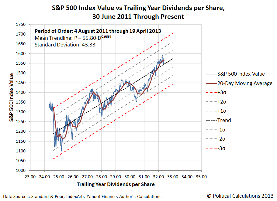
As of the close of trading on 19 April 2013, the value of the S&P 500 index was $1,555.25 per share, which is about 10 points above the mean trend curve shown on the chart, and 140 points above the level that would correspond to a breakdown in this longer term period of relative order in the stock market for the indicated value of trailing year dividends per share.
See this reference for how we define things like order, disorder, disruptive events and bubbles for the stock market.
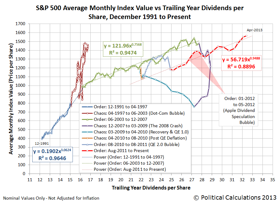
And to take an even larger step backward, the following chart shows just the mean trend lines for the long-term periods of order that have existed in the stock market over the past 22 years:
So this is what people like Barry Ritholtz mean when they say that the market bull run is not over (yet). Even if they mess up things like what was really responsible for generating the most recent rally. (Quantitative easing, Barry? Really? That thing the Fed started doing nearly a month after the rally for stock prices actually began?)
Ah, but we bust Barry's chops over a very small thing - he's still one of the better market observers out there!
We love it when we can both identify and quantify a noise event in the U.S. stock market! The accidental early release of the Federal Reserve's Open Market Committee's 19-20 March 2013 meeting minutes on 10 April 2013 gives us some unique data on how the Fed can affect asset prices with its policy statements.
Here's how CNN's Annalyn Kurtz described the content of the FOMC's meeting minutes:
The minutes contained very little new information about Fed policy. The main takeaway is most Fed members think the central bank should continue buying $85 billion in assets a month, at least through midyear.
But some members argued in favor of tapering down the purchases gradually while others didn't see a need to decrease the purchases until the third quarter. Two said some purchases would probably continue into 2014.
Being a journalist, Kurtz likely wouldn't appreciate how this news might affect markets. In committing to continue its current $85 billion worth of asset purchases ($40 billion in mortgage backed securities, $45 billion in U.S. Treasuries) per month through the middle of the year, and with a general consensus that the purchases would continue through the end of 2013, whether at the current level or at a decreasing level, the FOMC eliminated a lot of uncertainty for investors.
In effect, the Fed's policy commits it to sustain long term interest rates at low levels through 2013, which is beneficial for companies that might borrow money to fund their business expansion, and particularly those that use debt to finance their growth. Investors would then gain from that expanded business activity.
Knowing that now, let's look at what the market knew before the Fed acted to remedy its accidental release at 9:00 AM EDT on 10 April 2013, some 30 minutes before the market opened:
Unlike European markets which are sharply increasing today, the S&P 500 should open in a slight rise of 0.2%. It had closed up 0.35% at 1568 points, being very close to absolute records during the day.
At economic level, traders are waiting for Crude Oil Inventories at 10.30 am EST, the Federal Budget Balance and FOMC Meeting Minutes at 2 pm EST which should confirm the continuation of asset purchases by the Fed.
That story was reported at 8:48 AM EDT. A 0.2% increase to open the market would correspond to a value of 1571, just 3 points higher than it closed on 9 April 2013. The following chart shows what happened instead, after investors had over 30 minutes to digest the information contained in the FOMC's meeting minutes, almost an eternity in market time where unexpected information typically affects stock prices within two to four minutes of becoming known, after the market opened for trading at 9:30 AM EDT:

Quite a difference! But then, all noise events eventually end - it's only ever a question of when.
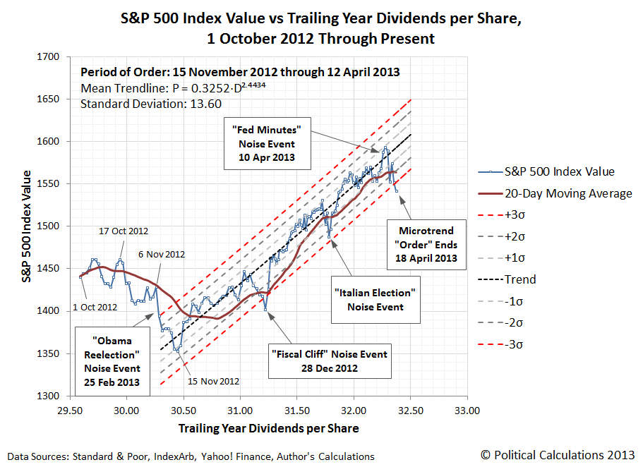
As best as we can tell, the response to the Fed Minutes noise event kept the rally that began after 15 November 2012 alive for a few days longer than it might have otherwise, while also marking the top for the rally.
And that will be the last time we'll feature that particular chart. What the end of order means here is simply that the most recent microtrend for the S&P 500 is over. We'll have more thoughts on that soon!
Labels: SP 500, stock market
After having a bad day on 15 April 2013, the stock market had a good day on 16 April 2013, as everything looked up. Wall St. Cheat Sheet's John Nyaradi captured the mood:
Among Tuesday’s three upbeat economic reports was the Federal Reserve revelation that industrial production rose by twice as much as expected.
Economists were expecting the U.S. Federal Reserve to report that industrial production increased by 0.2 percent in March. Investors were excited to see that industrial production actually increased by 0.4 percent. The reports on March housing starts and the Consumer Price Index were also better than expected.
Beyond that even, all the big earnings news of 16 April 2013 was good:
Now that earnings season is in full swing, investors are rightfully focusing the majority of their attention on what really matters: earnings reports. A number of the biggest companies reported today, and for the most part, the numbers look good. Positive results from Johnson & Johnson helped pull the health-care industry higher, while Goldman Sachs gave investors reason to believe in the financial industry.
With strong first-quarter results, the Dow Jones Industrial Average made a 180 from yesterday's 265-point drop and rose 157 points, or 1.08%, today. And after losing more than the Dow yesterday, the other major indexes gained more than the blue-chip average today, as the S&P 500 rose by 1.43% and the Nasdaq climbed higher by 1.5% today.
Those gains occurred in all sectors of the market.
But in all this good news, there was an important thing that didn't happen. Not one of these companies reporting such good earnings acted to boost their dividends. That's a crucial missing action that undermined the previous day's run-up in stock prices, because if they thought that the good times were going to go on, some of those great earnings would be converted into cash to benefit their shareholders.
And so, investors looking further forward into the future were left with the picture where there will be a large deceleration in the growth rate of dividends, which directly translates into a negative acceleration for stock prices. Which we certainly saw on 17 April 2013:
If you've been following our recent posts that have featured this chart, having stock prices for the S&P 500 close below the bottom red-dashed line would be a "sell signal", as it would indicate that order in the market is breaking down. (Please note that we have adjusted the period of order shown in the chart to conclude with 12 April 2013 - the last trading day before the recent outbreak of volatility.)
We should also recognize that since we're using both a power law-based regression analysis and a statistics-based approach to define these curves, there is a possibility that data points falling outside the red-dashed curves could be outliers for the established trend, rather than an indication that a state of order in the market has broken down. A more conservative approach for making a decision to sell in these circumstances would be to wait for the 20-day moving average of stock prices to fall outside the "normal" range for stock prices with respect to their trailing year dividends per share, which would be a confirmation that a previous state of relative order in the market has ended.
Speaking of which, much of the recent rally in stock prices (aka "the previous state of relative order in the market") was actually powered by changes in how many companies will be paying their top employees rather than by a rapidly improving business outlook for U.S. companies, which has apparently fooled a lot of investors. Here, many companies have really been acting to shift money that might have been paid to their highest earners in the form of wages and salaries to instead be paid out in the form of dividends, helping to keep them from being as negatively impacted by President Obama's higher income tax rates that took effect at the beginning of the year than they might have otherwise. Stock prices largely rose in response as investors also benefit from these kinds of changes in the employee compensation strategies of many corporations.
For serious market observers, the good news is that with most of this tax avoidance-driven activity now complete following the end of the first quarter of 2013, dividends are once again more accurately reflecting the business outlook for the private sector in the U.S.
On the Lighter Side
Finally, here are some fun items following a bleak day. First, for those who pay close attention to the comments we put in the margins of our favorite chart, there is now an open call for the Federal Reserve to amp up its latest quantitative easing program. We guess that only buying $85 billion per month worth of Mortgage-Based Securities (MBS) and U.S. Treasuries isn't enough to prop up the economy anymore.
Second, don't miss CNBC's executive news editor Patti Domm's article "Scary Pattern Could Be Forming on S&P 500 Chart". Knowing the state of the mainstream media these days, and at NBC-affiliated "news" organizations in particular, it's probably a serious piece of financial news reporting, but we couldn't stop laughing while reading it!
Third, have you ever heard of the DeMark 9 indicator? Well, neither had we until yesterday, but then it would also seem to be indicating that the market is on the verge of sending a rare sell signal, so the thing we just threw together a few weeks ago isn't the only game in town!
But that isn't the end of the story. CNBC is also wondering if a market sell signal could be near, based the kind of "highly informative" interview that we've come to expect from all NBC "news" outlets....
Labels: chaos, SP 500, stock market
Veronique de Rugy has analyzed the various federal government budget spending proposals now floating around Washington D.C. In the chart below, she shows how much each would spend from now through 2023:

As always, the challenge in really understanding what these numbers mean is to put them into a more "human" scale. To do that, we've added up the spending for each proposal for each of the ten years spanning the federal government's 2014 through 2013 fiscal years, then divided the result by the combined number of U.S. households per year.
The result, presented graphically below, is the average amount of federal spending per U.S. household being proposed in the nation's capitol.
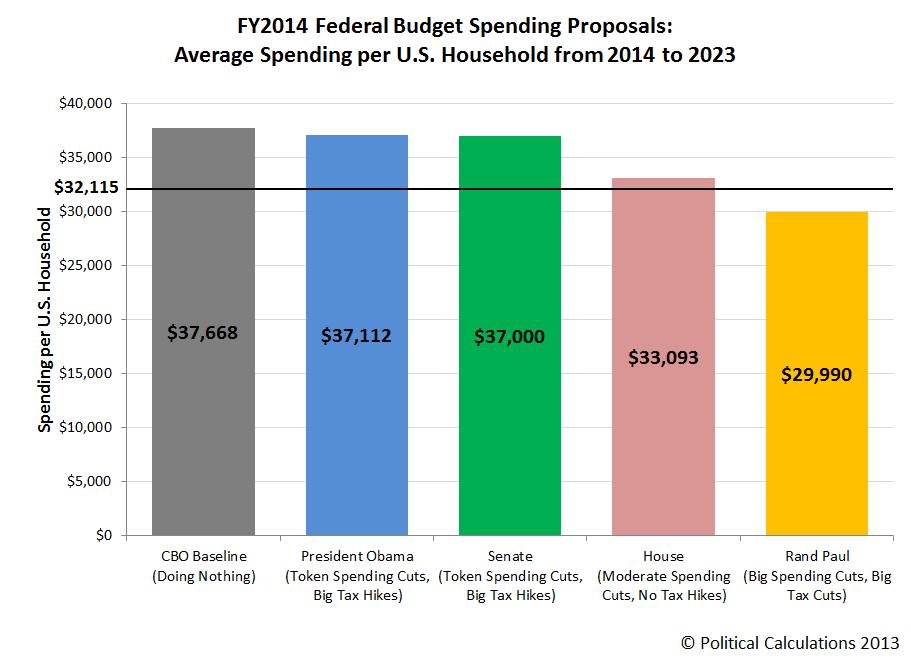
The horizontal black line on the chart represents the Congressional Budget Office's projected total of the amount of taxes that the federal government is likely to collect per U.S. household from FY2014 through FY2023. As you can see, both President Obama's and the Senate's budget proposals fail to come anywhere close to being in balance, as both only provide for token spending cuts. Both instead rely upon large tax hikes to try to close the projected deficits, however this would require the U.S. federal government to maintain its tax collections at levels it has historically not been able to sustain for more than a few years.
By contrast, the House's budget proposal comes close, but is still slightly in the red over the ten year period. We should note however that the House's budget proposal actually does achieve balance at the end of the 10 year period - the reason it's slightly in the red over the ten years from 2014 through 2023 is because of higher deficits that are run the early years of the period. There are no new tax hikes associated with this proposal, which assumes that the federal government's tax collections will be maintained at their post-World War 2 historic average.
Meanwhile, Senator Rand Paul's alternative budget is the only one that achieves balance by a significant margin, primarily due to large spending cuts. Since Senator Paul's proposed budget also reduces taxes, we should note that the resulting surplus would not be as large as indicated.
Projecting the Number of U.S. Households
We built on previous work we did to model the number of U.S. households. You can access those projected numbers using the modified version of that original tool below:
Labels: data visualization, national debt
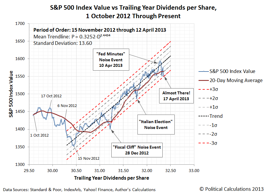
The 15th of April in 2013 was a bad day on many different levels. It was one of those days that started that way, then only got worse.
Let's focus on the stock market. Here's the chart that we know many of you are waiting to see:

On 15 April 2013, the S&P 500 fell 36.49 points to close at a value 1552.36, as our interpolated trailing year dividends per share figure for the day reached $32.31. That's a little over 11 points higher that the value of 1541 that would coincide with our statistically "not necessarily wrong, but useful" sell signal, which would be triggered if the S&P 500 closed at a value below that level.
The market did not close below that level, so an investor who might be using our newly developed method to help decide when to sell would not have done so. By this method, which is designed to preserve gains and to minimize losses by indicating whether an established period of order in the stock market might be beginning to break down, such an action would still be premature.
At present, the value of the S&P 500 that an investor might use to pocket any gains they have accumulated and to minimize any losses that might result from a breakdown of order in the stock market is rising by roughly 2.4 points per trading day. By Monday, 22 April 2013, that level will have risen to just over 1553, which coincides with our interpolated trailing year dividends per share figure for that day of $32.40, which we've determined using dividend futures data for the second quarter of 2013 with historic data for the three previous quarters.
Now, let's look at what's going on fundamentally in the market:
With earnings season for 2013-Q2 now underway, we're starting to see investors shift their focus beyond the current quarter when it comes to setting stock prices. Or rather, we're starting to see some investors shift their focus forward to either the third or fourth quarters of 2013 in setting their expectations for stock prices, while most other investors are still focusing on 2012-Q2 at this time.
Later this week, we'll take a closer look at what we're calling the "Fed Minutes" noise event.
With the U.S.' deadline for filing income tax returns for 2012 upon us today, we thought it might be interesting to find out which Americans aren't really paying a fair share of all the income they earn in the form of income taxes.
The answer may be found in our chart below, which we previously featured here:

Although built using data from 2009, newer data does not significantly alter this picture....
Here's what we wrote back on 26 April 2011:
Theoretically, all the area under the blue total aggregate income curve is subject to federal income taxes. In practice, deductions and tax credits exempt large portions of low-to-middle income earners from the burden of paying federal income taxes. The Tax Policy Center estimates that 47% of all income earners in 2009 either paid no federal income taxes or received back more from the federal government than what they would have had to pay, if not for the deductions and tax credits they could legitimately claim.
The chart above is inaccurate in that it significantly understates the effective total amount of income that Americans at the low end of the income spectrum accumulate, who benefit from government assistance programs that add to the incomes they earn from wages and salaries, or through unearned income sources like interest, dividends or Social Security benefits. This effective additional income is derived from such welfare programs as food stamps (aka the "Supplemental Nutrition Assistance Program"), Medicaid, Medicare and other health care-related subsidies, housing assistance, as well as job training and education assistance to name just a few tax-free income boosting government welfare programs.
We would argue that these effective-income boosting benefits should be reported on U.S. personal income tax returns. At least, if one truly believes in honesty and fairness in discussing who is really not paying a fair share of the income tax burden in the U.S.
More Tax Day Fun at Political Calculations!
- The 100th Anniversary of U.S. Income Taxes - our tool will let you do your taxes today as if it were 1913!
- How Many Pages Long is the U.S. Tax Code in 2013? - for the last week, the single most common question that U.S. lawmakers on Capitol Hill have asked us!
- Redesign Your Own Flat Income Tax - our tool let's you design and test drive your own alternative flat income tax program!
- The Flat Tax the U.S. Effectively Already Has - it's basically true, but don't take our word for it - the Congressional Budget Office says so!
- The Tax Burden of ObamaCare - starting soon in 2014!
- The Transformation of Student Loans Into Taxes - if you cannot discharge it through bankruptcy, and if the size your payment is determined by the size of your income, and if you owe it to the federal government, it's not really debt - it's an income tax!
Labels: taxes
From all appearances, the U.S. economy is now performing much more strongly than China's economy.

Going by the growth rate of the value of trade between the two nations, it appears that the U.S. economy turned a corner in August 2012, when it briefly turned negative. Since then, the relative health of the U.S. economy appears to have improved, which we see in the form of a rising demand for imported goods. For the data just released for February 2013, it appears that pace of economic growth in the U.S. is outstripping the rate of growth in China.
Meanwhile, the pace of growth of the Chinese economy appears to have rebounded off its slowness from last year, confirming that nation's economy has likewise improved, although not at the same rate as the U.S. economy.
This period of increased demand for imported goods in the U.S. approximately coincides with beginning of the sudden inflation in new home sale prices, as the housing sector of the U.S. economy began to show signs of a new bubble beginning to inflate in August 2012. Here, U.S. new home sale prices began to surge at a rate not seen since the first U.S. housing bubble ignited into its rapid inflation phase after November 2001.
That activity, in turn, appears to be what has sparked an increasing level of Chinese exports to the United States. We can confirm that much of this increase was driven by the improvement of the housing sector of the U.S. economy, as 54.6% of the year-over-year net increase in the total dollar value of goods imported into the U.S. from China in 2012 is represented by such goods as household and kitchen appliances, furniture and especially other kinds of household items.
Or rather, exactly the kinds of things you would expect to be in demand to support an improved housing sector of a nation's economy, which we'll take another look at soon.
Labels: real estate, trade
28 weeks ago, on 23 September 2012, a new trend in the seasonally-adjusted number of new jobless claims filed each week began. That trend has been characterized by extreme volatility, affected by such factors ranging from California's inability to process large numbers of claims in early October 2012, the impact of Hurricane Sandy from early November through early December 2012, a carry-over effect from December 2012's fiscal cliff event that ran from mid-January through mid-March 2013. And for 30 March 2013, perhaps a spike from the new seasonal adjustment factors that were just introduced in the last several weeks!

Let's get into the fiscal cliff carry-over effect, which we're considering as a hypothesis for what we observe in the data. Here, approximately 500 publicly-traded companies issued special or extra dividend payments to benefit their investors, who were seeking to avoid the risk of having dramatically higher taxes imposed upon them after the end of the year thanks to the "fiscal cliff" political impasse in Washington D.C., where the absence of a deal would hike the tax rate on dividends from 15% to as high as 43.4% with the looming expiration of the Bush-era 2003 tax cuts.
At the same time, many investors also sold off stocks at the end of the year to avoid a similar tax spike for capital gains, whose tax rate was set to rise from 15% to as high as 23.8%. Stock prices fell in response to this kind of selling in two phases. The first phase began following the re-election of Barack Obama as U.S. President on 6 November 2012, which continued through 15 November 2012. This phase was then interrupted by the actions of U.S. companies to issue extra or special dividend payments following the close of business that day, the reaction to which initiated a strong rally in stock prices as it created an incentive to hold stocks - at least through the time for when those dividend payments would be made before the end of the year.

That rally then continued until the final days of December 2012, after investors had pocketed the extra dividend payments that had been issued and could begin the second phase of selling to avoid the higher capital gains tax rates that would take effect in the new year. Stock prices then fell dramatically again through Friday, 28 December 2012, which was effectively the last real trading day of the year given the timing of the weekend and the New Year's holiday in the following week.
All that money had to go somewhere. And if we can use history as a guide, a lot of it went into housing - much like how the first U.S. housing bubble was sparked by the exodus of money from the stock market that accompanied the deflation phase of the Dot Com Bubble.
Consequently, the new year began with a surge of permits to construct new privately-owned single-unit houses, which surprised many builders, who had been expecting business in that segment part of the market to slack off considerably after December.

That unexpected increase in demand for new houses at the beginning of 2013 boosted construction employment, which has reflected in a reduced number of new claims for unemployment insurance being filed in the weeks from mid-January through mid-March, as there has been significantly fewer layoffs in the construction industry during this period.
It typically takes a U.S. builder some 3-4 months to build a new house. If this hypothesis holds, the decline in the number of new jobless claims filed in the period from mid-January through mid-March 2013 would coincide with the first phase of capital gains tax avoidance on the part of stock market investors following President Obama's re-election and the guarantee that higher tax rates would go into effect.
Also if our hypothesis holds, we can expect the U.S. housing market to be stronger than expected for several more months, especially for the kind of single-unit housing favored by recently dividend-and-capital-gains enriched stock market investors seeking second homes or investment properties in places known for their pleasant weather (especially in winter months) or recreational activities.
Kind of like all the places seeing the strongest growth in house prices at the moment.
Meanwhile, we suspect that the newest outlier for 30 March 2013 is primarily the result of the BLS' seasonal adjustment factors. Our final chart below compares the BLS' raw data with the seasonally-adjusted data for each weekly report going back to 6 January 2006:

That most recent seasonally-adjusted value shows quite a lot of effect from such a small increase in the actual raw number of new jobless claims for the week ending 30 March 2013. The new numbers that will be coming out later this morning should be a lot closer in value to each other, and hopefully, will put all this volatility in the rear view mirror.
Labels: jobs
In March 2013, the number of Americans counted as being employed fell by 206,000 to 143,286,000 from its level in the previous month, wiping out all of the apparent gains that had been made in that statistic since November 2012 in the process.
Working young adults between the ages of 20 and 24 were the hardest hit during the month, as their numbers in the U.S. workforce dropped sharply by 145,000 from the 13,527,000 that had been recorded as having jobs in February 2013 to the 13,382,000 counted as employed in March 2013. These individuals represent 9.3% of all employed Americans.
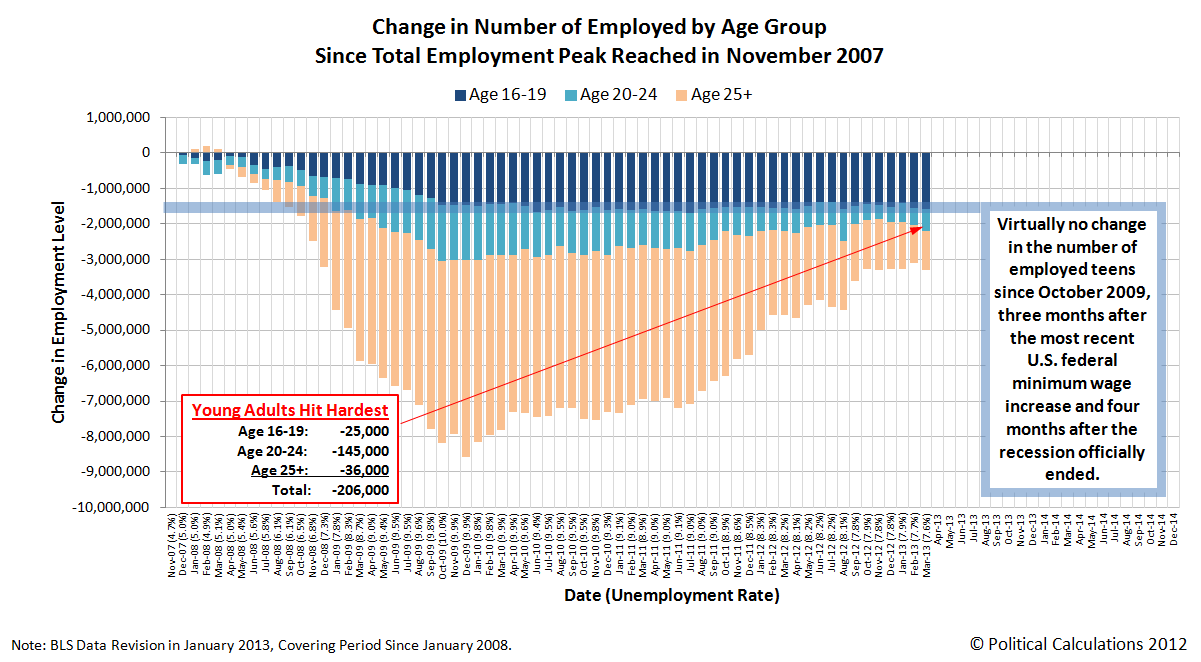
Click here to view a larger version of the chart.
The situation wasn't much better for other age groups, who also saw their numbers among the employed decline in the month of March 2013. The number of working adults (Age 25 and older) fell by 36,000 to 125,553,000 and the number of working teens (Age 16 to 19) was reduced by 25,000 to 4,351,000.
For all practical purposes, there has been no economic recovery for U.S. teens at all since the so-called "Great Recession" officially ended in June 2009. As a percentage of the working portion of the U.S. civilian labor force, teens now account for 3.037% of all employed Americans, the lowest share recorded for teens since July 2011, which at 3.031%, marked the lowest point for this statistic in the wake of the Great Recession.
Measured from the peak of total employment in November 2007, one month before the peak of economic expansion marking the official starting date of the Great Recession in December 2007, there are 3,309,000 fewer Americans with jobs today. Of those, 47.6% are teens (Age 16-19), 18.7% are young adults (Age 20-24) and the remaining 33.7% are Age 25 or older.
Since much has been made of the changes in the size of the civilian labor force during the past several years, we thought we might compare the data for March 2013 with November 2007. Here, in November 2007, 153,835,000 Americans Age 16 or older made up the civilian labor force, which has increased by 1,193,000 to 155,028,000 in March 2013 - an increase of 0.8%.
Of that total, the number of adults Age 25+ has increased by 1.8% over that time, from 131,502,000 in November 2007 to 133,860,000 in March 2013. Meanwhile, the number of young adults in the civilian labor force increased by 1.1%, from 15,262,000 to 15,431,000 over that interval.
The number of teens counted as being part of the civilian labor force though has declined by 18.9%, from 7,071,000 in November 2007 to 5,737,000 in March 2013. Meanwhile, the population of U.S. teens has been essentially flat over this whole time, falling slightly by 1.2% from 17,048,000 in November 2007 to 16,840,000 in March 2013.
Apparently, teens are getting a very clear message that they shouldn't even bother looking for even minimum wage jobs unless they get a college degree first.
That would mean then that help wanted ads requiring applicants to have bachelor degrees to be considered for cashier positions at places like McDonalds might not be as accidental as claimed, and might instead be a taste of things to come. Especially if the minimum wage is increased to the point where it no longer makes sense to even consider hiring someone without a college degree, or even anyone, for such increasingly automated jobs.
Labels: jobs
Welcome to the blogosphere's toolchest! Here, unlike other blogs dedicated to analyzing current events, we create easy-to-use, simple tools to do the math related to them so you can get in on the action too! If you would like to learn more about these tools, or if you would like to contribute ideas to develop for this blog, please e-mail us at:
ironman at politicalcalculations
Thanks in advance!
Closing values for previous trading day.
This site is primarily powered by:
CSS Validation

RSS Site Feed
JavaScript
The tools on this site are built using JavaScript. If you would like to learn more, one of the best free resources on the web is available at W3Schools.com.
Other Cool Resources
Blog Roll


