On 2 April 2012, we forecast that the U.S.' real GDP for the first quarter of 2012 would be $13,508.2 billion in terms of constant 2005 U.S. dollars. This value represents the midpoint of our projected forecast range for where GDP in 2012-Q1 would most likely be recorded.
Based on the first official estimate for GDP for 2012-Q1, we were off by about 0.05%, as the U.S. Bureau of Economic Analysis put their earliest estimate at $13,502.4 billion!
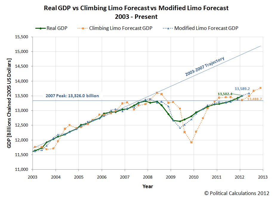
In terms of the annualized growth rate from the previous quarter, our forecast for 2012-Q1 would have been 2.4%, just one tick below the 2.5% rate that the "consensus" among all economic analysts had projected the value just before the BEA's GDP news release, which put its first official estimate of the annualized growth rate for the quarter at 2.2%. We point this out to illustrate how sensitive the growth rate calculation is to very small differences in the measured versus projected levels of GDP.
We would anticipate that the figure for 2012-Q1 GDP will be revised upward during the next two months.
Looking forward to the current quarter (2012-Q2), and incorporating the BEA's first estimate of 2012-Q1 GDP into our "modified limo" forecasting technique, we would initially anticipate that the likely range for real GDP in the U.S. will be centered around $13,589.2 billion in terms of constant 2005 U.S. dollars. Assuming that deviations between our projected value and the actual recorded can be described by a normal distribution, we would give nearly 70% odds that 2012-Q2's inflation-adjusted GDP level will fall in a range between $13,367.7 billion and $13,649.9 billion in constant 2005 U.S. dollars.
If we were to bet on which side GDP for the quarter will be with respect to our projected midpoint however, we would take the under.
Labels: gdp forecast
Normally, we'd build a tool to help you answer a question like this, but this time, let's explore just what your credit score means in terms of your potential mortgage, car loan, insurance premiums and credit card interest rates in infographic form, courtesy of Credit.org's Lori Lamb (HT: Angelo Cosentino):

For those who prefer their information in text format, here are Lori's comments for each category:
Here’s a rough guide to what various score ranges mean:
300-550: Poor credit. It is generally accepted that credit scores below 550 are going to result in a rejection of credit every time. If your score has fallen into this range, you need to work to improve your score. Often a bankruptcy filing will bring a score down to this level; over time, the score will improve if you make your payments on time, every time. Statistically, borrowers with scores this low default approximately 75% of the time.
550-620: Subprime. It’s possible to get credit in this range, but not guaranteed. If you do get a loan, it will be at very disadvantageous terms: you will pay much higher interest rates and penalty fees. In this range it is worthwhile to address any specific credit problems you have and try to boost your score before applying for credit. In this range, borrowers typically default 50% of the time.
620-680: Acceptable. Scores in the mid 600’s mean you will most likely be given credit when you apply for it. You still won’t get the best interest rates, but borrowers with scores over 620 are considered less risky and are therefore likely to be approved. In this range, borrowers can expect to qualify for a prime rate. Traditionally, “Prime” loans could be easily sold to Fannie Mae or Freddie Mac. Default rates in this range are between 15 and 30%.
680-740: Good credit. Scores around 700 are considered the threshold to “good” credit. Borrowers in this range will almost always be approved for a loan, and be offered very good interest rates. At this credit score, lenders are comfortable with the borrower, and the decision to extend credit is much easier. According to FICO, the median credit score in the U.S. is in this range, at 723. Borrowers in this range only default 5% of the time.
740-850: Excellent credit. Anything in the mid 700’s and higher is considered excellent credit, and will be greeted by easy credit approvals and the very best interest rates. In this high-end of credit scoring, extra points don’t improve your loan terms much. Most lenders count a credit score of 760 as just as good as a score over 800. Some people take this to mean that it’s not worth the effort to continue to improve your score after you get into this range, but as always, the higher your score, the better. Even if an extra 50 points in this range doesn’t help you get a better interest rate on your next loan, they can serve as a buffer if you have a negative item show up on your report (maxing out a credit card can penalize you 30-50 points. If your score is near 800, the resulting damage won’t push you down into a lower tier). The default rate in this range is approximately 2%.
As for how much company you have in your credit score bracket:
According to FICO, the following proportions of consumers have scores in the following ranges:
- Up to 499: 2%
- 500-549: 5%
- 550-599: 8%
- 600-649: 12%
- 650-699: 15%
- 700-749: 18%
- 750-799: 27%
- 800-850: 13%
Fair Isaac, the outfit behind the FICO credit score, has previously stated that the median credit score in the U.S., which marks the score at which nearly half of all Americans have either a higher or lower score, was 725.
Labels: personal finance
What happens when you give a bunch of engineers the challenge of building a model drag racer from the parts available in a vacuum cleaner?
Via Core 77, the following too short video shows you what you get when those engineers work for Dyson's UK division:
On a side note, we have to give these guys some serious props for at least one of their vacuum cleaner designs. It's light-years beyond other models that Consumer Reports has named to be "Best Buys", but which are really craptastic. Here's why:
- Better canister design for disposing of vacuumed "stuff". You don't need to stick your hands into any inaccessible nooks and crannies for the sake of unstopping the vacuum.
- Consistent suction - it's what Dyson's vacuums are most known for, and they're still the best at it!
- Accessory parts that don't fall off their mounts when bumped while in use.
- Better built and longer lasting. It's one thing for a vacuum cleaner to be inexpensive, but it's not all that great a deal or all that inexpensive any more if you have to buy new ones to replace them after they wear out or break down in too short a time.
- Waste heat disposal. You probably won't ever think about this until it's too late (you've bought the wrong vacuum and you're using it), but unlike certain vacuums whose designers apparently believe it's okay for waste heat to be vented on the user's legs, Dyson's designs don't do that!
There is however room for Dyson's product to improve. The one thing we would desperately wish for if we were shopping for a Dyson today is a power cord that's about 6 feet (actually 2 meters) longer than the current model, along with a more robust clip feature to secure the plug end of the cord in storage!
As these things go, those are very minor things!
Funny. We weren't going to review vacuum cleaners when we started this post....
And now it seems we're committed to marketing one! We won't complain though - it's a really good one!
Labels: none really, review, technology
Since August 2011, stock prices have been behaving in a very orderly manner.
By that, we mean that the relationship between average stock prices and their underlying dividends per share have been very closely coupled during the period from August 2011 to the present. So much so that a simple power law may be used to describe the relationship between the two, with a normal bell-curve distribution describing the variation of each month's data since with respect to the mean trend power curve.
Speaking of which, we've been playing around with how to automate our ability to visualize that pattern, which we've shown in the chart below, where we've shown the average for April 2012 through 20 April 2012. Although those lines may look like they're straight, they're really curves that are bending upward (with just eight data points, things still look linear, even though they're very much not so!)

In the chart above, the formula in the top left corner describes the power law relationship between average stock prices for the S&P 500 and their underlying dividends per share. Meanwhile, the statistical equilibrium/control chart-inspired lines represent the number of standard deviations (shown in the bottom right corner) either above or below the S&P 500's current trajectory and describe the typical variation we see in stock prices with respect to their average trajectory, at least while the market continues to behave in such an orderly manner.
Based upon that information, you might think that stock prices would appear to be following a very predictable path at present, and you would be right. But that will only last until they stop being normal. And if you pay close attention to the chart above, you'll see something that should give you quite a bit of concern that the market's current state of order will instead come to be defined by something quite different, perhaps sooner than you would hope, even though many periods of order in the modern era of the stock market were sustained for years at a time.
But then, we have other tools for dealing with that situation, which will hopefully help explain why stock prices have changed as they have from March to April 2012:

The funny thing is that the S&P 500's dividend futures through the end of 2012 have been largely set for some time now, and after Apple's dividend announcement, the only thing that has really changed from March to April 2012 is the point in time at which investors have focused their attention. And when they shifted their attention in time, stock prices soon followed to match their "new" expectations.
But then, that's what we should expect during such periods of order in the stock market!
Labels: data visualization, dividends, quality, SP 500
Those who follow our analysis on a regular basis already know that we consider the number of seasonally-adjusted initial unemployment insurance claims filed each week to be the most easy-to-accurately-predict number in all of economic datadom.
 The reason why is because the weekly data tends to follow a straight-line path over time, with the variation in the data from week-to-week about these linear trends being easily described by a normal, bell-curve kind of statistical distribution.
Periodically, breaks in existing trends occur and new trends begin, which we are able to identify using the kind of statistical analysis that has been successfully and widely applied in manufacturing or industrial applications for over 80 years.
Here, we recognize that the cause of a break in an existing trend in the weekly jobless claims data is actually triggered by events that significantly altered the business outlook for employers some 2-3 weeks earlier in time, which corresponds to the employers implementing their decisions affecting their employee retention plans with their next pay cycle. Since most employed Americans are paid on either a weekly or biweekly basis, that works out to a two-to-three week lag from when an event significantly affecting the pace of layoffs in the U.S. occurs, to when the effects of such a change in the business outlook of employers shows up in the BLS' weekly data reports.
With that in mind, we're going to present two possible hypotheses behind what's affecting the level of claims filed for new unemployment benefits that are being filed today. Here, we begin with what we describe as the "current" trend, which we've previously identified began on 3 December 2011, as the average price for gasoline in the United States fell below $3.50 per gallon two-to-three weeks earlier. In our first chart, we assume that trend is still in effect:

Here, our first hypothesis of what's behind the changes we're now observing for new jobless claims is that that previous improvement we've seen in the number of new claims filed for recently laid off employees is in the process of flattening out at a level somewhere between 370,000 and 380,000 claims each week. We note that level of new jobless claims is some 60,000-70,000 higher than the average level that was typical in the years preceding the December 2007 recession and would be consistent with a permanently higher unemployment rate than the 4.7% that was recorded in the U.S. during that time.
For our second chart, our hypothesis is that the increase in the national average of gasoline prices in the United States back above the $3.50 per gallon mark in the final week of January 2012, the effects of which would show up in the weekly data after 11 February 2012, has perhaps initiated a new, but increasing trend in the number of new jobless claims being filed each week:
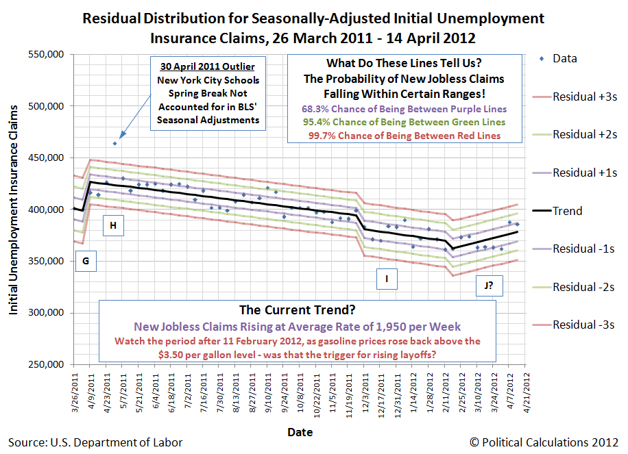
And that's where we are today in our thinking. We should know sometime this summer (and hopefully sooner) which of our two hypotheses has turned out to be true, or if another hypothesis might perhaps better describe what is happening with the number of new jobless benefit claims being filed each week.
Currently, international trade data suggests that both China and the U.S. are undergoing significant, near-recessionary slowdowns in economic growth, if not outright recessions, which we strongly suspect is already the case for China, but not the U.S., which we believe will only skirt the edge this quarter.

But that's not the main focus of our post today, where we'll instead deploy our doubling rate chart of the value of exports the U.S. has sent to China in each month from January 1985 through February 2012:

And our doubling rate chart of the value of everything that the U.S. has imported from China over the same period of time:

What these two charts illustrate is the period of time in which the volume of either U.S. exports to China, or U.S. imports from China, have taken to sustainably double since January 1985. And by "sustainably double", we mean to exceed a previous level at which the volume has trade has doubled, without having fallen back below that level since.
For example, in looking at U.S. exports to China, we see that although the volume of U.S. exports was well above the previous doubling line of $2,553.6 billion for much of 2007 and 2008, the crashing of exports as China went into a full-blown recession in December 2008 extended the doubling period out to 65 months.
We likewise see a similar pattern for what the U.S. has imported from China since January 2006. Here, the U.S. recession, which deepened severely in late 2008 and early 2009 with the large-scale failures in the U.S. automotive industry, also pushed out the amount of time it has taken the volume of Chinese goods and services consumed in the U.S. to double from its previous mark. At present, it is six years and counting....
Since we've previously found that international trade may be used to diagnose the relative health of national economies, what this data indicates is that the U.S. economy has essentially "gone flat" in the period since those darkest days of the "Great Recession", registering only minor gains in the period since. That would be a confirmation of the perception that the U.S. economy has failed to adequately recover under the nation's current political leadership.
By contrast, China's economy has grown more strongly, at least until December 2011. We believe it's still too early to tell what direction the political winds might break in that nation as a result, although recent events may be providing a preview of what is to come.
What would be interesting to see is how those economies that have been tightly linked to China's growth will fare now that its economic tide has changed. We would expect those nations whose trade with China involves the export of raw materials to the Chinese will be among the most negatively affected. We'll see what data we can dig up for future posts on the topic....
Labels: trade
The University of Phoenix has published an article on what it sees as the careers with the strongest prospects in the U.S. for 2012, extracting data from the BLS' Occupational Outook Handbook, which was just updated on 29 March 2012 and which looks ahead at the prospects for various careers throughout the current decade. Here are the top five:

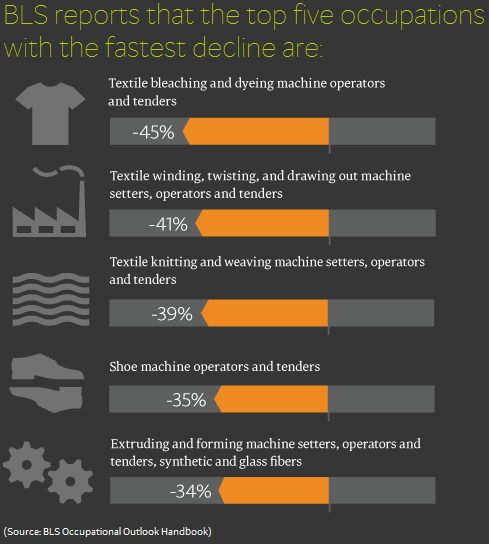
They also identify the five occupations expected to show the fastest decline over the next several years, which we can describe in one word - "textiles":
Finally, let's look at what CareerBuilder says are the skills the employers of the future will by seeking among job applicants:

While we can't help but observe that this last chart would be a candidate for a review on JunkCharts (we suppose the big gray circle is there just for decoration), the point made by the actual information presented in the chart is clear. The question for those on the outside looking in at the job market is: "How closely does what you're doing to build up your personal skills to be more attractive as a job candidate look like what employers say they really care about?"
Labels: jobs
In June 2005, President Barack Obama paid $1.65 million to acquire his house in Chicago. How much do you think he still owes on it today?  Stately Obama Manor (Image Source: Zillow)
Believe it or not we can actually answer that question using information from the President's tax returns, which he has released to the public! Combined with information about his mortgage, which the Washington Post has been kind enough to publish, we estimate that as of this month, April 2012, President Obama still owes approximately $806,000 on his residence at 5046 South Greenwood Avenue in Kenwood, Illinois.
Here's how we know. Since President Obama closed on the transaction to purchase his Chicago residence in June 2005, we estimated that his first payment would be in August 2005. Taking the original amount of the President's mortgage (approximately $1.32 million) along with his interest rate (5.625%), we used Hugh Chou's mortgage calculator to generate a full amortization schedule for the President's 30 year mortgage, which would apply provided that the President has never acted to refinance his mortgage.
President Obama's monthly mortgage payment on his Chicago residence is over $7,598. This combined total of just principal and interest adds up to $91,184 per year.
We then worked out what remaining principal would coincide with having made $47,564 in mortgage interest payments over a 12 month period of time, as he did for the 2011 tax year under the terms we know of his mortgage. That amount turns out to be almost $821,000, which represents the amount that the President still owed on his house in Chicago as of the end of 2011.
Looking ahead by four additional months down the amortization schedule to bring us up to this point in time, April 2012, would put the amount of principal still remaining on the President's mortgage at approximately $806,000. And that's how we arrived at this figure!
The President's Previous Payment History
Examining President Obama's previously released tax returns, we can reconstruct a good portion of the President's payment history on his mortgage.
For example, sometime in either December 2005 or January 2006, the President made an extra payment toward his mortgage of approximately $225,000. We base this estimate upon what the remaining principal on his house would have to be in order to accumulate just the $60,449 of mortgage interest payments by the end of the year, as reported on his 2006 taxes. If President Obama had not made the extra payment on his mortgage, he would have instead reported total mortgage interest payments for 2006 of around $73,000.
The $225,000 figure is not coincidental. Our best estimate of the actual value of President Obama's residence at the time he originally purchased it indicates that he overpaid by approximately $222,170. President Obama's released income tax records therefore provide evidence that indicates that he was fully aware that he had been taken to the cleaners in the transaction. So much so that he was willing to inject a substantial sum of cash into his mortgage for the sake of reducing his increased exposure to the risks of being fully underwater on his newly purchased house less than six months after making his first payment on it.
We also note that January 2006 saw the President's purchase of the so-called "Rezko" lot, a 10 foot wide by 50 feet long strip immediately south of the President's original property for $104,500 in cash. All told, we estimate that the President put nearly $330,000 of cash from his own pocket into his property in Chicago at that time. That would be on top of his original $330,000 down payment for the residence over six months earlier.
Using the same analysis methods as we did for 2006, we estimate the President made extra payment(s) totaling around $14,000 toward his mortgage in 2007, and in 2008, the President paid roughly an additional $31,000 toward his mortgage, above and beyond his regular monthly payments.
Since becoming President and moving to Washington D.C. to live at taxpayer expense in the White House, Barack Obama has made no extra payments toward his mortgage. The amount of mortgage interest paid during these years as reported on his taxes is fully consistent with only making scheduled payments for the remaining principal on the mortgage as reduced by the extra payments described above.
Data Sources
Obama, Barack. 2005 Tax Return, 2006 Tax Return, 2007 Tax Return, 2008 Tax Return, 2009 Tax Return, 2010 Tax Return, 2011 Tax Return.
Stephens, Joe. Obama Got Discount on Home Loan. Washington Post. 2 July 2008.
Other Sources
Image Credit: Zillow
Previously on Political Calculations
- How Much Is Obama Underwater Today?
We estimate how much President Barack Obama's house in Chicago is really worth at the end of June 2011. He was most definitely underwater compared to what he paid for it, but we didn't ask whether he was underwater on his mortgage, which we couldn't answer at the time....
- Is Obama Underwater?
We wondered if President Obama, like many Americans, was underwater on the house he purchased in 2005. It turned out that he was!
- How Much Was Obama's House Really Worth When He Bought It?
We take you through the data for how we nailed down the value of Barack Obama's house in Chicago at the time he bought it.
- How Much Is Barack Obama's House Worth Today?
We find, using the value of a comparable property sold in August 2008, that 1.43 million seems to be right after accounting for the luxury features his house incorporates! That doesn't include the additional strip of land he bought in January 2006, but turns out to be amazingly close to what we found using projecting data forward from the past. We've got the values bookended!
- Return to the Rezko Lot
New information about the appraised value of the "Rezko Lot" led us to revisit our analysis of the transactions involving this lot and 2008 Democratic party presidential candidate Barack Obama we had originally presented in The House That Obama Bought
- The House That Obama Bought
Now obsolete! Here, using that data and assumptions that we have replaced with new information, we showed that at a minimum, 2008 Democratic Party presidential nominee and current Senator Barack Obama (D-IL) paid $360,738 more than his house in Chicago was worth in 2005. At a maximum, he overpaid by as much as $468,502 for the property where his family now resides.
- Barack Obama's Big Mac Attack
Our tongue-in-cheek look into the negotiations and transactions surrounding Senator Obama's purchase of his current home - kind of a fun introduction to the relative valuations involved, all in the context of a trip to McDonald's! Remarkably, even though we've redone all our calculations, this post stands the test of time!
- Does Senator Joe Biden Have a House Problem? (Part 1)
We looked into suggestions that Senator Biden unduly benefited from the purchase of the property where he built his current home. We introduced our analytical method for projecting the value of real estate properties in this post.
- Does Senator Joe Biden Have a House Problem? (Part 2)
Here, we looked into long-standing allegations that have dogged Senator Biden regarding whether or not he unduly profited from the sale of his previous home in 1996. We originally couldn't make a determination, but thanks to one of our intrepid readers, we were able to find that he did not. Also, where we first built a tool to do the math!
Labels: real estate, taxes, whoops
The March 2012 edition of the Harvard Business Review is featuring an article by General Electric's CEO, Jeffrey Immelt, a man we've previously described as someone who "couldn't compete his way out of a wet paper bag."
Immelt, who also heads President Obama's Council on Jobs and Competitiveness, writes on "Sparking an American Manufacturing Renewal". In that article, he points to GE Appliances as an example for the broken paradigm of offshoring work to foreign countries when it might otherwise make more sense to stay in the U.S. (HT: Mark Perry):
One thing is clear: Outsourcing that is based only on labor costs is yesterday's model.
Today at GE we are outsourcing less and producing more in the U.S. We created more than 7,000 American manufacturing jobs in 2010 and 2011. Our success on the factory floor rests on human innovation and technical innovation – the keys to leading an American manufacturing renewal. When we are deciding where to manufacture, we ask, "Will our people and technology in the U.S. provide us with a competitive advantage?" Increasingly, the answer is yes.
Engineering are hands-on and iterative, and our most innovative appliance-design work is one in the United States. At a time when speed to market is everything, separating design and development from manufacturing didn't make sense.
Complex trade-offs have always been involved in location decisions, but as these trade-offs have shifted, around 2008, we came to the conclusion that outsourcing was quickly becoming mostly outdated as a business model for GE Appliances.
It's funny that he uses GE Appliances for his example, because that division of the company also provides a unique example of how dependent the entire company has become upon federal government's mandates, protections and subsidies for its revenue.
Here, if you want to see just how dependent the company has become upon the federal government "assistance", look no further than the front of its latest microwave ovens, where you'll find the "MyPlate.gov" button.

What does this mysterious button do? Can you figure it out without doing some research? Couldn't the company's designers devise a more intuitive way of communicating what will happen to whatever you've put in the oven to cook if you press it? And just what kind of results will you get out of that GE appliance if you use it?
That you cannot answer any of these questions right off the bat tells you that really bad design is involved.
But maybe you can figure it out from the other buttons that are right next to it. You can clearly see it's right under the Popcorn, Reheat, Family Snacks, Soften, and Steam buttons.... Surely it's obvious what GE's "human and technical innovation" staff intended purpose for the button is!
Or not. From our perspective, we think a better explanation of the function of the "MyPlate.gov" button has to do with GE's reliance upon government assistance for its revenue. We can't imagine what kind of detailed marketing studies or kind of high-level engineering analysis that might be performed by GE Appliance's non-outsourced "human and technical innovation" staff that would ever suggest putting such a mysterious label on a button on a microwave oven would be a good idea.
By contrast, you probably don't have any questions about what purpose the "Popcorn" button serves. That's because somebody actually studied how people actually use their microwave ovens over time and found that a special purpose button like that makes sense to include on the product. And because it captures how many people are actually using their microwave ovens, there's no question what function the "Popcorn" serves. That's how good design works in the real world!
That leaves the most likely explanation for the button's very presence on a device that might find a home in millions of American households is that the suits at GE thought it would be a good idea because it would make somebody in the U.S. federal government happy. Because if your revenue depends upon making those people happy, rather than say, consumers, good product design sense is going to go out of the window.
The "MyPlate.gov" button would also be an indication that GE has given up on the idea of exporting these particular units outside the United States. Because why would any potential consumer in any other country care about a button on a microwave oven whose mysterious purpose involves some sort of U.S. government web site?
We wonder when we might expect "milking government assistance for competitive advantage" to become the next outdated business model for GE?
References
Immelt, Jeffrey R. "The CEO of General Elecric on Sparking an American Manufacturing Renewal". Harvard Busines Review. March 2012.
Image Credit: Dalai's PACS Blo0g.
Just in case you might have thought that we were the only ones going tax-related tool crazy these days, Nick Kasprak of the non-profit Tax Foundation has done a major update to the organization's MyTaxBurden tool!
Today the Tax Foundation releases its latest interactive tool, an update and overhaul of its successful MyTaxBurden tax calculator. I've rewritten the calculator from the ground up and added a variety of new options and features.
The original MyTaxBurden calculator was released in July 2010, and calculated tax bills for tax year 2011 under three scenarios - full expiration of the Bush and Obama stimulus bill tax cuts, full extension of those cuts, and partial expiration for high income earners in the form proposed by President Obama. Later we added a similar proposal to reflect the proposals of Congressional Democrats, and finally the compromise plan that became law in December.
However, one limitation of the calculator was that it wasn't possible to customize policy scenarios in any real way. Suppose, for example, I wanted to compare the effects of failing to patch the AMT under full extension or full expiration of other tax cuts? What if I wanted to look at how my tax burden changes from year to year, and compare my 2010 bill to my 2011 bill? What if I want to look at the President's proposal, with and without the Buffett rule? What if I wanted to look at all of these scenarios but also see what would happen if health care reform is overturned by the Supreme Court?
The new calculator lets the user make these decisions. Each scenario in the calculator represents a particular combination of pieces of legislation, any of which can be turned on and off individually, on top of current law.
Here's a screen shot we snapped of the tool's basic interface:

The basic interface is a quick and easy for casual users, but the real strength of the tool is it's ability to go into great detail.
For example, once you click to "Calculate My Income Tax", the MyTaxBurden tool will currently show how you will fare on your taxes under current law, in 2013 after the "Bush tax cuts" of 2003 expire, and under the various proposals that President Obama has advanced.
And then, you can go even deeper into detail! And if you find anything worth commenting upon, the MyTaxBurden tool makes it easy to share what you find with whomever you might choose! (For those who would not like to circulate their income data around the Internet, we recommend entering non-specific data....)
By way of example of what the tool is capable of doing, Nick has put President Obama's own tax return data for 2011 into the MyTaxBurden tool to see how he might fare under four possible scenarios!
To show a quick example of this, let's take a look at President Obama's 2011 tax return under four scenarios:
- actual 2011 tax law,
- full expiration of Bush-era and stimulus tax cuts in 2013 (the default "Tax Cuts Expire" scenario),
- same as (3) except that the AMT is also not patched ("Taxmageddon"), and
- the President's own budget, plus the enactment of the "Buffett Rule" (the default "Obama proposals scenario.)
(2) and (3) are the same in this case, since the expiration of the Bush tax cuts pushes the President out of AMT.
As for how President Obama fares under his own proposals, Nick observes:
Ironically, the President owes the most under his own proposal, because his budget includes a provision to cap the benefits of itemized deductions to at most 28% of their value.
And so we find that the President is unwilling to allow any deduction to go unclaimed on his own tax return....
On a final note, we reviewed the previous generation of the MyTaxBurden.com calculator back in July 2010, awarding it our "Silver Standard" for overall online tool quality.
We're upgrading the MyTaxBurden calculator to our "Gold Standard", as the new generation of the tool appears well adapted to go far beyond the time-specific limitations that held us back from giving it that award in its previous incarnation. We find that it produces highly informative results, allowing users to enter as much or as little data as they might wish in a very clean user interface, producing highly detailed, yet easy to follow results. Very highly recommended.
 Tax day 2012 has arrived! And what better way to mark the day where your income taxes have finally come due than by providing another form for you to fill out just so you can see how much you would have been taxed when income tax forms were first issued by the IRS in 1913!
Our tool below is based upon the first page of the original Form 1040, which originally consisted of just four pages: the summary sheet modeled below (Page 1), the Gross Income calculation sheet (Page 2), the General Deductions sheet (Page 3) and finally, one page of Instructions (Page 4). Yes, you read that right. Just one page of instructions!
We'll make it just a bit easier still. All you need to do is to enter the indicated data (shown in boldface type) below with your figures from this year, and we'll take care of the math (which we show in the shaded rows of the form!):
Excerpts from the Instructions
3. The normal tax of 1 per cent shall be assessed on the total net income less the specific excemption of $3,000 or $4,000 as the case may be. (For the year 1913, the specific exemption allowable is $2,500, or $3,333.33, as the case may be.) If, however, the normal tax has been deducted and withheld on any part of the income at the source, or if any part of the income is received as dividends upon the stock or from the net earnings of any corporation, etc., which is taxable upon its net income, such income shall be deducted from the individual's total net income for the purpose of calculating the amount of income on which the individual is liable for the normal tax of 1 per cent by virtue of this return.
19. An unmarried individual or a married individual not living with wife or husband shall be allowed an exemption of $3,000. When husband and wife live together they shall be allowed jointly a total exemption of only $4,000 on their aggregate income. They may make a joint return, both subscribing thereto, or if they have separate incomes, they may make separate returns; but in no case shall they jointly claim more than $4,000 exemption on their aggregate income.
Well, wasn't that a fun exercise! Are you ready for the "improved" modern version of the same thing now?
As a final note, we first published our "Original Form 1040" tool back on 10 April 2007 - we hope you enjoyed this trip to yesteryear!
How many pages does it take for the CCH Standard Tax Reporter to fully document the U.S. tax code as it stands in 2012?
If you answered 73,608, you're right. Note that we didn't say "you win"!...
Update 24 February 2013: For the answer for 2013, see here!

Believe it or not, that's within 1.3%, or 956 pages, of the number of pages that our tool below would predict that the CCH Standard Tax Reporter would be this year!
You might think that our tool being "off" by 956 pages is a bad thing that might depress us! But it's it's really a cause for celebration, especially when you consider real reason why the U.S. tax code isn't growing as much as our tool would predict: it's a direct benefit of having the laziest U.S. Senate perhaps ever in U.S. history!
 Now that we've covered your ideas for what might work for a flat income tax for the U.S., let's say you're one of those really twisted people who don't care how twisted you make the income tax code, so long as you stick it to the topmost income earners in any given year. Even if they're never really the same people.
How high might you be able to realistically set that topmost income tax rate given that you need to get your proposal through the U.S. Congress?
Once upon a time, we created a tool that makes it possible to predict how high U.S. politicians will set the maximum personal income tax rate in the U.S., depending upon three things:
- The size of the U.S.' national debt.
- The nation's GDP, and;
- Its population.
This exercise is especially timely now that President Obama and his Democratic Party are pushing to hike that top rate to 50%, which includes the so-called "Buffett tax", it's time to see how well our tool works.
Using our tool with the default data, which represents the most recent data available on 17 April 2012, we find that today's national debt burden per capita scores in at 3.168, which translates to an "old school" maximum income tax rate of 72.6%. Modern politicians are a different breed however, preferring to stay closer to the margins where changes in the nation's maximum personal income tax rate are likely to be triggered for the political advantages such a strategy offers. Our tool finds that they would set the top tax rate at 49.2%.
President Obama and the congressional Democrats are currently proposing to raise the top tax rate to 50.0%.
We should note that the real difference between the "old school" and "modern" politicians is that the "old school" politicians didn't actually know where the margins for triggering changes in the top income tax rate are - it's something that's had to be worked out by political trial and error. It has really only been since the late 1960s, and really, since the 1980s, that U.S. politicians appear to have registered any sort of recognition that these margins exist.
Comparing Today with the Past
The first time we featured this tool back in April 2009, the U.S. national debt was only 11.15 trillion dollars, U.S. GDP was 14.2 trillion dollars and the U.S. population was estimated to be 306,170,293. The national debt burden per capita was 2.565, which corresponds to an "old school" top tax rate of 62.1%. Modern politicians would the top tax rate would be somewhere close to 40% with that old data. And President Obama was, at the time, seeking to let the Bush-era tax cuts expire, which would push the top marginal income tax rate up to 39.6%.
The reason today's predicted maximum income tax rate has risen to 49.2% since that time is completely due to President Obama's spending, which has significantly driven up the national debt.
Of course, we foresaw that President Obama would push for higher income tax rates back in December 2009 as well, finding that the sharp rise in the national debt through that point in time would likely result in the maximum personal income tax rate in the U.S. being set somewhere between 44 and 45%.
And that's exactly where they're currently set to rise in 2013, thanks to the new taxes that congressional Democrats and President Obama imposed through the Patient Protection and Affordable Care Act (aka "Obamacare").
Adding in President's Obama and the congressional Democrats' "Buffett Tax" of 5.4% is how we get to the new proposed top income tax rate of 49% 50%.
Which either means that they're overshooting where they should set the top income tax rate, or are planning to crank up spending and the national debt even more to make that rate seem to make sense.
Updating the Chart
As you might imagine, tracking the interaction between the United States' national debt, GDP, population and U.S. politicians for the sake of predicting how high they might try to set the maximum personal income tax rate gets pretty complicated. Fortunately, we have a chart that visualizes all this data, which incorporates President Obama's optimistic national debt and GDP forecasts through 2016:
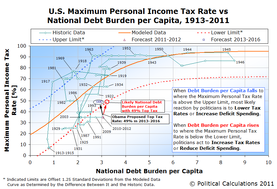
What can we say? President Obama is nothing else if not depressingly predictable. We've had his number for a pretty long time now....
Speaking of which, here is a criticism of our "Debt Burden per Capita" index value, which we put to practical application for the tool featured in this post. We would describe the critic as a "total crank", who despite our best efforts, would seem to reject the principles of basic algebra that we used to create our index and also completely disregards the idea that a successful practical application of such math trumps their extremely limited perspective on reality. What an empty suit!
 Now that you've gone through the ever-increasing hassle of filing your annual income taxes, especially if it took you until today to file your income taxes for 2011, perhaps you're now thinking to yourself "there's got to be a better way to do this!"
So why don't you invent one?
What if you were in charge of reforming the U.S. individual income tax? Would you consider ditching today's excessively complex tax code in favor of something much, much simpler? Something like a flat income tax, perhaps?
If so, you've come to the right place! Our featured tool for this post, which we originally introduced in September 2011, puts you in the driver's seat for determining how the nation's, and your own, fortunes would fare under such a system!
In the tool below, all you need to do is enter the percentage income tax rate that would apply to all Americans, from Warren Buffett on down to his pool of non-amused secretaries, along with the value of a single tax credit, which would be provided to each individual American, again regardless of who they are.
After that, if you want to see how your or your family's income taxes might change as a result of your dramatic proposal, enter your household's total money income (whether you earned a salary, wages, capital gains, and/or dividends) and the number of individuals who would be covered by it (sorry, pets and other livestock need not apply!)
About the Tool
We used our model of the 2010 aggregate distribution of household total money income for the U.S. in generating the "how would the federal government do with your flat tax?" portion of the tool, along with the U.S. GDP for 2010, and the IRS' count of the number of exemptions reported on tax forms for 2009 (the most recent year this data is available.)
The rest was just simple math! (Trust us - you should see how the IRS does quadratic equations!)
Final Thoughts
In 2011, it took 72,536 pages to document the ins and outs of the U.S. tax code. We whipped our tool up yesterday afternoon. If you're into simple, this is about as simple as it gets.
Do you think anyone in Washington, D.C. wants that?
Data Sources
White House Office of Management and Budget. Budget of the United States Government: Historical Tables Fiscal Year 2012. Table 2.1 - Receipts by Source: 1934-2016. [Excel Spreadsheet]. 14 February 2011. Accessed 28 September 2011.
Bureau of Economic Analysis. Gross Domestic Product: Second Quarter 2011 (Second Estimate). 26 August 2011. Accessed 28 September 2011.
Internal Revenue Service. Selected Income and Tax Items for Selected Years (in Current and Constant Dollars). Individual Complete Report (Publication 1304), Table A, 1990-2009. [Excel Spreadsheet]. Accessed 28 September 2011.
Image Credit: Real Clear Markets (thanks guys!)
Welcome to the blogosphere's toolchest! Here, unlike other blogs dedicated to analyzing current events, we create easy-to-use, simple tools to do the math related to them so you can get in on the action too! If you would like to learn more about these tools, or if you would like to contribute ideas to develop for this blog, please e-mail us at:
ironman at politicalcalculations
Thanks in advance!
Closing values for previous trading day.
This site is primarily powered by:
CSS Validation

RSS Site Feed
JavaScript
The tools on this site are built using JavaScript. If you would like to learn more, one of the best free resources on the web is available at W3Schools.com.
Other Cool Resources
Blog Roll


