We're trying out Google's Fusion Tables for its data visualization capabilities, so we extracted some data on motor vehicle thefts from the FBI and created the following interactive visualization for the states with the highest per capita rate of motor vehicle thefts (sorry District of Columbia - you're neither a state nor a place where people don't have to worry much about their cars being stolen!):
We're not sure why Washington state's data isn't properly displaying (the state saw 355.1 motor vehicle thefts per 100,000 inhabitants), but our initial impression is that what Google's programmers have developed is cool, if not quite fully ready for prime time.
Labels: data visualization
We've been playing once again with IBM's ManyEyes online data visualization tools. The results of today's experiment shows the number of criminal alien incarcerations by state for the years from 2003 through 2009:
SCAAP Criminal Alien Incarcerations in State and Local Jails, 2003-2009


An interactive version of the chart along with the source data are available for you to knock about with as well!
The interactive version will also allow you to tap the numbers behind the chart - so, for instance, you'll be able to see that the large population state of Ohio has seen the number of criminal aliens that it has incarcerated more than double since 2003, growing from 756 in that year to 3,879 in 2009. Meanwhile, the large population state of New York has seen its number of incarcerated criminal aliens fall by just over 30%, from 16,130 in 2003 to 11,096 in 2009.
As for the Top 10 states for the largest reported population of criminal aliens (or rather, undocumented immigrants who have committed felonies or multiple misdemeanors) for 2009, they are:
- California (102,795)
- Texas (37,021)
- Arizona (17,488)
- Florida (17,229)
- New York (11,096)
- Illinois (10,677)
- New Jersey (9,971)
- North Carolina (8,948)
- Colorado (7,574)
- Georgia (7,371)
Altogether, California accounts for 34.7% of the number of criminally incarcerated undocumented immigrants in the United States in 2009, with Texas coming in second at 12.5%, Arizona third at 5.9%, Florida fourth with 5.8% and New York fifth at 3.5%.
Data Source
U.S. Government Accountability Office. Criminal Alien Statistics: Information on Incarcerations, Arrests, and Costs. March 2011. GAO-11-187.
Labels: data visualization
If you had to guess, what adjusted gross income range would you say had the biggest gains in the number of households included within that range during the years from 1996 through 2009? Here are the choices:
- $1 to $25,000
- $25,000 to $50,000
- $50,000 to $75,000
- $75,000 to $200,000
- $200,000 and over
We won't keep you in suspense. The answer is displayed in the following chart:

In looking at the chart, you can easily see that the cumulative distribution curves for adjusted gross incomes from $1 through $75,000 are within very close proximity to one another for all years shown on the chart. So much so that these curves essentially overlap each other.
And when you look at households with adjusted gross incomes above $200,000, you can see that this portion of each year's cumulative distribution curve runs nearly parallel with all the others. This indicates that there has been very little change in the number of households counted as having incomes above this level.
But the income range that saw the greatest change from year to year for each year from 1996 through 2009 is that for households with adjusted gross incomes between $75,000 and $200,000.
In fact, if not for the growth in the number of households in this income range, the cumulative income distribution curves would be nearly identical from year to year! How different is that observation from what you've likely heard in the media during all these years?
Finally, note the data curves for 2000-2003 and 2009 in the chart above. These are years that coincide with recessions in the United States, where the change in the number of households earning between $75,000 and $200,000 was either flat (2000-2003) or falling (2009).
It is the reduction in the number of households earning adjusted gross incomes between $75,000 and $200,000 that accounts for the majority of any shortfall that existed in the U.S. government's tax collections during these years. And that's something that neither increasing tax rates nor reducing "spending through the tax code" for households with incomes over $200,000 can ever fix.
The numbers just aren't there!
Data Sources
Internal Revenue Service. SOI Tax Stats - Individual Statistical Tables by Size of Adjusted Gross Income. All Returns: Selected Income and Tax Items. Classified by: Size and Accumulated Size of Adjusted Gross Income. Published as: Individual Complete Report (Publication 1304), Table 1.1. Tax Years: 2009, 2008, 2007, 2006, 2005, 2004, 2003, 2002, 2001, 2000, 1999, 1998, 1997, 1996.
Labels: income distribution, income inequality, taxes
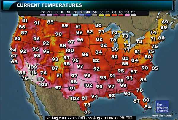
At this late summer date, the Weather Channel's map of high temperatures in the U.S. looks like this:
Which made us think the following diagram might be especially helpful for deciding how to best keep cool this weekend:
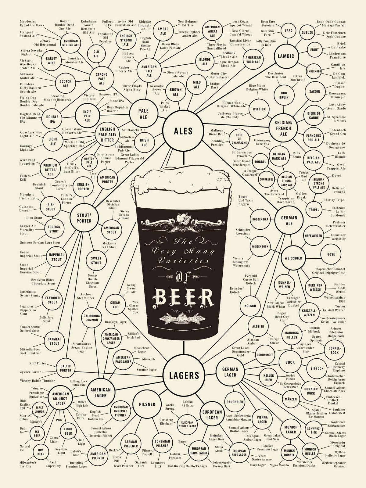
As for how to keep your beverage of choice cool once you've selected it, be sure to see what science has to say on the matter....
Labels: data visualization, food
The number of new jobless claims through 20 August 2010 is now out for the U.S., as the number of unemployment insurance initial claim filings rose to 417,000. That figure is well within the range of values we would expect for the statistical trend established since 9 April 2011.

At 417,000 for 20 August 2010, the initial number of new jobless claims in the United States is still 100,000 higher per week than the level that would be consistent with a genuinely "stable" U.S. economy, which was last observed in the years from 2005 through nearly all of 2007.
Side Note: We would describe the media's recent suggestion that levels of new jobless claims "below 400,000" are consistent with a stable U.S. economy as being north of normal by as much as 80,000 layoffs per week.
Now falling at an average rate of roughly 810 new unemployment insurance claim filings per week, the current trend was established beginning on 9 April 2011. At that established rate, it would take 122 weeks, or just over 2 years and 4 months, for the number of new jobless claims filed each week to return to the level that was normal before December 2007, when the so-called "Great Recession" officially began.
Labels: jobs

What kind of return can you expect to get from your "investment" in Social Security?
We thought it was long past time to update our previous look at that question to take advantage of the updated actuarial projections that were just issued in July 2010.
We then created a mathematical model for the data that represents the "present law" assumptions for the program's payout, which should put most of the calculated internal rates of return in our tool below within 0.2% of the projected return provided by Social Security's actuaries. That is, assuming they don't hike your taxes or slash your benefits at some point in the future!
Update: Minor calculation glitch now fixed!
High, Low and Average
If your birth year is before 1930, you can expect that your effective rate of return on your "investment" in Social Security is at the high end of the range presented above.
On the other hand, if your average lifetime annual income is high (more than $60,000), you can expect that the approximation is overstating your rate of return and that your effective rate of return is closer to the low end of the approximated range.
Otherwise, you should be pretty comfortably somewhere near the average approximate value!
Winners and Losers, Generally Speaking
In using the tool, you'll find that Single Males fare the worse, followed by Single Females and Two-Earner Couples, while One-Earner Couples come out with the best rate of return from their "investment" in Social Security.
These outcomes are largely driven by the difference in typical lifespans between men and women. For the typical One-Earner Couple, the household's income earner, usually male, dies much earlier than their spouse, who keeps receiving Social Security retirement benefits until they die. This advantage largely disappears if both members of the household work, which increases the amount of Social Security taxes paid without increasing the benefit received.
The Older The Better
 Going by birth year, you'll find that those born in recent decades don't come out anywhere near as well as those born back when the program was first launched in the 1930s. This is primarily a result of tax increases over the years, which have significantly reduced the effective rate of return of Social Security as an investment.
For example, when Social Security was first launched, the tax supporting it ran just 1% of a person's paycheck, with their employer required to match the contribution.
Today, 4.2% of a person's paycheck goes to Social Security, down from 6.2% in 2010, which is one reason why Social Security is now regularly running in the red. (President Obama is actively seeking to continue that situation.)
Meanwhile, employers pay an amount equal to 6.2% of the individual's income into the Social Security program. Since benefits are more-or-less calculated using the same formula regardless of when an individual retires, the older worker, who has paid proportionally less into Social Security, comes out ahead of younger workers!
The Poorer the Better
If you play with the income numbers (which realistically fall between $0 and $97,000), you'll see that the lower income earners come out way ahead of high income earners. Social Security's benefits are designed to redistribute income in favor of those with low incomes.
Living and Dying
There's another factor to consider as well. This analysis assumes that you will live to receive Social Security benefits (which you only get if you live!) If you assume the same mortality rates reported by the CDC for 2003, the average American has more than a 1 in 6 chance of dying after they start working at age 19-20 before they retire at age 66-67. Men have a greater than a 1-in-5 chance of dying before they reach retirement age, while women are slightly have slightly over a 1-in-7.5 chance of dying pre-retirement age.
Morbid? Maybe. But your Social Security "investment" isn't as without risk as many politicians would have you believe!
Labels: social security, tool
How can you make your résumé stand out from the crowd in today's job market?
Eugene Woo, the CEO and founder of Visualize.me, describes the problem confronting millions of job seekers:
"People aren't even really reading [resumes] anymore," said Vizualize.me CEO and founder Eugene Woo. "They've gotten too long, and they just aren't useful."
That sentiment is why Woo's company has built an online web app that pulls information about an individual's work, education and skill experience from their LinkedIn profile, and allows them to generate what we would describe as a résumé infographic:

From our perspective, this kind of information visualization is something that we've been wanting to do for some time, and apparently, we're not alone. At present, there is a waiting list of over 175,000 people waiting for a beta invite to use the web app.
Including us!
HT: Drake Martinet
Labels: data visualization

Once upon a time, we found that stock prices are a contemporary indicator of the state of the U.S. economy, meaning that instead of telling us what's going to happen in the future, they tell us what's happening today.
So what exactly is the stock market trying to tell us about what investors are expecting for the U.S. economy?
Let's first look under the hood of the S&P 500. Because changes in the growth rate of stock prices are directly proportionate within a narrow range to changes in the growth rate of their expected underlying dividends per share at defined points in the future, we can use dividend futures data along with current stock prices to determine the extent to which changes in future expectations in the stock market's fundamentals are responsible for the changes we observe in today's stock prices.
The chart below [1] shows where things stand as of Friday, 19 August 2011. We've shifted the dividend data some 7 months to the left, which assumes that investors are currently focused on where the income they can expect to earn from dividends will be at the end of 2011 (the dividend futures data for 2012Q1 covers the period from 17 December 2011 through 16 March 2012.)

Here, we observed that the change in the growth rate of stock prices has sharply decoupled from where their underlying dividends per share would place them. This is a characteristic of what we call a "noise event", which indicates that factors other than those direct expectations are influencing stock prices.
Further, the magnitude of the change is approximately equivalent to the deviation between the two that we observed between April 2010 and September 2010, a period in which deflationary expectations took hold, as it fell between the U.S. Federal Reserve's Quantitative Easing 1.0 (QE 1.0) program and the subsequent Quantitative Easing 2.0 (QE 2.0) program, which recently ended on 30 June 2011.
As we saw then, stock prices have fallen approximately 10% from where they would otherwise be without such noisy expectations at work. The chart below shows the S&P 500's average monthly index value against its trailing year dividends per share to put the two deflationary expectation driven noise events into perspective:
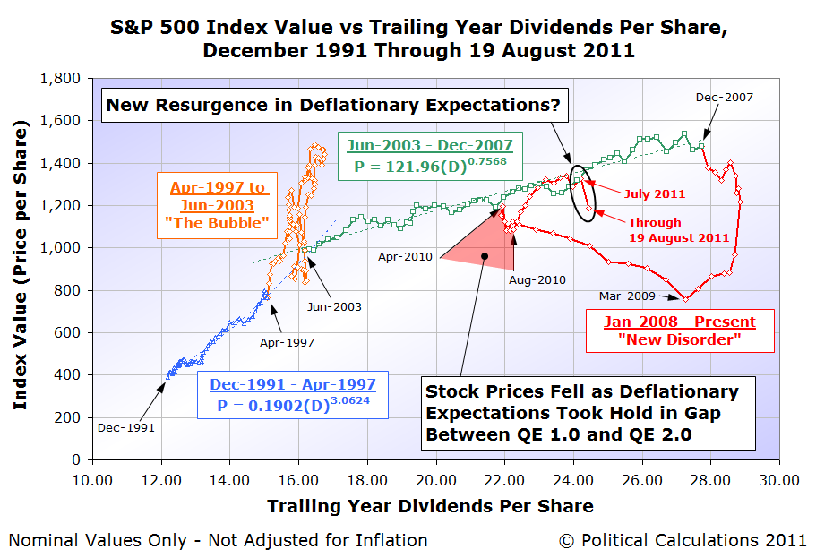
This second chart also provides some insight into the short term noise event we saw from March through April 2011 in our first chart. Here, we are seeing the effects of adjustments the Federal Reserve made to its QE 2.0 program, as it appears that the U.S. central bank was indeed targeting specific stock price levels to correspond with the S&P 500 index' dividends per share in setting the amount of positive inflation generating quantitative easing they were doing at that time.
In effect, once stock prices reached a level that would be consistent the major trend in stock prices that existed from June 2003 through December 2007 for the similar level of dividends per share (shown as the green dashed line in the second chart), the Fed took their foot off the QE gas pedal. That brief deflationary adjustment then shows up as the short term noise event during these two months in our first chart.
Surveying the currently developing economic situation, Jim Hamilton anticipates the Fed's next move with respect to the apparent resurgence of deflationary expectations:
And in response, the Fed should do what, exactly? A new phase of large-scale asset purchases (which doubtless would be referred to in the press as QE3) could sop up a few more percent of publicly-held Treasury debt. Conceivably that could put pressure on the nominal or TIPS yields to decline even further, and I suppose that one might hope that a 10-year real Treasury yield of -0.2% would be slightly more stimulative than the current real yield around zero.
I would suggest that the more important and achievable goal for the Fed should be to keep the long-run inflation rate from falling below 2%. The reason I say this is an important goal is that I believe the lesson from the U.S. in the 1930s and Japan in the 1990s is that exceptionally low or negative inflation rates can make economic problems like the ones we're currently experiencing significantly worse. By announcing QE3, the Fed would be sending a clear signal that it's not going to tolerate deflation, and I expect that would be the primary mechanism by which it could have an effect. Perhaps we'd see the effort framed as part of a broader strategy of price level targeting.
Once that happens, if the Fed continues to use stock prices as its gauge for setting the amount of quantitative easing it will do, we can expect stock prices to begin increasing in response. We anticipate that the market will bottom either this month or in September as the Fed initiates such a program.
Notes
[1] This is perhaps the most complex chart we use to analyze the stock market. In addition to a frequently changing level of change in the expected growth rates of dividends per share and stock prices, investors can shift their focus to different points of time in the future as well, which is why we shift the position of the dividend data from right to left.
Over time, the two track each other within a narrow band of variation quite closely (except during large noise events), which would be easier to see on a time-lapse version of the chart. One important thing to note is that as shown, the historic data for dividends per share shows their final recorded value, rather than the level they were when the changes in expectations they represent were changing stock prices.
Labels: chaos, economics, SP 500, stock market
You might not have realized it, but there is a mathematical formula that defines how to produce the perfect piece of toast:
They spent three months experimenting with gadgets and grills and packs of butter to find out how thick the spread should be.
Finally, they concluded that the answer was... about ONE SEVENTH of the thickness of the bread.

The formula, commissioned by UK butter producer Lurpak, was crafted by food scientists at the University of Leeds and designed to produce the optimum combination of butter and bread for a slice of toast. The elements of the formula are as follows:
- ha = thickness of bread
- hb = thickness of butter
- Cpa = Specific heat capacity at constant pressure for bread
- Cpb = Specific heat capacity at constant pressure for butter
- ρa = Density of bread
- ρb = Density of butter
- T = Temperature of toasted bread
- wa = Weight of bread
- wb = Weight of butter
Fortunately, Professor Bronek Wedzicha saved us the trouble of researching the various values of these components and gets straight to what we need to know to "release Lurpak's maximum taste potential on your slice of bread":
The calculations should result in hot toast with islands of butter which have not quite melted.
Prof Wedzicha said: “The release of flavour when butter is only partly melted intensifies the taste, along with a cooling sensation in the mouth which is enjoyed by those who eat buttered toast.
"If butter is allowed to soak into toast, the effect is less."
The scientists discovered that the unmelted butter must have a temperature just below body heat for it to melt in the mouth.
Researcher Dr Jianshe Chan, said: "It gives you a melting feeling and smooths the toast."
The team said the bread should be toasted to at least 120°C until it turns golden brown.
The butter should be taken from the fridge with a temperature of 5°C and spread while the toast is about 60-70°C.
A hard butter with a high melting point temperature creates more pools of unmelted butter.
We assume that the formula is really giving the thickness of the pad of butter, as cut from a standard stick, which would be applied when the just-toasted bread has cooled to approximately 60° Celsius. Kind of like what the picture below implies:

Because we can't resist the opportunity to create a tool to solve real life problems like this, here's our tool for doing the math developed by the Leeds food scientists:
No, we really can't make this sort of thing up. But before you think that's the end of it, new scientific research has revealed the one vital piece of information missing from the formula above: the optimum toasting time for a slice of bread!
Now, after sacrificing 2,000 pieces of bread, and polling nearly 2,000 people, more research is claiming to have discovered the ideal cooking time for "the ultimate balance of external crunch and internal softness": precisely 216 seconds.
But wait, there's more!
The report, authored Bread expert Dr. Dom Lane, a consultant food researcher, and commissioned by Vogel, a bread company, also provides additional tips for those seeking toast nirvana:
- The best bread is 14 mm in width, and, ideally, it's just come fresh from the fridge.
- Butter immediately, before the toast becomes too cool to melt it. (Who knew?)
- The ideal amount of butter is .44 grams per square inch. Too much butter, the study explains, and the "toast will lose crucial rigidity, too little, and the moisture lost during toasting will not be replaced."
- Lift the toast your mouth carefully. Otherwise, "crucial butter may be lost on entry."
- And to clarify: "Obviously the shape of the toast once taken into the mouth doesn't effect the flavour or texture."
Science at work, ladies and gentlemen. And to show that no stone has been left unturned in working out how to craft the perfect piece of toast, here's what else Dr. Lane discovered:
Both sides of the bread should be cooked at the same time, using a toaster rather than a grill, to help 'curtail excessive moisture loss'.
And:
... the cooked and buttered slice should be cut once, diagonally, and served on a plate warmed to 45 degrees Celsius, to minimise condensation beneath the toast.
The reason for the one, diagonal cut, of course, is that "crucial butter and other toppings may be lost on entry, deposited on cheek or lip. We therefore recommend a triangular serving for ease of consumption".
Clearly, after all this scientific research, if you can't make a perfect piece of toast, it's your own damn fault.
What can international trade data tell us about the current state of the U.S. economy?
Quite a lot, actually! Previously, we found that we can use the change in the growth rate of U.S. imports from and U.S. exports to China to diagnose the economic health of each nation. We found that when an economy is growing, it will draw in a goods and services from outside its borders at a growing rate, while the opposite appears to be true for an economy that is contracting.
The chart below shows what we see for the U.S. and China through June 2011:

What we observe is that the economies of both the U.S. and China continue to realize slowing rates of trade growth, indicating that both economies are continuing to decelerate. The rate at which China's more strongly growing economy is pulling in goods and services from the United States is falling from the levels recorded in 2010, however the big story is found in the more severely falling level of China's exports to the United States.
We now observe that the growth rate of U.S. imports from China is at near-recessionary levels, confirming the declining economic situation of the United States through the first half of 2011. If we follow the current trend back to its peak, we observe that the decline really began in the middle of 2010.
As we've seen with the current U.S. employment situation, for all practical purposes, there has effectively been no sustained improvement in the U.S. economy since that time.
Labels: trade

Move over, CD Jewel Case! The new worst piece of design ever done is, drum roll please... Plastic Clamshell Packaging!
Anita Schillhorn writes:
Design should help solve problems. This packaging attempts to solve the problem of theft, but creates new problems that are far worse, principally irritating your own customers.
It's been the cause of thousands of emergency room visits, and there's even a Wikipedia-approved term to describe the frustration you feel when confronted with an unrelenting piece of plastic between you and your product:
Wrap rage. We know it well, but what can be done about it?
The answer might be found among the winners selected as part of the 23rd DuPont Packaging Awards (HT: Core77), where Proctor and Gamble was named a "Diamond Winner" for excellence in innovation, cost/waste reduction and sustainability for it's "Be Green" packaging:
In its new design, packaging for Gillette Fusion ProGlide moved away from a clamshell approach and opted instead for a formable pulp tray made of renewable bamboo and bulrush fiber-based material. This new package pushed the boundaries of pulp trays, reducing both cost and material weight. Additionally it is much easier to open, making it popular with consumers. The graphics strongly reinforce the product’s brand identity and support great shelf appeal.
This is a good example of why big business is good - in order to become a big business and to stay a big business, the people behind big businesses need to devote their great resources to work to make consumers happy. Otherwise, in a genuinely competitive market, some other business will. And as it happens, there are compelling economic reasons for big businesses to move away from plastic clamshell packaging:
The Pyranna, the Jokari Deluxe, the Insta Slit, the ZipIt and the OpenIt apply blades and batteries to what should be a simple task: opening a retail package.
But the maddening — and nearly impenetrable — plastic packaging known as clamshells could become a welcome casualty of the difficult economy. High oil prices have manufacturers and big retailers reconsidering the use of so much plastic, and some are looking for cheaper substitutes.
"With the instability in petroleum-based materials, people said we need an alternative to the clamshell," said Jeff Kellogg, vice president for consumer electronics and security packaging at the packaging company MeadWestvaco.
Companies are scuttling plastic of all kinds wherever they can.
And they're saving money in the process, adding to their bottom lines:
"We’ve seen a lot of small, high-value products moving away from what would have been two to three years ago a clamshell, to today what is a blister pack or blister board," said Lorcan Sheehan, the senior vice president for marketing and strategy at ModusLink, which advises companies like Toshiba and HP on their supply chains.
The cost savings are big, Sheehan said. With a blister pack, the cost of material and labor is 20 percent to 30 percent cheaper than with clamshells. Also, he said, "from package density — the amount that you can fit on a shelf, or through logistics and supply chain, there is frequently 30 to 40 percent more density in these products."
The packages also meet other requirements of retailers. Graphics and text can be printed on it.
Because most people cannot tear the product out of the blister pack with their hands, it helps prevent theft.
Which is the problem that plastic clamshell packaging was originally intended to solve. Thus, everybody wins....
Labels: business, ideas, technology
Philips, the maker of a $40 LED replacement for standard incandescent 60 Watt light bulbs, has won the U.S. Department of Energy's L-Prize. In addition to the title, the Netherlands-based company will collect 10 million dollars from U.S. taxpayers for the company's technical achievements.

Designed to replace an A19 style bulb, Philips' 12.5 Watt LED replacement bulb is one of the first alternative lighting technologies to come close to replicating the quality of light produced by the familiar incandescent light bulbs when lit.
At today's $40 price, the bulb may appear expensive, however we previously did the math and found that it could very well more than pay for itself over its 25,000 hour expected lifespan. You can see for yourself with the tool we developed below, and we should note that Philips has offered a series of rebates (here's the current $10 rebate for LED purchased between 1 July 2011 and 30 September 2011) to customers which makes the purchase of its 60-watt incandescent replacement much less costly.
We should note that Philips' Ambient LED Dimmable 60W Replacement Light Bulb is now available to be purchased on Amazon.
We're especially excited because the designs of the next generation LED products with similar levels of performance promises to offer more for less, complete with more compelling aesthetics and prices poised to drop as competition takes off.
HT: Core77.
Labels: ideas, technology
A Credit Default Swap (CDS) is a special kind of insurance policy that can be purchased by individuals or institutions that invest in debt securities to protect themselves from losses if the issuer of the debt chooses to default on their obligations.
The annual cost of this special kind of insurance policy is called the "spread". As with any kind of insurance, the cost of a CDS spread for a debt issuer who has a high probability of defaulting on their debt payments is higher than it is for a debt issuer who has a low probability of not making good in paying off their debts.
The chart below shows the relationship between CDS spreads and the cumulative probability that the debt issuer will default on their debt payments during the next five years for a number of sovereign governments:

Compared to a debt issuer that has a low risk of default, a debt issuer with a higher risk of defaulting on their debt payments will also pay more to the individuals or institutions that loan them money. These higher payments are reflected in the interest rates, or yields, they agree to pay for the debt securities they issue.
As it happens, there's a very direct relationship between the interest rate a debt issuer pays and the value of a CDS spread on the debt they issue. Here is a chart showing the yields of government-issued 10-Year debt securities against the CDS spreads on those debt securities for a number of sovereign governments:

In general, each 100 point increase in the risk of default as measured by CDS spreads corresponds to a 1% increase in the interest rates the debt issuers must pay to the individuals and institutions that loan them money.
We should note that there are other factors that can influence interest rates without affecting the risk of a debt default, such as inflation. We can recognize the influence of inflation however in the chart above by seeing how far above or below the individual data points fall with respect to the general trend line mapped out between interest rates and CDS spreads.
Meanwhile, the general trend line gives us the means by which we can determine how much a change in CDS spreads can effectively change a country's interest rates. And a change in a nation's interest rates can give us a good idea of how much its GDP may be affected by a change in the risk that it will default on its debt.

Here, for the case of the United States, we can apply a rule of thumb provided by the Federal Reserve Bank of Boston. The Fed estimated that a 1% change in the yield, or interest paid, paid out for a 10-Year U.S. Treasury corresponds to a 2.65% change in the growth rate of the U.S. Gross Domestic Product (GDP) in the opposite direction.
So a 1% drop in the U.S. 10-Year Treasury will act to increase U.S. GDP growth rate by 2.65%, because a lower interest rate lowers the costs of things like mortgages and the cost of borrowing to support business expansion, while a 1% increase in the U.S. 10-Year Treasury will act to decrease the growth rate of U.S. GDP by 2.65%, making mortgages and business loans more costly.
Using this information, we can now work out how much an increase in the risk of default for the United States over the last several years is hurting U.S. GDP.
The next chart shows how the U.S. 10-Year Treasury's CDS spreads have changed since late 2007, when the risk of a U.S. default on its debt was minimal, to the levels recorded in the days immediately after the passage of the Budget Control Act of 2011, following the U.S. national debt limit debate in the summer of 2011.

What we see is that compared to the pre-financial crisis level of CDS spreads that ranged between 6 and 10, when the U.S. was seen to have almost no risk of defaulting on its debt payments, today's CDS spreads are almost 50 points higher on average, ranging between values of 52 and 56 since the Budget Control Act passed into law.
That 50 point difference between today's higher risk of default vs the almost zero risk of default before 2008 means that the yield on today's 10-Year U.S. Treasury is about 0.5% higher than it might otherwise be, if not for the increase in the risk that the U.S. might default on some of its debt payments.
Applying the Fed's rule of thumb for determining the impact of a change in the 10-Year Treasury's interest rate, that 0.5% increase in the yield for investors is lowering the U.S. GDP growth rate of about 1.2-1.3% in the first half of 2011.
If we go back to 2010, we find that the average increase in the CDS spreads for that year were about 40 points above the almost-zero risk of default level. We therefore find that GDP growth in that year was effectively reduced by 1.1% below what it would otherwise have been.
Our tool below will estimate the effective impact on GDP for the change in CDS spreads you enter. The default value for the Current CDS Spread is that recorded for 10 August 2011:
The causal factor for the increase in the U.S. government's risk of a default on the debt it has issued is the rapid increase in federal government spending that has occurred since 2007 and most significantly since 2008. The following chart shows the projected track of U.S. federal government outlays that President Obama intended to spend prior to the passage of the Budget Control Act of 2011:

The increase in federal government spending shown in this chart, both realized and projected, is what has most contributed to the U.S. government's national debt crisis. The growth of the spending has been so extreme that it has increased the risk that the U.S. government might default on its debt payments, which in turn has been negatively affecting the growth rate of the nation's GDP since 2007.
Now, here's the kicker. Because GDP growth is being negatively affected by the increase in the likelihood that the U.S. might default on its debt payments, U.S. tax revenues have likewise been depressed below what they might otherwise have been. By hurting GDP growth, the government's spending is also hurting its tax collections.
To be able to keep spending at President Obama's desired levels, the U.S. government must borrow even more to make up for the resulting shortfall in tax collections, which then makes the underlying problem, the risk the U.S. government might default, even worse as CDS spreads get pushed up, refueling the cycle.
There's a special name for that situation. It's called a "death spiral". And while the Budget Control Act of 2011 helped lessen the U.S. government's financial rate of descent, it still has not resumed a healthy fiscal trajectory.
Labels: national debt, tool
Barry Ritholtz recently featured the following map showing the connections of the world's undersea cables (original source: Greg's Cable Map):

Now consider Deborah Braconnier's story from back in March regarding the work of physicist Alexander Wissner-Gross, who has considered how financial traders could use physics to become more competitive and give themselves a financial advantage:
With financial markets being located all over the world, stock trading has become reliant on the speed of fiber optic cables and their ability to process information. While fiber optic cables are currently operating at about 90 percent of the speed of light, Dr. Alexander Wissner-Gross shares how companies might be able to exploit physics and position themselves in locations capable of more competitive speeds and transactions.
In a paper first released in 2010 in the Physical Review E, Dr. Wissner-Gross determined locations that are at the most optimal sites to best compete with the current locations of financial markets. With the idea that the quickest route between two points is a straight line, he determined locations which would essentially be right in the center of that line. This location being ideal in the fact that you then had the shortest distance to cover for both markets, thus better setting your business up to buy low and sell high between the two markets.
The map below shows the optimal locations where such trading operations could benefit from the limitations of information transmission technology between the world's 52 major securities exchanges:
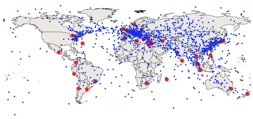
It will be interesting to see if the idea is worth enough for traders to rent out an offshore oil platform and some fiber optic cable laying boats to set up shop amongst all those series of market midpoints crossing the North Atlantic.
Labels: ideas
Leonard Read's famous 1958 essay "I, Pencil" is often used to make the point that no one person really knows how to make something as seemingly simple as a pencil. Excerpting Read's essay:
I, Pencil, simple though I appear to be, merit your wonder and awe, a claim I shall attempt to prove. In fact, if you can understand me—no, that's too much to ask of anyone—if you can become aware of the miraculousness which I symbolize, you can help save the freedom mankind is so unhappily losing. I have a profound lesson to teach. And I can teach this lesson better than can an automobile or an airplane or a mechanical dishwasher because—well, because I am seemingly so simple.
Simple? Yet, not a single person on the face of this earth knows how to make me. This sounds fantastic, doesn't it? Especially when it is realized that there are about one and one-half billion of my kind produced in the U.S.A. each year.
Discovery's How It's Made describes how pencils get made today, in the following five minute video (HT: Core77):
After having seen the video, you might have a better idea of how a pencil is made once all the parts arrive at where they're made, however the basic premise of Read's essay holds more true than ever, once you realize that today's pencil making incorporates the efforts of literally millions of more people from more places than Read himself ever would have imagined just to produce and deliver the components to today's pencil production facility.
That's not counting all the thousands of small improvements in the actual process of pencil making that have taken place since 1958, which itself was much changed from how it was done a hundred years earlier. Which, in turn, was much different from how it was done a hundred years before that.
And all while making a seemingly simple product that doesn't seem like it's changed all that much for hundreds of years!
Labels: economics
Did the S&P 500's downgrade of the U.S. government's credit rating change how investors view the risk of default in the United States? Better still, what events during the past several years coincide with changes in the risk of the U.S. government defaulting on the debt it issues?
We can answer these questions by seeing how the spreads of Credit Default Swaps (CDS) - the special insurance policies that investors in debt securities can buy that pay out in the event the borrower defaults on their owed debts, have changed over time. Because the costs (or spreads) of these insurance policies are dependent upon the likelihood of default, we can correlate changes in their level over time with the events that could drive the observed changes.
The chart below shows the risk of the U.S. defaulting on its 10-Year Treasury as measured by CDS spreads from 14 December 2007 through 8 August 2011, an interactive version of which is available from Bloomberg:

We'll next go through the major gyrations shown in the chart above, providing a timeline of the major events that could influence the perception of the risk of a U.S. default from the end of 2007 through the aftermath of S&P's credit rating downgrade of the creditworthiness of the U.S. government.
| Significant Events Coinciding with Changes in U.S. Default Risk | |||
|---|---|---|---|
| Starting Date | Ending Date | CDS Direction: Range | Milestone |
| Before | 22 Feb 2008 | Flat: 6-10 | Typical Level of U.S. Credit Default Swap (CDS) Spreads (aka "default risk") in "Pre-Financial Crisis" Period |
| 22 Feb 2008 | 1 May 2008 | Increase: 11-18 | Subprime Lending Crisis begins as banks act to bail out bond insurer Ambac. Bear Sterns collapses and is acquired for pennies on the dollar by JPMorgan. |
| 1 May 2008 | 8 Jul 2008 | Decline, Flat: 6-9 | Post-Subprime Crisis spike returns to typical pre-crisis CDS spreads. |
| 8 Jul 2008 | 5 Sep 2008 | Increase: 9-16 | IndyMac bank fails. Fannie Mae and Freddie Mac (both government-supported enterprises) both increasingly seen at risk. Both are seized by federal government on 7 September 2008. |
| 5 Sep 2008 | 24 Feb 2009 | Increase: 16-100 | U.S. Financial System Crisis explodes. CDS Spreads peak at 100 on 24 February 2009. |
| 24 Feb 2009 | 30 Oct 2009 | Decline: 100-21 | First phase of financial system crisis abates. U.S. Treasury issues "Next Phase" report in September 2009, which anticipates how emergency financial support from the federal government to the financial industry will wind down. |
| 30 Oct 2009 | 8 Feb 2010 | Increase: 22-47 | Second phase of financial system crisis begins with failure of Citigroup, which declares bankruptcy on 1 November 2009. The move forces U.S. government to write off $2.3 billion in TARP bailout money. |
| 8 Feb 2010 | 16 Mar 2010 | Decline: 47-31 | Secondary U.S. financial system crisis abates. Federal Reserve begins to unwind emergency measures. |
| 16 Mar 2010 | 4 Aug 2010 | Increase: 31-43 | U.S. default risk increases as U.S. new government debt issues continue to flood the markets in record quantities, with debt buyers beginning to balk at amount of U.S. Treasuries being issued to support government spending, as U.S. Congress controlled by Democratic Party declines to pass budget for federal government. |
| 4 Aug 2010 | 12 Oct 2010 | Increase: 39-50 | A second step upward in U.S. default risk as concerns begin to grow as U.S. nears national debt ceiling with no action being taken by U.S. Congress, which is fully controlled by Democratic party. |
| 12 Oct 2010 | 14 Jan 2011 | Decrease: 44-36 | Likelihood of Republican party winning U.S. Congress pushes default risk downward, as "Tea Party" candidate campaigns focusing on reducing excessive government spending prove popular. After dipping to low of 36 ahead of 2010 election, default risk rises slightly as Democratic party retains control of U.S. Senate, limiting potential for bringing federal spending into control. |
| 14 Jan 2011 | 31 Jan 2011 | Increase: 48-52 | Short term spike as President Obama releases Fiscal Year 2012 budget, demonstrating intent to continue and increase excessive levels of government spending, with no plan to reduce it through remainder of his first term. |
| 31 Jan 2011 | 6 Apr 2011 | Decrease: 52-36 | Decline in default risk as Republican party controlled House of Representatives passes a budget blueprint developed by new House budget committee chairman Representative Paul Ryan designed to bring federal spending back under control and sets to work on creating budget legislation based upon it. |
| 6 Apr 2011 | 18 Apr 2011 | Increase: 36-50 | Spike in U.S. default risk as President Obama sketches out a "second" budget in national speech on 13 April 2011, which continues excessive levels of government spending while also seeking to reduce annual budget deficit by increasing taxes that are unlikely to be supported by Republican-controlled House of Representatives. |
| 18 Apr 2011 | 17 May 2011 | Decrease: 50-41 | Decline in default risk as "Ryan" deficit reduction plan passes U.S. House of Representatives. |
| 17 May 2011 | 1 Jun 2011 | Increase: 41-51 | U.S. Senate rejects "Ryan Plan" without developing any alternative of its own. U.S. reaches $14.3 trillion debt limit. |
| 1 Jun 2011 | 13 Jul 2011 | Flat: 50-54 | Range of volatility in CDS spreads while deficit reduction/national debt limit increase negotiations are ongoing. |
| 13 Jul 2011 | 18 Jul 2011 | Increase: 50-56 | Short term spike in default risk as President Obama storms out of national debt limit negotiations. |
| 18 Jul 2011 | 22 Jul 2011 | Decrease: 56-53 | Obama returns to the table in secret negotiations at the White House to resume debt limit talks. |
| 22 Jul 2011 | 28 Jul 2011 | Increase: 53-64 | Short term spike as Speaker John Boehner withdraws from national debt limit talks in face of Obama/Senate Democrats refusal to consider any spending cuts, insisting instead upon imposing massive tax hikes and continuing unsustainable levels of spending. |
| 28 Jul 2011 | 2 Aug 2011 | Decrease: 64-54 | Boehner offers new scaled-back deficit reduction/higher national debt limit plan, which passes the U.S. House on 29 July 2011. Two part spending reduction plan reduces immediate risk of default, which results in lowering CDS spreads to pre-spike level. Deficit reduction/national debt limit increase plan signed into law by President Obama on 2 August 2011. |
| 2 Aug 2011 | 8 Aug 2011 | Flat: 54-57 | U.S. default risk, as measured by 10 Year Treasury CDS spreads essentially holds level within a narrow band of volatility, even though S&P issues downgrade to rating of U.S. debt from AAA to AA+ on 5 August 2011. Downgrade has very little no effect on U.S. default risk (debt ratings only *confirm* status of U.S. financial situation - they don't actually change it!) |
From the end of 2007 through 8 August 2011, the risk of the U.S. government defaulting on its debt payments, as measured by CDS spreads, in the U.S. increased by about 50 points.
Because the risk of default is directly proportional to interest rates, with a 100 point change being roughly equal to a change in interest rates of 1%, we estimate that the yield on the U.S. 10-Year Treasury has risen to be about 0.5% higher than it would otherwise be if not for the high debt-level driven increase in the risk of a U.S. government default on its debt payments.
Though small, that 0.5% increase is sufficient to reduce the U.S. GDP growth rate by approximately 1.3 to 1.4% in 2011. This is a principal reason why the government's stimulus programs in recent years have largely failed to generate the levels of growth their proponents had projected.
As a final note, we'll observe that actions consistent with the objectives of so-called "Tea Party" have tended to decrease the risk of a U.S. government default over the past several months and years, which directly contradicts the political spin being produced by the White House and Democratic Party members.
By contrast, we estimate that actions taken by either President Obama or his party beginning just in the past year's national debt limit debate have added approximately 10 points to the U.S.' 10-Year Treasury CDS spread, corresponding to a 0.1% increase in the 10-Year Treasury yield above what it would otherwise be. That 0.1% increase in the 10-Year Treasury yield then translates into a GDP growth rate that's 0.2%-0.3% slower than it would otherwise be.
If only President Obama had any good ideas on how to fix that problem....
Labels: national debt
Welcome to the blogosphere's toolchest! Here, unlike other blogs dedicated to analyzing current events, we create easy-to-use, simple tools to do the math related to them so you can get in on the action too! If you would like to learn more about these tools, or if you would like to contribute ideas to develop for this blog, please e-mail us at:
ironman at politicalcalculations
Thanks in advance!
Closing values for previous trading day.
This site is primarily powered by:
CSS Validation

RSS Site Feed
JavaScript
The tools on this site are built using JavaScript. If you would like to learn more, one of the best free resources on the web is available at W3Schools.com.
Other Cool Resources
Blog Roll


