 Don't you just hate it when civilization loses something useful for a couple thousand years? The recent confirmation that an artifact recovered from an ancient Roman shipwreck off the island of Antikythera in the Mediterranean over a century ago was actually a highly sophisticated astronomical calculator is just such a case. The device is so sophisticated in fact, that its intricate gearing could be used to perform basic math operations such as addition, subtraction, multiplication and division in addition to showing where the sun and moon would be in the zodiac, and quite possibly the positions of the planets with respect to the constellations of the zodiac as well.
 To put the capabilities of this device into perspective, the type of gearing incorporated in this ancient Greek bronze-age tool would have no comparable equivalent until the development of intricate time pieces and clockworks over a millennia later and well into the 1800's for an equivalent level of miniturization and sophistication.
Where the ability to do math is concerned, the development of the difference engine in the late 1700's-early 1800's provides the most relevant example. The ideas behind the invention of this device are the direct forefathers of today's computers.
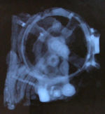 The capabilities of what was perhaps the most advanced device on the face of the planet when it was created more than 2000 years ago are just now coming to light thanks to technology that allows this ancient device to be studied and modeled without risking damage to its internal components. X-ray tomography has helped identify and define the gearing within the device, while modern rapid prototyping technology may be used to create a working version of the mechanism to help confirm its functionality.
It's not the first time that a device from the ancient world has proven to be centuries before its time. It's happened before with the steam engine, the coin-operated vending machine, and the battery, but nothing anywhere as near as sophisticated as the 1st-century BC device now called the "Antikythera Mechanism."
More Information
Labels: technology
Context. The answer to the question of why we were looking at historic U.S. Treasury bond yields is to gain a better understanding of how likely it would be for the probability of recession to actually occur given the current levels of U.S. Treasuries and the Federal Funds Rate.
It's one thing to take these two bits of information and calculate the probability of recession beginning in the next 12 months, it's another to consider the yield spread in the context of the underlying data used to determine this figure: the difference between the yields of the 10-year and 3-month Treasuries. How likely is it, for example, that the yield of the 10-year note will drop low enough compared to the 3-month bill to increase the probability of recession to 60%? Or 80? Or higher?
So, we took the latest data we had for the 3-month Constant Maturity Treasury (5.05%) and the Federal Funds Rate (5.25%) and said, let's say these were the average levels for these figures for the last quarter. What would the corresponding level of the 10-year Treasury have to be to reach the 60% threshold? Or the 80% threshold? Or a 99% threshold?
Now you know why we created yesterday's tool! We used the data above to find the corresponding spread between the 3-month and 10-year Treasuries and did the addition to find the yield of the 10-year note that would be associated with the other two bits of data. Then, we plotted the history of 10-year Treasury yields going back to January 2, 1962 along with the yields for each of the probability thresholds we considered to see just how often the 10-year note shows up at these levels, which we've presented in the following chart (click the chart for a larger image):

The recession probability lines shown on the chart only apply for the very recent conditions of a Federal Funds Rate of 5.25% and a 3-month Treasury yield of 5.05% (today's assumed conditions) and are shown across the entire span of time on the chart for reference only - they only apply for November 27, 2006.
In running the numbers, we find that the 10-year note has been at the level necessary to trigger a 60% probability of recession some 13% of the time since January 1962. The 10-year note has been at the level needed to trigger an 80% chance of recession in the next 12 month just 0.2% of the time over the period we considered, and never for the 99% level of probability. (We'd go back further that 1962, but the Fed's archived data was the oldest continuous stream we could find!)
You can also see in the chart that there's still quite a bit of separation between the current level of the 10-year Treasury and the 60% threshold. On the whole, this data does suggest that it's more unlikely than likely that the 10-year Treasury will drop low enough to truly provide a clear signal that there will be a recession. The data is more consistent with a slowdown in the economy.
We found it interesting that the FRBSF Economic Letter that kicked off our recent bout of recession probability analysis noted that "the single-equation model based on the yield curve and the funds rate appears to have performed better historically than other models, it makes sense to take its pessimistic forecast seriously." But, they caution that this data may not be enough and that "there also are mitigating factors to consider" and point to other forecasts and metrics to make their point that a recession is unlikely.
Given our preferred state of optimism, we're inclined to agree – although we don't know that you have to go very far beyond the underlying data in the Treasury yield curve to get there. Especially if you place it in context!
Sometimes, we have absolutely no idea where one of our projects is going to lead. Our latest tool certainly fits in that category, as we started off by looking at the historic data for the yield curve in U.S. Treasuries, but kept coming back to the same question: "What bond yield spread do you need to reach a ___% probability of recession for a Federal Funds Rate of ___?"
We've kind of touched on this before, when we developed our tool for working out the spread needed to reach the 50% probability level of recession, but we had never gone beyond that, mainly because it's not something we've asked a lot before. Or even thought about asking a lot.
Then, suddenly, we kept having to go back to our recession odds reckoning tool to reverse engineer the spreads the hard way, one at a time, tweaking the input data until we got our desired result.
Well, that was nuts. And time consuming. So, instead, we took some of the data we generated and fit a curve to it so that now, all we need to answer our question is the Federal Funds Rate and the probability of recession in which we're interested in finding the associated spread in U.S. Treasuries. That work is now the tool you see below:
What else can we say - our pain is your gain!
Labels: recession forecast, tool
In the latest edition of the Federal Reserve Board of San Francisco's letter, economists John Fernald and Bharat Trehan ask the our headline question for the day (via Greg Mankiw). Unlike the most avid recession hounds, they've been using the method developed by Jonathan Wright, for which we've dedicated a tool here at Political Calculations!
Here's the key graph from the SF Fed letter, which tracks the recent history of the probability of recession from 1964 through November 8, 2006:

It certainly appears that the risk of recession is rising, so it seems like a good idea to update the SF Fed's calculations with the latest numbers. Now, to use Wright's method, you need to average a quarter's worth of data for the spread between the 3-month and 10-year Constant Maturity Treasury yields, as well as for the Federal Funds Rate.
Going back over a one-quarter period, beginning August 23, 2006 and ending November 24, 2006, we find the following average data:
10-Year = 4.70%
3-Month = 5.02%
Federal Funds Rate = 5.25%
Using our tool, this gives the current probability of a recession beginning in the U.S. sometime within the next 12 months to be 46.4%. Looking at this data over the past several weeks, the probability of recession is trending higher.
Regular users of our tool know that we point to Yahoo's composite bond rates for the Treasury data. These yields are discounted from the Constant Maturity series and so far, we've found them to be a fairly good substitute for the data averaged over a quarter, which isn't directly available on the web.
Using this daily data, we find the probability of recession beginning in the next 12 months to be 47.4%, which we obtained using the discounted daily treasury rates for the 10-Year = 4.54% and the 3-Month = 4.89% with the same Federal Funds Rate for November 24, 2006.
Finally, if we use the closing bell data for the Constant Maturity Treasuries for November 24, 2006, the tool returns a recession probability figure of 51.6%. As with any single data point, this may be a spike, it may be random noise, or it may be a real trend. That's why Wright uses the data averaged over a one quarter period of time. In any case, it provides a point of comparison for Fernald's and Trehan's November 8 data point in the table above, which appears to be slightly under the 50% mark.
We'll go more into this topic in the days ahead, but for now, we're not prepared to make the call for an imminent recession, as the conditions we've previously noted as being essential in making the call have yet to occur.
Fernand and Trehan conclude the SF Fed's letter by noting that:
... not only are recessions hard to predict, it is even hard to tell that the economy is in a recession once it has begun.
Well, for that, we would rely on the recession probability index developed by James Hamilton and Marcelle Chauvet, which would provide the earliest, best indication that the U.S. economy has entered into recession.
 Welcome to the Thanksgiving 2006 weekend edition of On the Moneyed Midways, the blogosphere's only weekly review of the best business, management and money-related posts from each of the week's major blog carnivals! Each week, we select not only the best posts from each of the blog carnivals we read, but we also select one post as being The Best Post of the Week, Anywhere!(TM)
But wait, that's not all! In addition to The Best Post of the Week, Anywhere!, we've also identified posts that you can't miss reading - what we believe to be Absolutely essential reading!(TM) You'll find them all below - just scroll down for the best posts of the week that was....
| On the Moneyed Midways for November 24, 2006 | |||
|---|---|---|---|
| Carnival | Post | Blog | Comments |
| Carnival of Business | The Best Company Structure in Four Easy Steps | Reasoned Audacity | Jack Yoest has a four step plan for budding entrepreneurs to gain control over their businesses - and it involves setting the boss at the top of the pyramid! |
| Carnival of Debt Reduction | How to Save Money on Credit Cards | MattHutter.com | Sometimes, getting a break on credit card rates can be as easy as asking for one. Matt Hutter has the scoop! |
| Carnival of Fraud | Top Ten Ways to Prevent Employee Theft | sequence inc. | Tracy Coenen, the host of the Carnival of Fraud, lists the 10 things you can do to ensure your employees aren't draining the till! |
| Carnival of Future Millionaires | Scam-Proof Yourself to Eliminate Risk | Wisdom from Wenchypoo's Mental Wastebasket | Wenchypoo reprints a consumer scam quiz that her bank sent her - how well will you score? |
| Carnival of Marketing | What Would Seth Godin Say? | Okdork.com | Noah Kagan has a challenge for you to find just three things wrong in the ad in the picture. You'll find the answers in the comments! |
| Carnival of Personal Finance | Micro Lending and the Decline of Poverty | Art of Money | Muhammad Yunus only lends money to the poorest people in the world who have no collateral, and has a 98% repayment rate. Jon of the Art of Money has the story. |
| Carnival of Real Estate | Craigslist Court Decision | Zillow Blog | Liam Lavery breaks news and analyzes the impact of the Chicago federal district court dismissing a suit charging that craigslist's housing listings are in violation of the Fair Housing Act. The Best Post of the Week, Anywhere! |
| Carnival of the Capitalists | New Wealth More Generous Than Old Wealth | Entrepreneurial Mind | Jeff Cornwall highlights a study that reveals that those who earn their wealth, rather than inherit it, are far more generous with their money in donating to charities. |
| Cavalcade of Risk | Coffee May Reduce Diabetes Risk | That's Fit | Rigel Gregg has the story that all coffee-drinkers can rejoice in, as the world's caffeinated beverage of choice appears to have a positive effect on the risk of getting diabetes. |
| Festival of Frugality | 5 Tips for Spending Less on Gifts | Binary Dollar | Are you looking to save money this shopping season? You don't have to give your family members Festivus poles like Binary Dollar plans, but you can follow some of these timely tips! |
| Festival of Under 30 Finances | Goooooooooal! | An English Major's Money | The English Major doesn't know what her financial goals are, which complicates how she talks with people over 30 about the long term. |
| Festival of Stocks | REIT Delete | StockReply | George of Fat Pitch Financials, the host of the Festival of Stocks this week, made this contrarian post questioning the valuation of REITs an Editor's Choice, and we're calling it Absolutely essential reading! |
| Home Business Carnival | Why Corporations Fear Network Marketing | geniustypes | Brian C. Lee explores the nuts and bolts of what network marketing is and why you should consider pursuing it as a means of reaching your potential customers. Absolutely essential reading! |
| Personal Growth Carnival | Why You Lose Your Focus (And What To Do About It) | Ririan Project | Ririan shows how we lose track of what we want and provides six actions you can take to regain your focus. |
| Carnival of Future Millionaires | Deadbeat Tenants Slide Over One | The Landlord Blog | Anesia Springborn tells the tale of neighbors who thought renting out their house would be easy, until reality hit. |
Previous Editions
- On the Moneyed Midways – November 24, 2006
- On the Moneyed Midways – November 17, 2006
- On the Moneyed Midways – November 11, 2006
- On the Moneyed Midways – November 3, 2006
- On the Moneyed Midways – October 27, 2006
- On the Moneyed Midways – October 21, 2006
- On the Moneyed Midways – October 13, 2006
- On the Moneyed Midways – October 6, 2006
- On the Moneyed Midways – September 30, 2006
- On the Moneyed Midways – September 23, 2006
- On the Moneyed Midways – September 15, 2006
- On the Moneyed Midways – September 8, 2006
- On the Moneyed Midways – September 1, 2006
- On the Moneyed Midways – August 25, 2006
- On the Moneyed Midways – August 19, 2006
- On the Moneyed Midways – August 11, 2006
- On the Moneyed Midways – August 4, 2006
- On the Moneyed Midways – July 29, 2006
- On the Moneyed Midways – July 21, 2006
- On the Moneyed Midways – July 14, 2006
- On the Moneyed Midways – July 7, 2006
- On the Moneyed Midways – June 30, 2006
- On the Moneyed Midways – June 23, 2006
- On the Moneyed Midways – June 16, 2006
- On the Moneyed Midways – June 9, 2006
- On the Moneyed Midways – June 2, 2006
- On the Moneyed Midways – May 26, 2006
- On the Moneyed Midways – May 19, 2006
- On the Moneyed Midways – May 12, 2006
- On the Moneyed Midways – May 5, 2006
- On the Moneyed Midways – April 28, 2006
- On the Moneyed Midways – April 21, 2006
- On the Moneyed Midways – April 14, 2006
- On the Moneyed Midways – April 7, 2006
- On the Moneyed Midways – March 31, 2006
- On the Moneyed Midways – March 24, 2006
- On the Moneyed Midways – March 31, 2006
- On the Moneyed Midways – St. Patrick's Day 2006 Edition
- On the Moneyed Midways – March 10, 2006
- On the Moneyed Midways - The inaugural edition from March 3, 2006!
 Happy Thanksgiving! And, because it's never too early to start planning your next meal, or even what to do with your last one, here's our post from last year on what to do with the remains of the bird!
Labels: thanksgiving, turkey
The week of Thanksgiving does strange things to us here at Political Calculations, as the thought of enjoying a large feast with family sways us from our usual thoughts of money and business matters. Well, almost, because as we updated our annual look at the growth of turkeys on U.S. dining tables in recent years, we started wondering about how much money there is to be made in turkey farming.
Quite a bit, as it turns out! Our go-to source for all things turkey-related confirms that billions of dollars are made each year in producing turkeys. The following chart shows how many of those billions of U.S. dollars made it to the turkey farmers of America from 1990 through 2005:
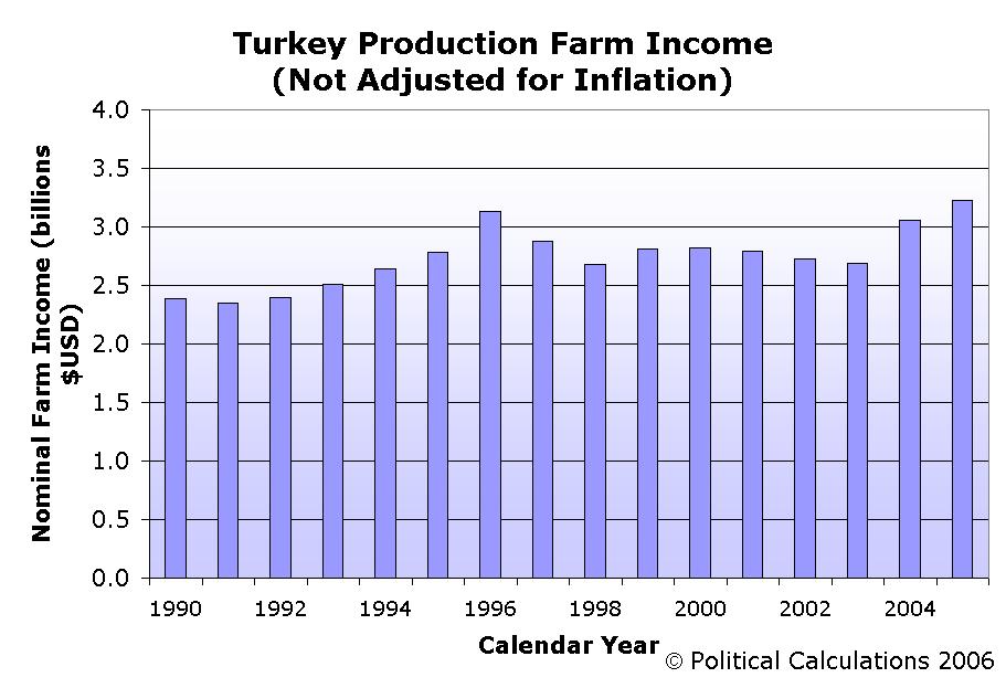
As we can see, in 2005, the number of dollars accumulated in the coffers of America's turkey producers surpassed all previous years for which we have data, reaching $3.23 billion! The previous record was set in 1996 at $3.13 billion – not bad considering that over 47 million more turkeys were produced in that year than in 2005!
But wait, there's more - we haven't taken inflation into account!
Using Oregon State Professor Robert Sahr's conversion factors (available in this 36KB PDF document) for translating the value of dollars of previous years to 2005 U.S. dollars, we find that today's record isn't all it's cracked up to be:
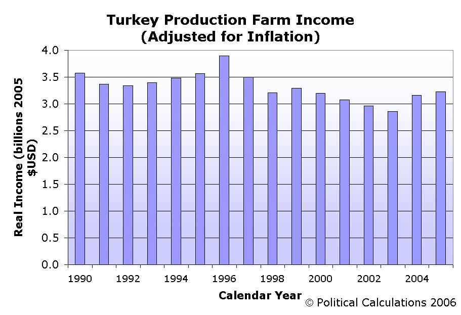
In this chart, it's clear that the 1990s were very good to U.S. turkey farmers, as compared to the years since! We find that 2005's apparent record-setting $3.23 billion of income pales in comparison to 1996's inflation-adjusted $3.90 billion. What's really remarkable, as we saw yesterday, is that the total amount of turkeys produced in 2005, as measured by their Ready-To-Cook (RTC)-Inspected weights, which is what U.S. consumers actually buy, was 58 million pounds greater than the amount produced in 1996.
What this tells us is that turkeys have become much less lucrative per pound to produce than they were in the 1990s. Our next chart shows the trend in farm income per RTC-Inspected pound of turkey using inflation-adjusted 2005 U.S. dollars:
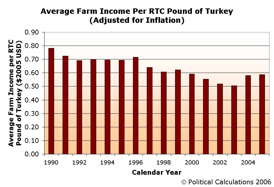
This decline in real income has come even as the productivity of the U.S. turkey farmer has increased consistently throughout the same period.
We suppose we won't be closing up shop to begin farming turkeys anytime soon!
Labels: thanksgiving, turkey
 Last year, for no good reason at all, we dove into the seamy underbelly of U.S. turkey production and showed what we had long expected: the turkeys occupying prime table real estate in the United States are indeed getting bigger!
This year, we've updated our analysis of the very revealing statistics and we've found some disturbing trends that are not being reported by the mainstream media. Or even the Food Network! That's why we've opted to present our dull data analysis as sensationalistically as possible! For instance, did you know that the volume of U.S. turkey production has plunged below levels not seen since 1989?

Yes, it's true! Our chart above reveals that last year's production of 256 million turkeys is not only 5 million less than 1989's production of 261 million turkeys, it's also 47 million below the peak year's production of 303 million turkeys in the U.S. in 1996!
You would think the media might notice some 47 million fewer turkeys walking around U.S. farms. Could they be in on the conspiracy?! Are they part of the turkey-industrial complex?
What's more, the combined live weight of the turkeys produced in 2005 (7.207 billion pounds) is holding roughly level with the combined live weight of the turkeys produced in 1996 (7.233 billion pounds):
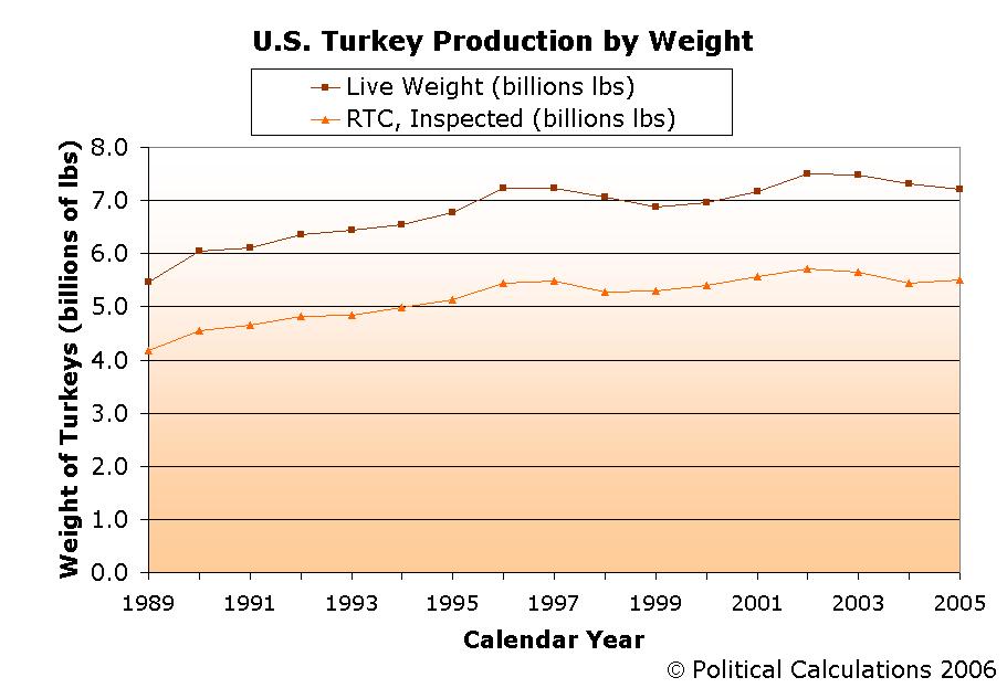
That's right! 47 million fewer birds and their combined live weight only dropped by 26 million pounds? But wait – things get even more disturbing as the combined Ready-To-Cook (RTC) - Inspected weight of U.S. turkeys has increased by some 58 million pounds over 1996's 5.466 billion pounds to 2005's 5.504 billion pounds.
Combined, these facts can only mean one thing: today's turkeys in the U.S., despite being substantially fewer in number, are much meatier than the turkeys of less than a decade ago. Oh, the horror, as this can only mean that the increasing productivity of the U.S. turkey farmer is growing unrepressed! The proof is in our next chart:
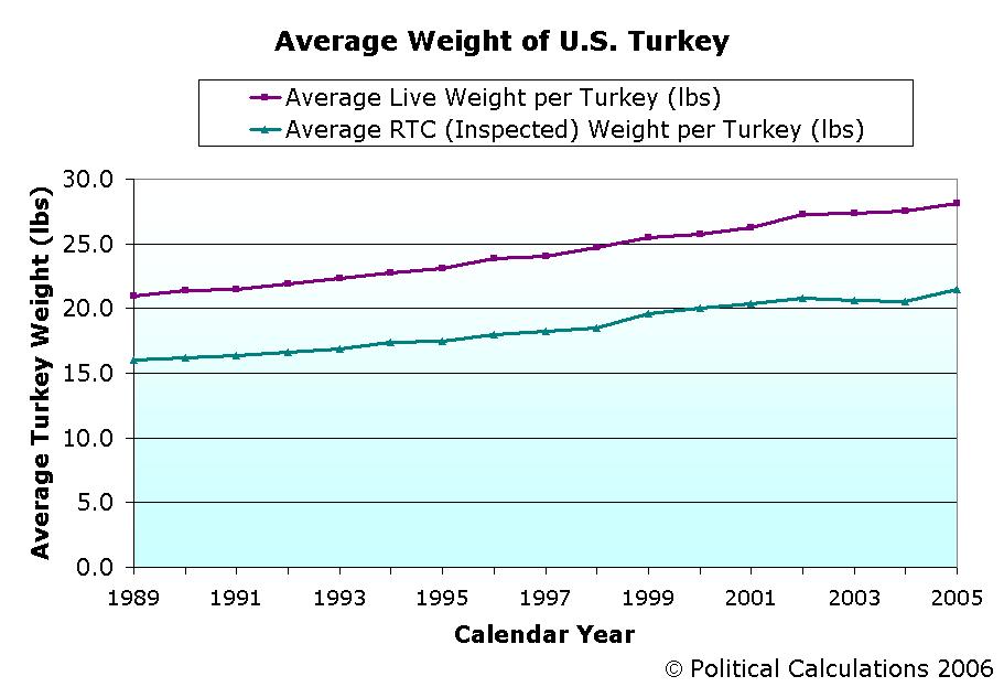
The turkeys of 2005 weighed in at 28.15 pounds (live) on average and their ready-to-cook weight is 21.50 pounds. That's a weight increase of 7.2 lbs (live) and 5.5 lbs (RTC), or rather 34.4% (for both weights) of the average weight of a turkey in 1989. Compared to 1996, that's a weight increase of 4.28 pounds (live) and 3.53 pounds (RTC), for gains of 18% and 20% respectively.
We think it's time for action! Only government subsidies have proven capable of keeping the growth of productivity in the U.S. agricultural industry under control. Only government subsidies can remove the pressures of having to compete in the free market, keeping those who receive them from having to work as hard as those who do not in improving what they produce.
Otherwise, what's to stop these free-market turkey farmers from achieving their ultimate goal – the creation of the "super turkey," which would weigh over 7.2 billion pounds and be able to meet the annual turkey consumption needs of the entire United States. Write and call your representatives today!
Labels: thanksgiving, turkey
Welcome to the November 17, 2006 edition of On the Moneyed Midways, the blogosphere's weekly review of the best business, management and money-related posts from each of the week's major blog carnivals! Each week, we select one post from among the hundreds that we read as being The Best Post of the Week, Anywhere!(TM)
But, what about those situations where there are many strong contenders for the top spot, as we've had in recent weeks? To address this situation, we've created a new category to direct you to these well-written posts, which we find to be Absolutely essential reading!(TM) Just scroll down for the best of the best and the best of the rest of the week that was....
| On the Moneyed Midways for November 17, 2006 | |||
|---|---|---|---|
| Carnival | Post | Blog | Comments |
| Carnival of Business | 76% Think You Are a Liar | Seeds of Growth | Dave Free compares traditional marketing with an approach that uses Consumer Advisory Panels to build more effective word-of-mouth. |
| Carnival of Career Intensity | Why More People Should Consider Quitting Their Jobs | Innovation Zen | Daniel Scocco lists seven things you should consider to decide if you should stay where you are or strike out for new opportunities. |
| Carnival of Debt Reduction | Debt: Face the Numbers | The Weight of Money | Should you carry big debt on your credit cards? Donna Jean shares her very real numbers to show just what carrying debt can really cost you! |
| Carnival of Fraud | SOX, Trust and Ethics | SOX First | Leon Gettler reports on recent findings that reveal that regulations designed to rebuild trust in corporations and other institutions are actually undermining real trust from developing. Absolutely essential reading! |
| Carnival of Home Business | Small Business Pitfalls | Blogfabulous | Kim Banks discusses the downside to running your own business from home. |
| Carnival of Investing | Index Investing Out-Performs Most Actively Managed Funds, Costs, Taxes Are Why | FreeMoneyFinance | How much do expense ratios and taxes affect your investment returns from mutual funds and ETFs? FMF shows why the low fees and taxes that come with index investing outpace actively managed funds. |
| Carnival of Personal Finance | Financial Politics | eFIPO | Does spending your own millions to win an election make sense? Budding politician Jamie Beaudry learns campaign finance from recent history! |
| Carnival of Real Estate | Tearing Down a Brick Wall: The Problem with Sellers | Matrix | Jonathan J. Miller is waiting for sellers to adjust to the realities of the current real estate market and contemplates what's taking them so long. |
| Carnival of Real Estate Investing | Schadenfreude | Lording the Land | The Landlord highlights other blog posts telling tales of real estate investments gone south, deals gone wrong, and those on the road to financial devastation. |
| Carnival of the Capitalists | Counterpoint: Patents and Defensibility | How to Change the World | Guy Kawasaki posts a response to his recent diatribe on the patent process - as it happens, it's a very good description of how patents can be used to defend a company's brand in the marketplace. |
| Economics and Social Policy | Hallowe'en Economics | thesharpener | Donald writes from England and is amazed at the boom in sales of Halloween merchandise in the U.K. over the past five years. |
| Festival of Frugality | Saving Money on Road Trips | The Simple Dollar | The Simple Dollar finds some expected and unexpected savings for traveling long distances by car. Who knew MapQuest and Google maps could steer you wrong?! |
| Festival of Investing | uWink: A Promising Project fro mGaming's Most Legendary Entrepreneur | ValueBlogger | Kevin Kelly and Zac Bissonnette profile a new restaurant concept - one that seeks to differentiate itself with technology to encourage interaction among customers by providing a social gaming environment. |
| Carnival of Fraud | My Recent Mistakes at Value Investing | Experiments in Finance | Two investments. Two mistakes. Two losses. All avoidable - at least if Ricemut had heeded value-investing pioneer Benjamin Graham's "margin of safety" rule. |
| Personal Development Carnival | Trust Tip #14: More Hard Talk About Soft Skills | Trusted Advisor Associates | Charles H. Green provides maybe the best advice for building trust ever. The Best Post of the Week, Anywhere! |
| Personal Growth Carnival | Why the Kaizen Approach Helps You Make Changes in Your Life | kSuccess | Kaizen is the Japanese word for continuous improvement - Rodger Constandse shows how the kaizen approach can help you overcome obstacles on your way to a better you! |
| Personal Growth Carnival | How to Avoid Manic Entrepreneurship | Instigator Blog | "Entrepreneurs are not the most level-headed people around," Ben Yoskovitz observes in providing advice for avoiding the emotional peaks and valleys that come with being an entrepreneur. |
| Wealth Building Ideas | Innovations About Innovating | David Maister | David Maister has been attending a conference on innovation in Denmark and presents the key points he's picked up on how to stimulate innovation in business. |
Previous Editions
- On the Moneyed Midways – November 17, 2006
- On the Moneyed Midways – November 11, 2006
- On the Moneyed Midways – November 3, 2006
- On the Moneyed Midways – October 27, 2006
- On the Moneyed Midways – October 21, 2006
- On the Moneyed Midways – October 13, 2006
- On the Moneyed Midways – October 6, 2006
- On the Moneyed Midways – September 30, 2006
- On the Moneyed Midways – September 23, 2006
- On the Moneyed Midways – September 15, 2006
- On the Moneyed Midways – September 8, 2006
- On the Moneyed Midways – September 1, 2006
- On the Moneyed Midways – August 25, 2006
- On the Moneyed Midways – August 19, 2006
- On the Moneyed Midways – August 11, 2006
- On the Moneyed Midways – August 4, 2006
- On the Moneyed Midways – July 29, 2006
- On the Moneyed Midways – July 21, 2006
- On the Moneyed Midways – July 14, 2006
- On the Moneyed Midways – July 7, 2006
- On the Moneyed Midways – June 30, 2006
- On the Moneyed Midways – June 23, 2006
- On the Moneyed Midways – June 16, 2006
- On the Moneyed Midways – June 9, 2006
- On the Moneyed Midways – June 2, 2006
- On the Moneyed Midways – May 26, 2006
- On the Moneyed Midways – May 19, 2006
- On the Moneyed Midways – May 12, 2006
- On the Moneyed Midways – May 5, 2006
- On the Moneyed Midways – April 28, 2006
- On the Moneyed Midways – April 21, 2006
- On the Moneyed Midways – April 14, 2006
- On the Moneyed Midways – April 7, 2006
- On the Moneyed Midways – March 31, 2006
- On the Moneyed Midways – March 24, 2006
- On the Moneyed Midways – March 31, 2006
- On the Moneyed Midways – St. Patrick's Day 2006 Edition
- On the Moneyed Midways – March 10, 2006
- On the Moneyed Midways - The inaugural edition from March 3, 2006!
 With the passing of Milton Friedman today, we here at Political Calculations are greatly saddened as one of the world's great philosophers is no longer with us to share their wisdom.
For any teacher, as the man affectionately known as "Uncle Miltie" truly was, the greatest reward is knowing that what you taught has been taken to heart by your students and put to good use. It occurs to us that precious few teachers bring their lessons to entire nations, and it's appropriate to commemorate the man with the testimony of one of his most avid pupils, Matt Laar, the former prime minister of Estonia:
When Mart Laar began his second term as prime minister of Estonia in 1999, the country was in the midst of a fiscal crisis. The collapse of Russia's economy the year before had left Estonia's stock market reeling, and the government was struggling to fund the benefits promised by Soviet-era social programs.
Laar realized that the only way for Estonia to weather the crisis was to finally leave behind the legacy of its communist past. He announced deep cuts to paternalistic state welfare programs, slashed business taxes, and urged liberalization of international trade. By the end of his term, the government's Bureau of Privatization was dissolved; more than 90 percent of the economy was in private hands. The economy was growing 7 percent annually, and Laar was widely credited as the force behind the creation of the "Baltic Tiger."
Mart Laar believes in economic freedom because he believes in the Estonian people. As a young student of history, Laar braved Soviet arrest by researching Estonian resistance to the World War II occupation. In his first term of office, he negotiated the withdrawal of Russian troops from the country, introduced the highly stable Estonian currency, and implemented a flat tax that has decreased steadily since 1994.
Laar is not an economist, and he says that his boldness came mostly from naiveté. "I had read only one book on economics — Milton Friedman's "Free to Choose
," he said. "I was so ignorant at the time that I thought that what Friedman wrote about the benefits of privatization, the flat tax and the abolition of all customs rights, was the result of economic reforms that had been put into practice in the West. It seemed common sense to me and, as I thought it had already been done everywhere, I simply introduced it in Estonia, despite warnings from Estonian economists that it could not be done. They said it was as impossible as walking on water. We did it: we just walked on the water because we did not know that it was impossible."
Laar's dedication to progress and economic freedom has allowed the former communist state to develop into one of the most dynamic economies in the world, ranking in the top 10 countries in the Economic Freedom of the World index. At the dedication in 1995 of the F. A. Hayek Auditorium at the Cato Institute, House Majority Leader Dick Armey said of Laar's government, "If Estonia is not a vindication of everything we believe in—from free trade to privatization to sound money to balanced budgets—I am at a loss as to how else one could validate our ideas." Laar has defied common wisdom in Europe to prove that economic freedom works.
We can't think of any better tribute for Milton Friedman's life.
 We've previously commented on how the users of our reckoning and visualizing recession probability tools might be able to make best use of them in forecasting if a recession will materialize within the context of another article, but this topic really deserves its own post.
We've identified the 50% probability level as being a key threshold for telling if the economy will move toward recession sometime over the next 12 months, but there's an interesting question that should be asked: if the current probability of recession is hovering around the 50% mark, what has to happen to tip the balance enough to make the call?
To answer this question, we tapped the Federal Reserve's historical records for each of the components that goes into the recession probability calculation. We loaded up our spreadsheet software with the available data, ran the numbers, and found a recurring pattern as the U.S. economy approached the 50% probability mark.
We'll spare you the spreadsheet, but the pattern is essentially this:
- The probability of recession in the next four quarters bounces around the 50% mark for a short period of time, typically for one to two weeks.
- Then, the probability of recession grows significantly past the 50% mark in a relatively short period of time.
That latter point is illustrated by this chart from Jonathan Wright's paper:
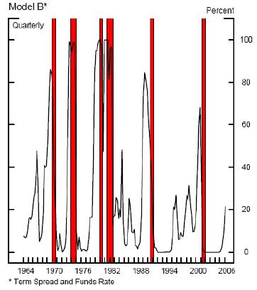
The chart above shows two periods where the odds of recession spiked up near the 50% level, then receded with no following recession, in both 1966 and 1983. Meanwhile, when a recession does follow crossing the key 50% threshold, the probability of recession grows significantly past this point.
As for our first point, the "bounciness" we see in our figures is a direct result of our tool's making use of the daily data for the bond spread and federal funds rate components of the formula. In his original paper, Jonathan Wright uses the average of these figures over a three month period (our thanks to a sharp-eyed reader for pointing this out!) This approach has the advantage of reducing the volatility in the data. This reduced volatility allows the user to discount any unusual spikes that might be seen in using the daily data and be sure that the probability has truly edged up over the 50% mark.
There are two disadvantages to averaging the values of the data components over a 90-91 calendar day period. The first is that in the case that the probability of recession occurring is slowly, yet consistently increasing, it delays the prediction of a recession until the averages finally reach the 50% probability level. The second is more practical – there aren't any online sources of which we're aware that have already averaged the daily values of the last 90-91 days of bond spread and federal funds rate data together for you, which means that you have to do the averaging yourself!
That's why we're opting to leave our tool unchanged and to simply point this fact out for your reference!
So, recession hounds, if you're looking to predict a recession, that's what you need to see and to consider before you can confidently make the call. Tally ho!

Labels: forecasting, recession forecast
In creating our mathematical model of the highest and lowest historical inflation in the United States yesterday, we discovered the formula we generated for describing the highest recorded inflation significantly undershot the actual recorded data for periods of time ranging from 2 to 7 years, while closely correlating with data from all other periods. Obviously, we needed to take a closer look at the data, so that's what we did!
The chart below focuses in on the area in question that, if only for our lack of imagination, we're calling "The Bump":
We wanted to see how much data fell outside our modeled "extreme" limit, since this would provide a good indication of how messed up our formula might be. The table below presents our findings, along with the number of affected data points out of the entire series we originally analyzed:
| Modeled vs. Actual Highest Recorded Inflation Data | ||||
|---|---|---|---|---|
| Period (Years) | Modeled Maximum (%) | Actual Maximum (%) | Number of Rolling Periods in Range | Number of Affected Rolling Periods |
| 2 | 18.57 | 18.75 | 1102 | 1 |
| 3 | 15.50 | 17.75 | 1090 | 22 |
| 4 | 13.63 | 17.95 | 1078 | 19 |
| 5 | 12.34 | 15.66 | 1066 | 12 |
| 6 | 11.38 | 13.07 | 1054 | 12 |
| 7 | 10.62 | 12.27 | 1042 | 5 |
The most discrepancies between modeled and actual data occurs for the 1090 2-year rolling periods we analyzed, with 2.02% of the actual data falling outside our modeled limits. The next worse are the 3-year (1.76%), 4-year (1.41%) and 5-year (1.14%), with the other periods falling below 0.5%. Given the good correlation between all our other modeled periods and the actual data, these results confirm that our formula for estimating the highest inflation for a given period of time will work and may be used successfully for its intended purpose: providing the user with a range of extremes in inflation for making investment decisions.
But what about the actual data? What happened in history that created these much higher than high rates of inflation?
 Reviewing the data, we found that these exceptionally high periods of inflation all corresponded with the same event: the sky-high inflation rates that rocked the U.S. economy in the aftermath of World War I. The rolling periods of time that produced the much higher than modeled inflation rates all ended in the period from October 1918 to January 1921.
A quick review of the history of this period found the primary culprits behind the inflation. One significant factor came from U.S.' entry in the Great War in 1917, which significantly drove up the prices of many consumer goods as resources were diverted by government intervention away from normal civilian production.
The other main factor was also the direct result of World War I, but is much less obvious. Here, the reason has to do with how the countries involved in the fighting went about financing their war efforts.
 During the course of the war, many of the European nations involved in the fighting went off the gold standard that had prevailed in the pre- and early-war years, largely for the purpose of continuing to finance their war efforts through deficit spending (in effect, inflating their currencies.)
With so many countries going off the gold standard for setting the value of their currencies, both individuals and institutions sought to move their gold holdings away from these countries to other nations that were still maintaining a gold standard. The United States was a primary recipient of these flows of gold.
But, instead of simply holding the gold, the Federal Reserve of the day monetized it instead – in other words, the newly created Fed issued U.S. dollars backed by the gold that was coming in from other parts of the world. In doing so, the Fed sharply increased the money supply in the U.S. and, in effect, ensured that significant inflation would be the result. Robert Mundell describes the cause and effect of how maintaining the gold standard in the U.S. led to hyper-inflation in the U.S.:
World War I made gold unstable. The instability began when deficit spending pushed the European belligerents off the gold standard, and gold came to the United States, where the newly-created Federal Reserve System monetized it, doubling the dollar price level and halving the real value of gold.
The inflation continued until the Fed slammed the brakes on the U.S. economy and plunged the nation into the recession of 1920-1921. The following chart shows the effect of this policy on the rate of inflation as the steepest, deepest slope on the chart (approximately at 1920):

The stuff we learn when we go off on these tangents!...
 When we created our "Lemony Snicket and the S&P 500" tool, we included a feature that would allow our tool's users to account for inflation during the terms of their hypothetical "absolute" best and worst case investing scenarios.
But, that left us with a hard question for us to answer: what rate(s) of inflation should investors use in making their investment decisions?
There are two main factors that make answering this question tough. The first factor is that inflation can be pretty volatile. We've had periods of double-digit inflation here in the U.S., as well as periods of negative inflation (or deflation). The second factor is time. The range of inflation data that an investor should consider should correspond to the length of the time period they expect to hold their investments.
In our "Lemony Snicket" tool, the best information we had available to provide our readers came from Bryan Taylor of Global Financial Data (via this 43.0KB Word document), which showed the range of inflation data for selected 30-year periods beginning in 1871.
But, what if you wanted to consider the extremes of inflation for all thirty-year periods since inflation data began being collected? And what if you wanted to consider something other than a 30-year period?
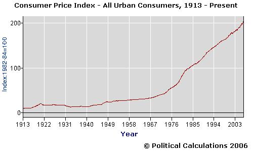
Those are the kinds of questions we answer here at Political Calculations! And to do this job, we went straight to the source: the U.S. Bureau of Labor Statistics' record of the Consumer Price Index for All Urban Consumers (CPI-U) averaged across U.S. cities for each month since January 1913. This inflation data has been collected continuously since 1919 and represents the oldest measure of inflation in the U.S. (the index was estimated back to 1913 to provide a reference for comparison in the data's early years. While others have estimated CPI-U for earlier years, 1913 represents the base year for the BLS' officially tabulated data.)
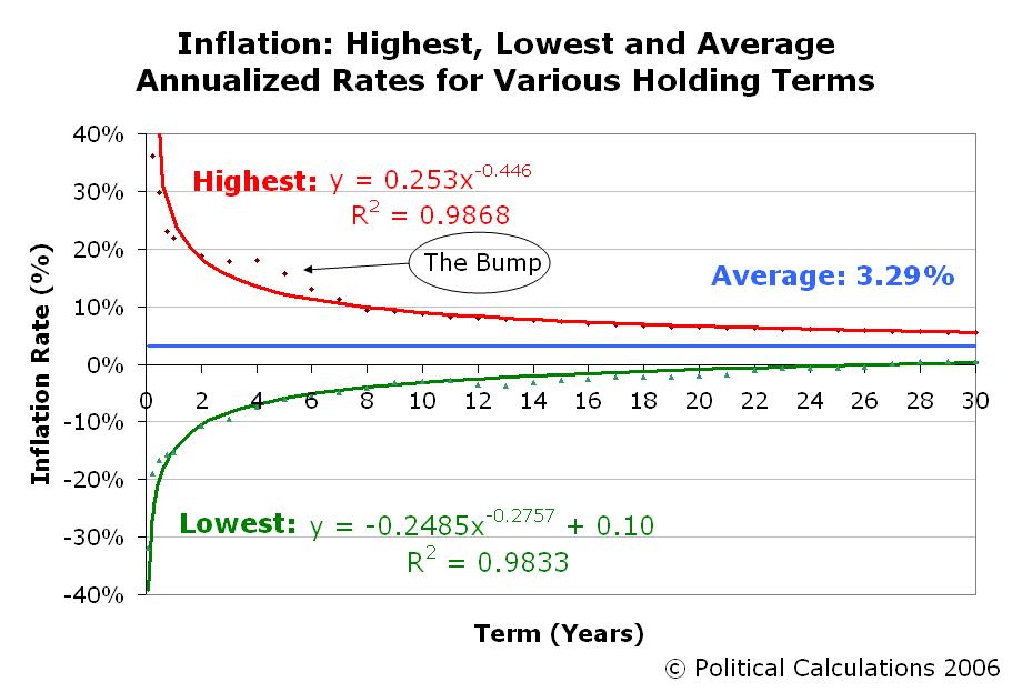
Using this data, we generated the following chart to map the extremes of inflation for periods ranging from one-month to 90 years. We utilized rolling periods of time in generating the chart to find our extremes to map. For instance, the first one-year period we considered began in January 1913 and ended in December 1913, while the second one-year period began in February 1913 and ended in January 1914, and so on until we ran out of months in September 2006 (and we did this for every fixed period of time from one-month to 90 years!):
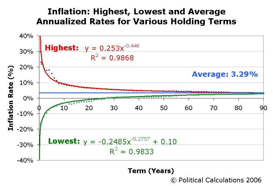
Our first surprise was to see that the average rate of inflation in the U.S. for every period of time we measured since January 1913 is 3.29%, instead of the 2.5% we had set as our original default data in our "Lemony Snicket and the S&P 500" tool. (Depending upon the time period, this figure fluctuates within a range between 3.1 and 3.4%. The average rate of inflation for of all CPI-U data is 3.29%.)
Our next step was to generate the formulas you see in the chart above that effectively approximate the historical bounds of inflation in the U.S. These formulas are utilized in our tool below, which will provide you with the approximations of inflation you should consider when selecting potential investments:
In looking at the chart again, we're intrigued by the "bump" for the highest limits of inflation (where the actual historic inflation is significantly above our mathematical model), which occurs for periods of time ranging from 2 years through 6 years, while all the other actual data points fit well on our curve. We'll be taking a closer look at the underlying data in days ahead.
Labels: best case, economics, inflation, tool, worst case
Welcome to this Saturday, November 11, 2006 edition of On the Moneyed Midways, the blogosphere's only review of the best business and money-related posts of the week that was! Each week, we review more than a dozen blog carnivals, seeking out the posts most worth reading and one post each week is proclaimed to be The Best Post of the Week, Anywhere!(TM)
We had another very strong week again, as we had several contenders for the top prize. What's more, several of the posts we selected for this week's edition really turn conventional wisdom on its head! Scroll down for more....
| On the Moneyed Midways for November 11, 2006 | |||
|---|---|---|---|
| Carnival | Post | Blog | Comments |
| Carnival of Business | They Call It the Hawthorne Effect | Seeds of Growth | Creating positive emotional bonds is vital to making your business a success. Dave Free taps a unique study from the 1930s to illustrate the point. |
| Carnival of Career Intensity | A Revolt on the Revolt of the Fairly Rich | Wisdom from Wenchypoo's Mental Wastebasket | What do the ultra-rich and an ordinary housewife know about real success that apparently is being completely missed by lots of people making over $100,000 per year? A close contender for being The Best Post of the Week, Anywhere! this week. |
| Carnival of Debt Reduction | The IRS Is Using Outside Debt Collectors | Sequence, Inc. | Tracy Coenen uncovers the IRS' latest nefarious plan to go after late taxpayers - outsourcing to those debt collection outfits that everybody loves. |
| Carnival of Fraud | SOX and the Social Impact of Fraud | SOX first | Leon Gettler extracts the impact upon society when managers who have been cooking the books at their companies have to restate their earnings. |
| Carnival of Real Estate | In Defense of Landlords | hotpads.com | While the housing market has weakened, the rental market, and rents, are now booming. Colleen Corgan shows the forces at work behind this trend. |
| Carnival of Taxes | The Bad-Math-Skills Tax | MattHutter.com | Matt Hutter uncovers some surprising statistics on what is perhaps the most unfair tax ever created: the state lottery. |
| Carnival of the Capitalists | Interesting Engine Technology | Photon Courier | We're engineers at heart, so David Foster's look at some very promising technology for boosting the energy efficiency of cars looks very interesting to us. More so, since it points to how ethanol might finally be used to produce more advantages than disadvantages in powering automobiles. |
| Carnival of the Capitalists | How to Price Your Brand's Products | Trizoko | Trizoko declares that the middle is nowhere to be when it comes to setting the prices for your products. The Best Post of the Week, Anywhere! |
| Cavalcade of Risk | 5 Ways to Invest $1200 | Insureblog | Normally, when we see a post like this, the options are usually things like stocks or CDs. Bob Vineyard lists five tests costing $1200 all together for screening for potentially devastating major health problems. |
| Festival of Frugality | Recycling Time! | It's Just Money | You won't know what frugal really means until you read how lamoneyguy is building up a wedding fund by recycling trash for cash! |
| Festival of Investing | What's This Got to Do with the Price of Tea in China? | CheapSmarts.com | Did you ever wonder where the expression about the price of tea in China comes from? Peter Kirby provides a quick history lesson. |
| Festival of Stocks | Bull Market? | MoneyKeg | Are the recent record highs on the Dow Jones Industrial index all they're cracked up to be? Paul Paulson offers a unique perspective. |
| Home Business Carnival | What's This Got to Do with the Price of Tea in China? | CheapSmarts.com | Did you ever wonder where the expression about the price of tea in China comes from? Peter Kirby provides a quick history lesson. |
| Personal Development Carnival | A Lesson from the Devil | The Meaning of Existence | Way off track from the posts we normally highlight, but well worth reading. It's nothing less than the story of the Devil and Daniel Brenton. |
| Carnival of Fraud | Most Important Quality in a Coach | JaneChin.com | Jane Chin argues that caring enough to tell the truth, and having the integrity and guts to do it, is the most important quality that a coach can have in working with others. |
| Wealth Building Ideas | 102 Personal Finance Tips Your Professor Never Taught You | Your Credit Advisor | Jimmy Atkinson has a well organized list of the top 102 things you should do be financially healthy. |
Previous Editions
- On the Moneyed Midways – November 11, 2006
- On the Moneyed Midways – November 3, 2006
- On the Moneyed Midways – October 27, 2006
- On the Moneyed Midways – October 21, 2006
- On the Moneyed Midways – October 13, 2006
- On the Moneyed Midways – October 6, 2006
- On the Moneyed Midways – September 30, 2006
- On the Moneyed Midways – September 23, 2006
- On the Moneyed Midways – September 15, 2006
- On the Moneyed Midways – September 8, 2006
- On the Moneyed Midways – September 1, 2006
- On the Moneyed Midways – August 25, 2006
- On the Moneyed Midways – August 19, 2006
- On the Moneyed Midways – August 11, 2006
- On the Moneyed Midways – August 4, 2006
- On the Moneyed Midways – July 29, 2006
- On the Moneyed Midways – July 21, 2006
- On the Moneyed Midways – July 14, 2006
- On the Moneyed Midways – July 7, 2006
- On the Moneyed Midways – June 30, 2006
- On the Moneyed Midways – June 23, 2006
- On the Moneyed Midways – June 16, 2006
- On the Moneyed Midways – June 9, 2006
- On the Moneyed Midways – June 2, 2006
- On the Moneyed Midways – May 26, 2006
- On the Moneyed Midways – May 19, 2006
- On the Moneyed Midways – May 12, 2006
- On the Moneyed Midways – May 5, 2006
- On the Moneyed Midways – April 28, 2006
- On the Moneyed Midways – April 21, 2006
- On the Moneyed Midways – April 14, 2006
- On the Moneyed Midways – April 7, 2006
- On the Moneyed Midways – March 31, 2006
- On the Moneyed Midways – March 24, 2006
- On the Moneyed Midways – March 31, 2006
- On the Moneyed Midways – St. Patrick's Day 2006 Edition
- On the Moneyed Midways – March 10, 2006
- On the Moneyed Midways - The inaugural edition from March 3, 2006!
Welcome to the blogosphere's toolchest! Here, unlike other blogs dedicated to analyzing current events, we create easy-to-use, simple tools to do the math related to them so you can get in on the action too! If you would like to learn more about these tools, or if you would like to contribute ideas to develop for this blog, please e-mail us at:
ironman at politicalcalculations
Thanks in advance!
Closing values for previous trading day.
This site is primarily powered by:
CSS Validation

RSS Site Feed
JavaScript
The tools on this site are built using JavaScript. If you would like to learn more, one of the best free resources on the web is available at W3Schools.com.
Other Cool Resources
Blog Roll


